Group formed: me, Rachel and Richard. On our first meeting we decided to compile a list of websites or apps that have we consider of bad usability, services that we use with a certain frequency and that fill one of these items:
a website/app that let us achieve our main goals but don’t leave us completely satisfied with the overall experience.
a website/app with an unnecessarily complicated screen.
a website/app that has too many hurdles between us and our goals.
Firstly we decided to redesign an existing experience, we wanted to make a contribution to the users of a particular service, and maybe send our findings to their development team and hopefully have this new user experience developed for ourselves and other users.
The group selected a few of the worst user experiences we came across in the market and voted. The nominees were:
Amazon app for its bad shopping experience on mobile devices.
Mytaxi for not picking up what people loved about Hailo.
Tesco Automated Checkout always telling us there is an unexpected item in the bagging area even though there is nothing there.
Dromoland Castle for its complicated booking system.
Three.ie for being a mobile operator and not having a responsive website.
IADT student registration for having so many passwords and registration forms to go thru.
Blackboard for being stuck in a distant past.
Lotto app for not offering the experience we think we deserve when buying tickets.
We have lift-off
After a quick discussion, we have chosen to redesign the Lotto app. We all shared a few pain points using the Lotto app and as we thought that the majority of people played the Lotto or had contact with the app at some stage, this would make it easier to gather information.
To identify usability problems within the Lotto app, we performed a Heuristic Evaluation to analyze how well the Lotto app complies with recognized usability principles. This method is used mainly to find probable usability issues in the user interface by gathering constructive critiques from professionals [1]. In this case, we were the evaluators. We evaluated the site to measure its user experience and we constructed summaries for each heuristic and found potential issues users may have, listed the heuristic violated, and then rated the severity of the problem.
The list of heuristics are:
Visibility of system status
Match between system and the real world
User control and freedom
Consistency and standards
Error prevention
Recognition rather than recall
Flexibility and efficiency of use
Aesthetic and minimalist design
Help users recognize, diagnose, and recover from errors
Help and documentation
Taking the heuristics list in consideration, each of us started to search for what we considered usability issues within the Lotto app. After discussing our findings, we related each problem to a heuristic from the list above.
#
Issue
Heuristic Violated
1
There are too many graphical elements on the home screen. [2]
8
2
Green button with white label is difficult to read. [3]
8
3
Menu contains too many links that don't need to be available there. [4]
3
4
No feedback to the user when selecting lines to play. [5]
9
5
Font sizes varies throughout the app. [6]
4
6
Button varies in sizes, colours and font size. [7]
4
7
No information hierarchy. [8]
3
8
Navigation is inconsistent. [9]
3
9
No breathing space between elements. [10]
8
The can of worms: what is your problem Lotto app?
To identify the problems with the Lotto app we designed a questionnaire on Google Forms and we sent to all channels available to us (Facebook, LinkedIn, Twitter, Email). A sample of the questionnaire can be found on this link and the responses can be found here.
It’s important to point out that the questionnaire has no valid representation of the user population but it’s interesting to notice that while 91.8% of the users responded that they play the lottery, 77.6% of them don’t use the Lotto app. From this percentage, some used the app but uninstalled afterwards for various reasons. Below are some problems pointed out by the users.
I get the lotto [tickets] when I’m buying fags.
Not enough space on the phone to download.
Mortgage application.
I prefer to go into a shop.
Didn’t know about it.
Easier on laptop [desktop version]
Poor user experience compared to the responsive website.
Phone apps are not secure.
All you can do is check your results.
The Android version doesn’t allow users to buy tickets due to some restrictions with Google Play, on Android the users need to go to the Irish National Lottery website and download an APK file, this app has the same visual and the same functionalities as the mobile website. The iOS version is the same as the mobile website and allows users to play online. Because of this restriction, we decided to focus on the Lotto app targeted at iOS devices.
Narrowing down
From the previous chapter it became clear that there are many issues with the Lotto app, the lack of awareness of its existence is one, being afraid that playing Lotto somehow could affect the mortgage application was another. These issues are educational and marketing efforts that are out of the scope of this exercise. We wanted people that use the app but are not completely satisfied with it or have used the Lotto app at some stage and for some reason gave up on it. These two user descriptions are our proto-persona.
We decided to release the second questionnaire, gathering qualitative data about the problems our users are facing when using the Lotto app. The questionnaire was used as guidelines for us to collect data and we decided that the users would be driving the interviews and we would just nudge to the questions we wanted to be answered if necessary. [11]
Have you ever used the Lotto app?
What do you use the app for?
How do you find the overall usage of the Lotto app?
What games do you play? Bingo, Euromillions
How often do you play?
What did you think of the sign-up process?
What do you think of topping up your account?
Do you buy tickets online? If yes, how do you find the process of buying tickets?
Do you find you have a better chance of winning using the app or buying a physical ticket?
[1] Preece, J. (2002). Interaction design: beyond human-computer interaction. New York: Wiley.
[2] Komischke, T. (2011, May 16). The Impact of Screen Clutter on the User Experience. Retrieved from https://www.infragistics.com/community/blogs/b/ux/posts/the-impact-of-screen-clutter-on-the-user-experience
[3] Longo, L. (2017, May 6). Best Practices for Buttons. Retrieved from https://uxplanet.org/best-practices-for-buttons-b7048479d440
[4] Whitenton, K. (2015, November 29). Menu Design: Checklist of 15 UX Guidelines to Help Users. Retrieved from https://www.nngroup.com/articles/menu-design/
[5] Hogue, D. (n.d.). Principles of Interaction Design. Adobe MAX.
[6] Babich, N. (2017, June 23). 10 Tips On Typography in Web Design. Retrieved from https://uxplanet.org/10-tips-on-typography-in-web-design-13a378f4aa0d
[7] Babich, N. (2016, March 15). Button UX Design: Best Practices, Types and States. Retrieved from https://uxplanet.org/button-ux-design-best-practices-types-and-states-647cf4ae0fc6
[8] Dodd, J. (n.d.). How to define a successful content hierarchy. Retrieved from https://gathercontent.com/blog/define-successful-content-hierarchy
[9] Lin, S. (2017, January 31). The Rules for Modern Navigation. Retrieved from http://www.uxbooth.com/articles/the-rules-for-modern-navigation/
[10] Babich, N. (2017, June 30). The Power Of Whitespace. Retrieved from https://uxplanet.org/the-power-of-whitespace-a1a95e45f82b
[11] How to Conduct User Interviews. (2017, November 10). Retrieved from https://www.interaction-design.org/literature/article/how-to-conduct-user-interviews
Each one of us organised interviews with users or potential users of the Lotto app. For the interviews, both users signed a declaration allowing us to take notes during the interviews and to release the information. The users did not feel at ease being recorded during the interview so I took notes of what I considered relevant for our research.
Robbie Lynch, Male, 30 years old
The user uses the app frequently to buy tickets for a company syndicate. The main goals are to buy tickets and scan tickets. The user uses the Android application of the Lotto app downloaded from the website (needs to download the APK and install manually, not via Google Play). User finds the app complicated to navigate, there are too many options available on the menu than it’s needed (Security, Privacy Policy, Register). User finds hard to read the green buttons with white labels. Navigation buttons are not clickable everywhere, only on top of the letters.
User mainly plays Euromillion and occasionally Lotto when the jackpot is high (above 7 million euro). User organises the syndicate at work, collects the money and play online via Lotto app. Finds it hard to play multiple times, and the app offers no solution for syndicates. The user feels that the Quick Pick doesn’t actually give random numbers as it often sees the same lucky star numbers being repeated on the same purchase and feels there are too many steps in order to purchase the ticket, finds the UI confusing and also doesn’t cater to him organising the syndicate.
The user wishes notifications were better, it should say the amount won by the ticket without needing to log in to the app. Also, there should be a notification set by the user, i.e. when the jackpot reaches a certain amount, where was the winning ticket sold. The user feels there’s a lack of transparency, no details about online winners, what kind of ticket was bought. The app doesn’t allow picking more than 5 numbers and 2 lucky stars.
Note: The full Lotto app, which allows you to play, is now available in the Google Play store without the need to download the APK from the Lotto website.
Marie Roult, Female, 32 years old
Main use is to check results and scan tickets for the Euromillions and Lotto. User comments that there is no way to play the Euromillions or Lotto on the Android version of the app downloaded from Google Play. On average the user plays twice a month but stays without playing for long periods, only plays when the jackpot is high. The user registered thru the desktop website. Only uses the app when buying tickets in the shop. User finds the registration on the website pretty good, no major issues, prefers the mobile website than the app.
The user knows about other games but doesn’t play them. To top up the account she registered a debit card and occasionally she tops up her account, only filling the CVV (the 3 digits at the back of the card) details in the input field.
The user does only Quick Picks online, she also feels there are fewer chances of winning when playing online but still does because of the practicality. She considers herself an experienced user and wishes that the website could save her preferences (never plays Euromillions plus).
Get notifications when winning a prize but the notifications don’t say how much you won, wish she could know without having to log in. Also feels it’s a major let down to not being able to play via the app which renders it useless, would use the app more often.
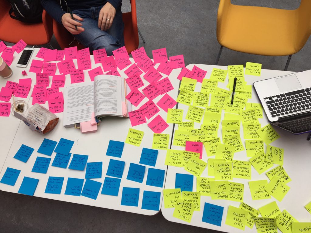
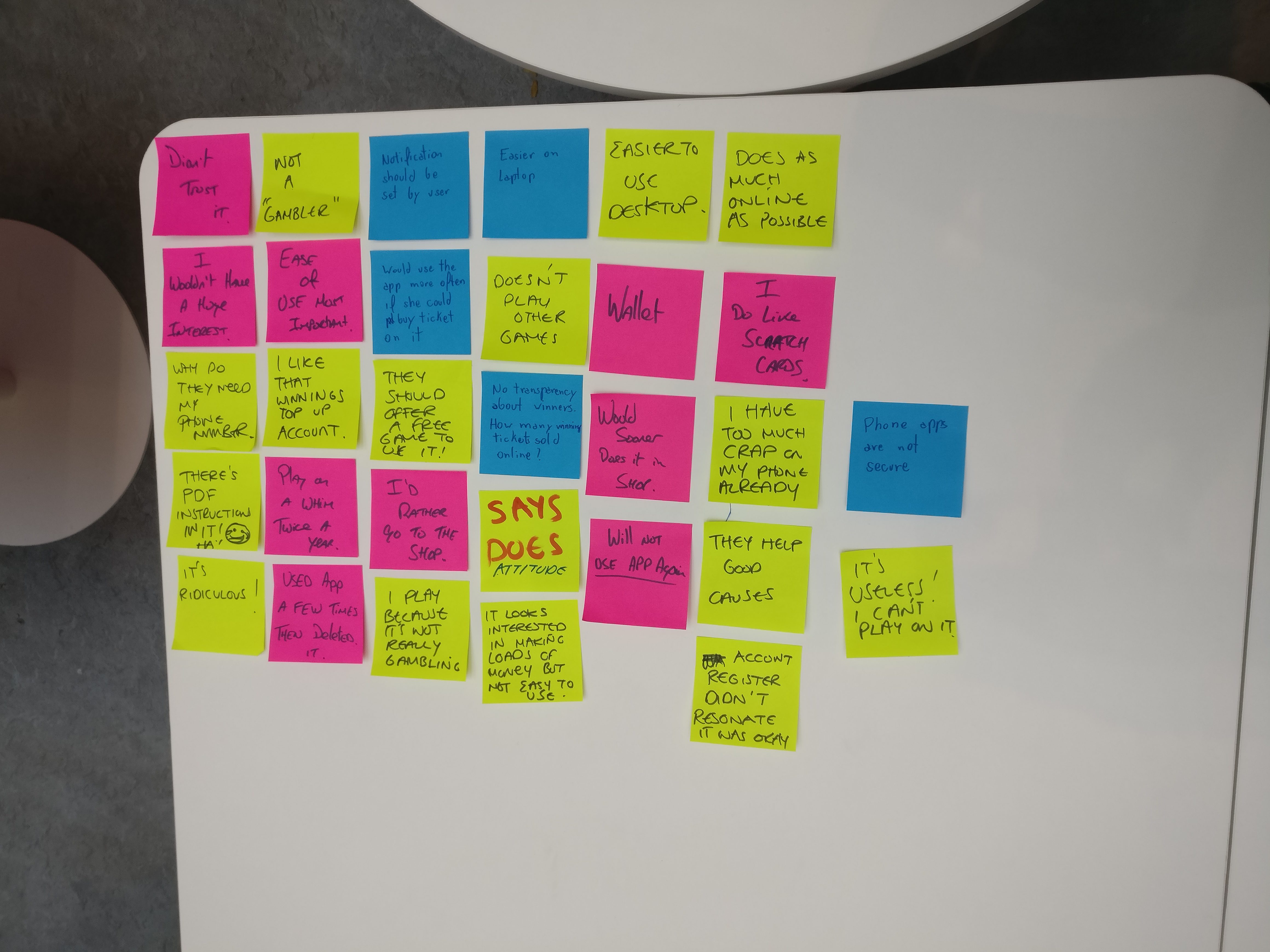
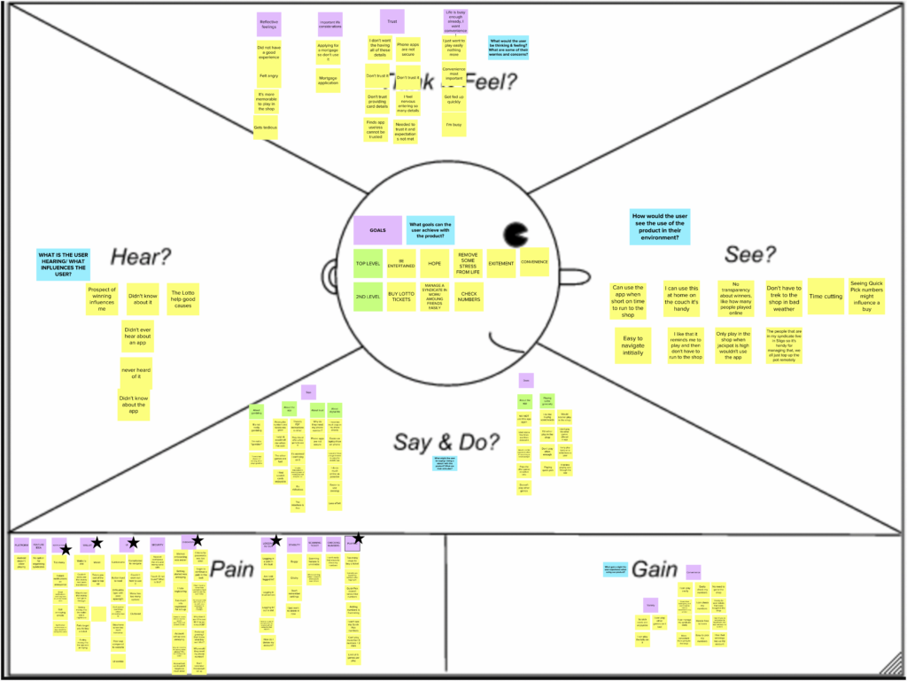
Empathy Map
We wrote notes of all relevant aspects of the interviews into post-its so we could start putting together an Empathy Map. Also, we added relevant notes found in the initial questionnaire with 85 participants and we browsed the information on Google Play Store and the Apple App Store to the notes.
When ordering into the Empathy Map we started to discover what goes where and we changed our minds a few times, until we found a blog post from Katherine Rosenkranz on the Invision Blog [1] where she explains what goes into each box.
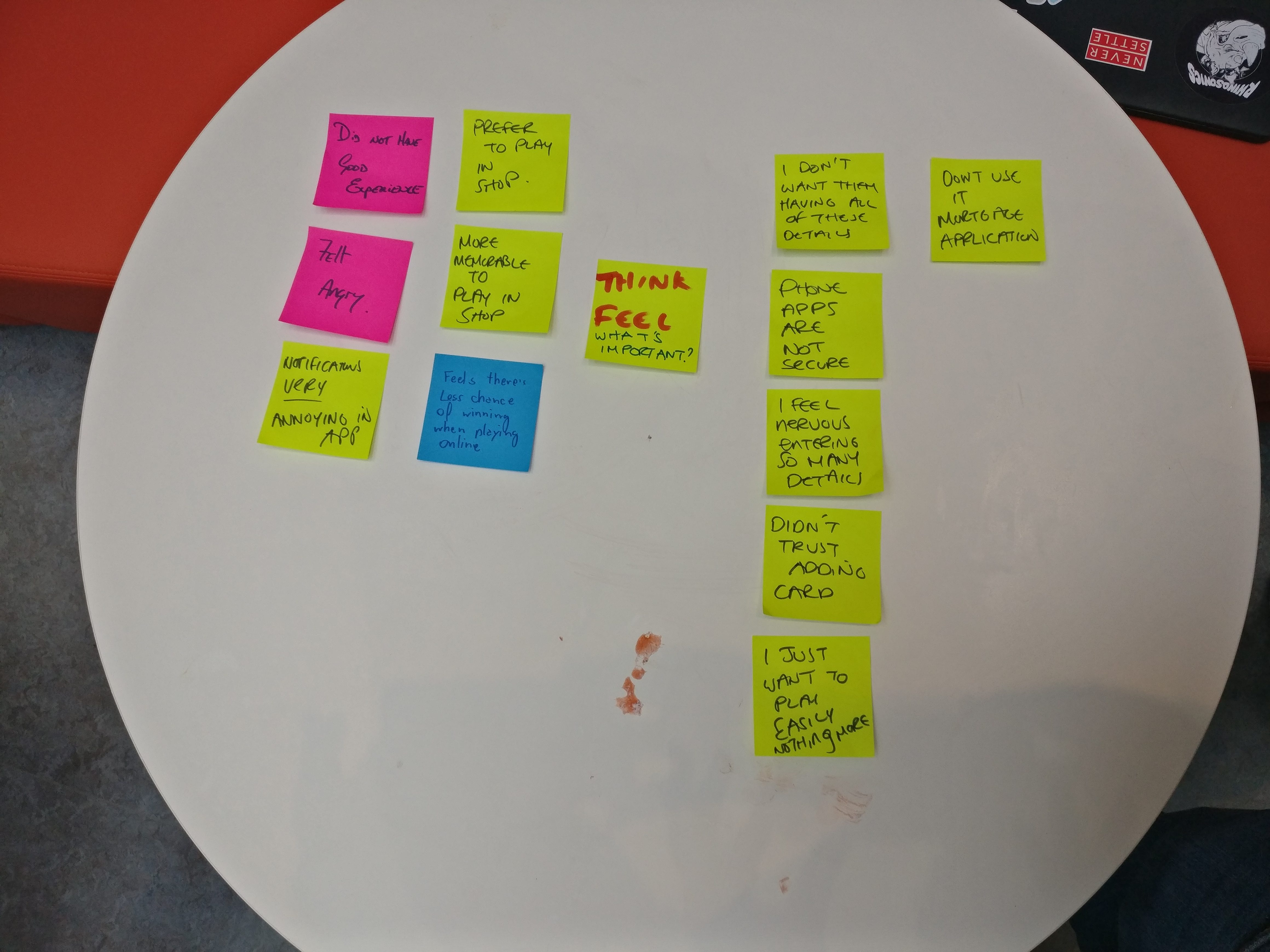
Think & Fell
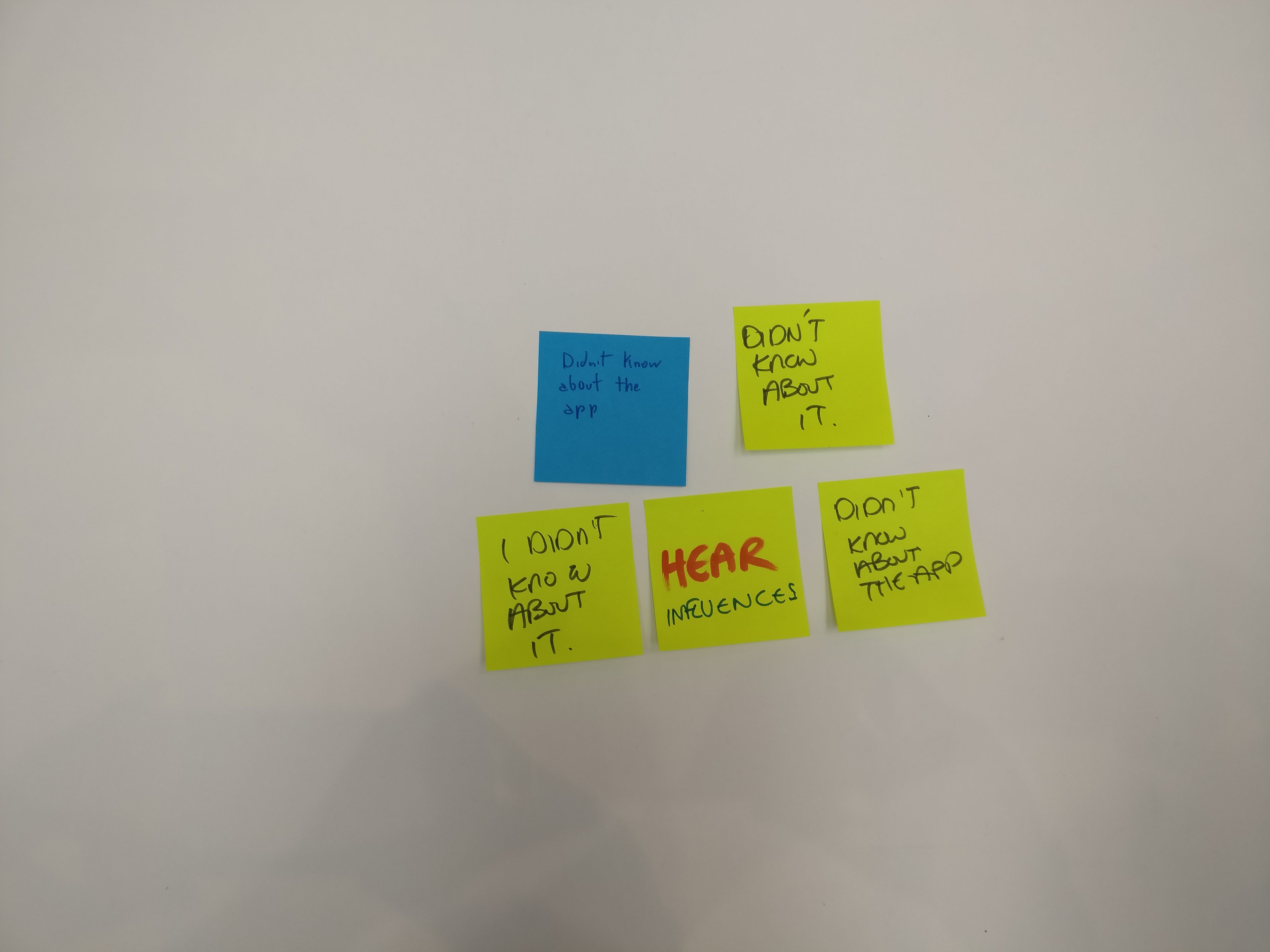
Hear
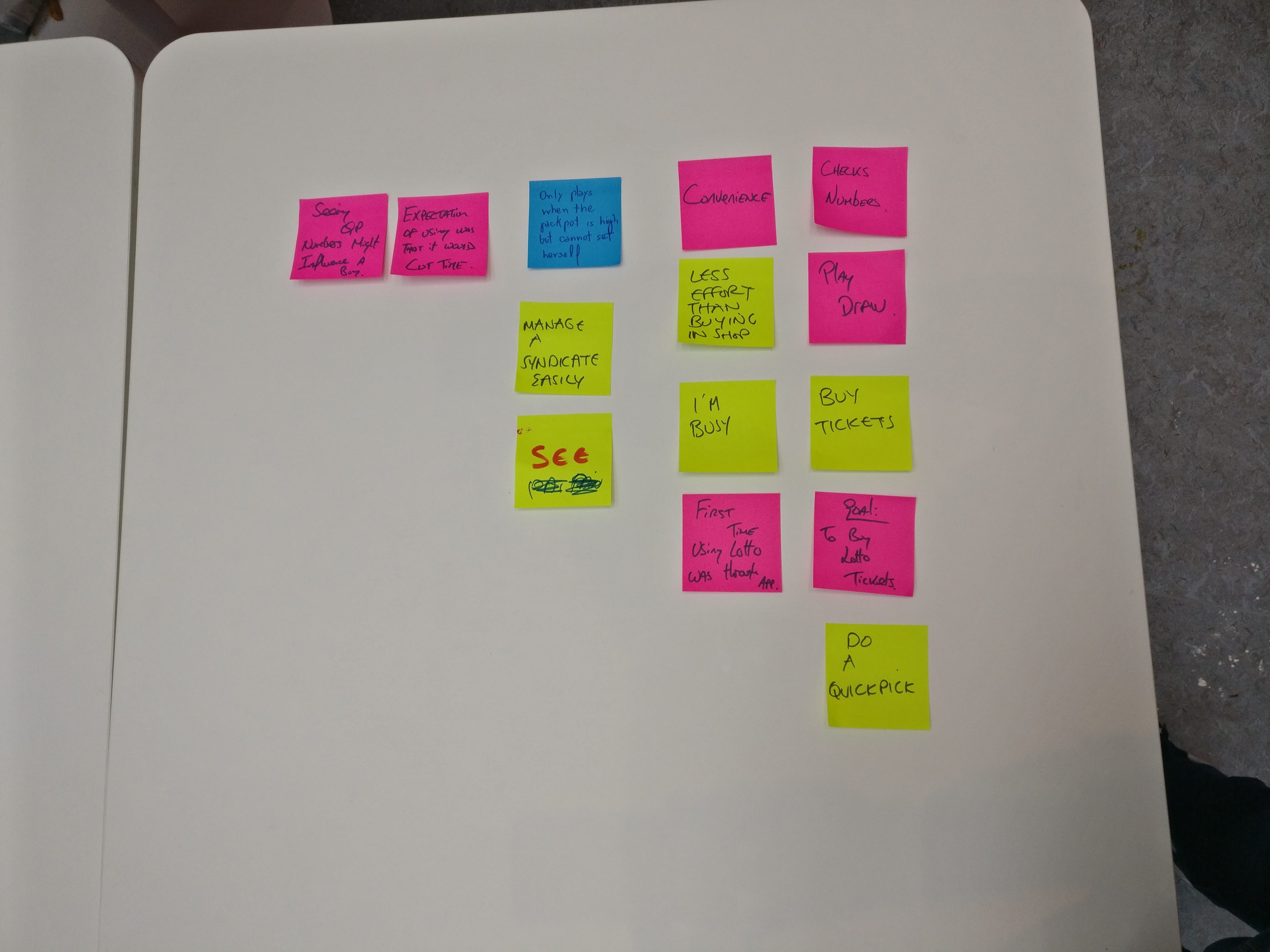
See
Say and Do
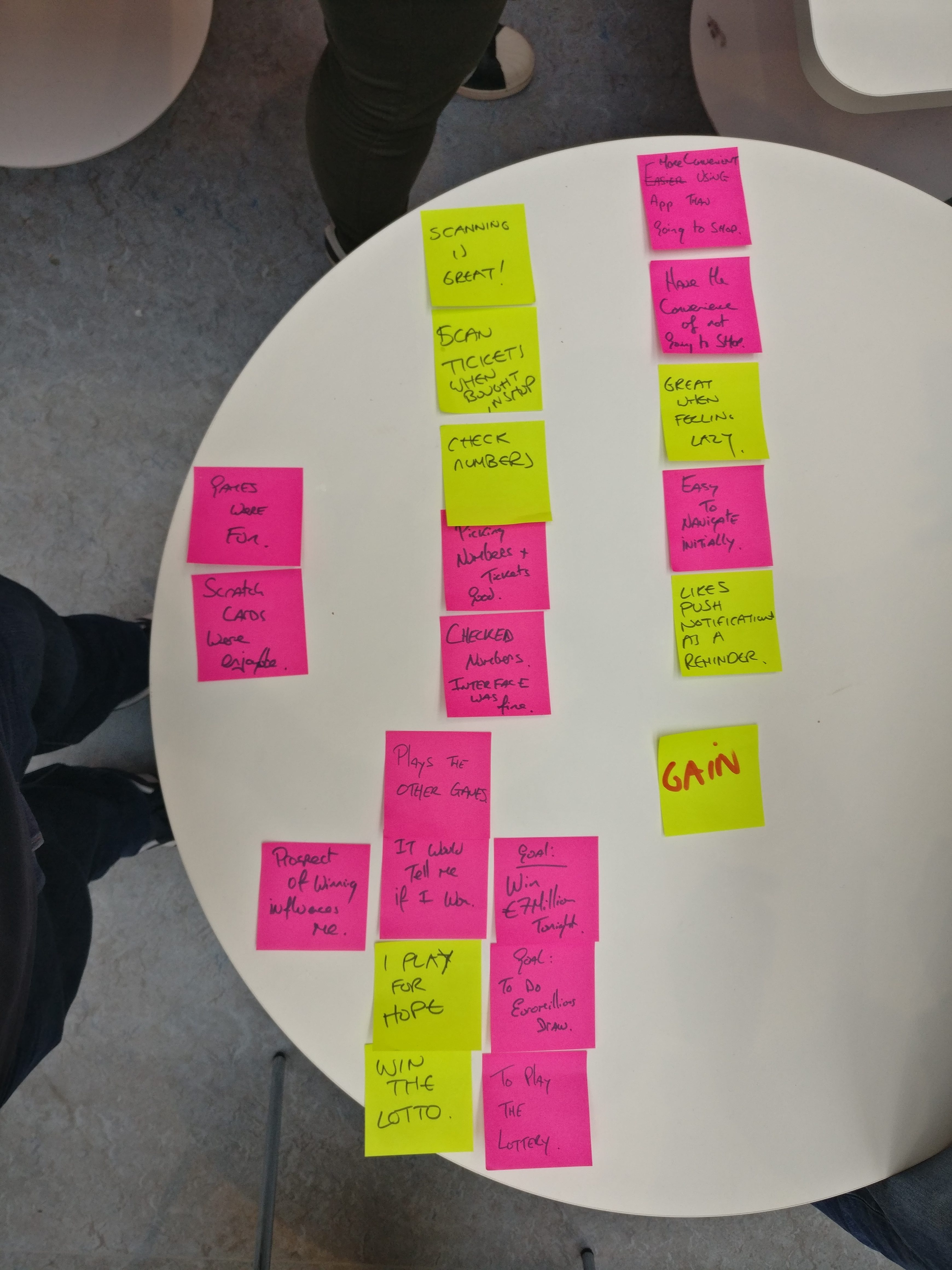
Gain
Grouping Gain
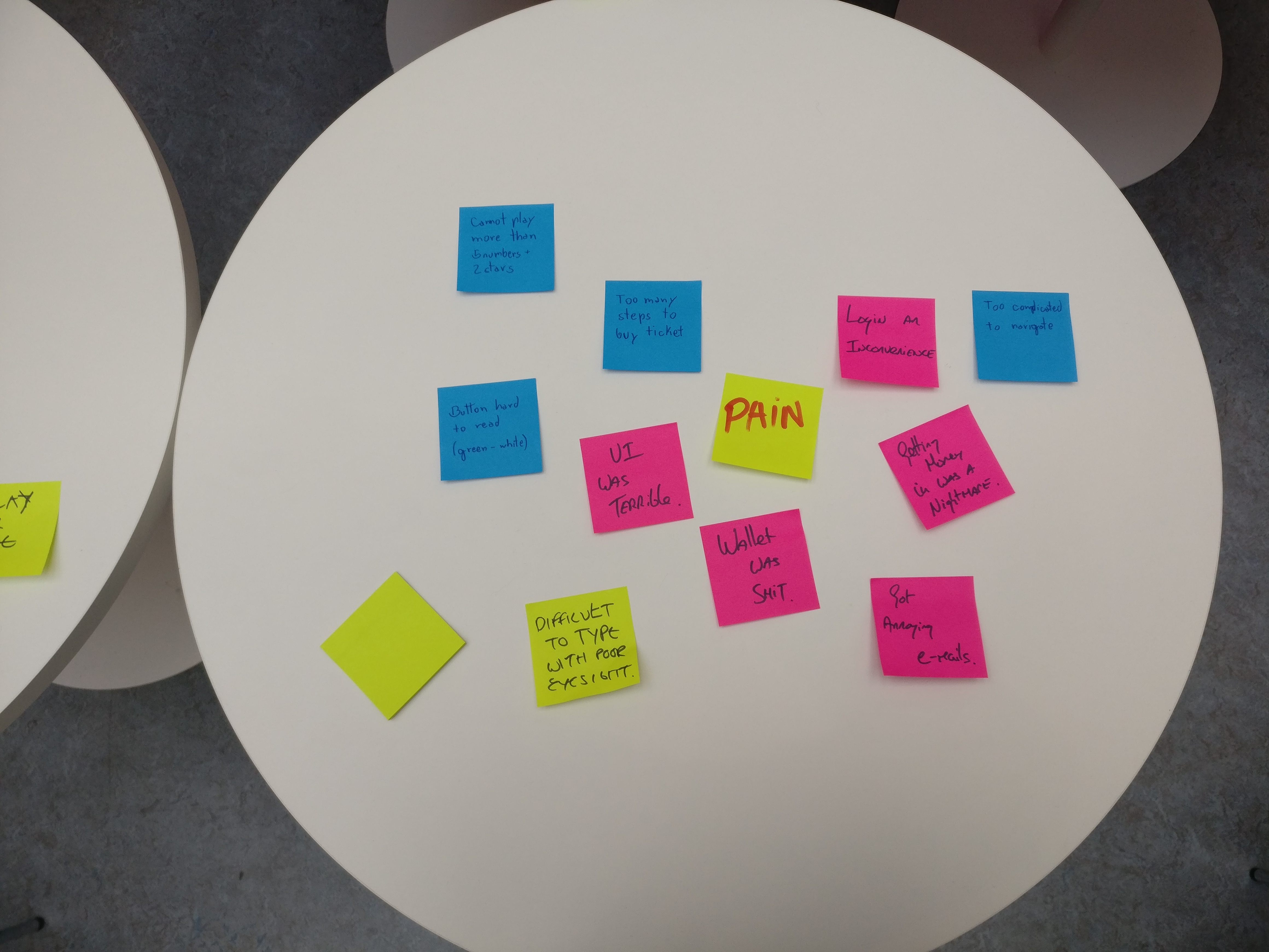
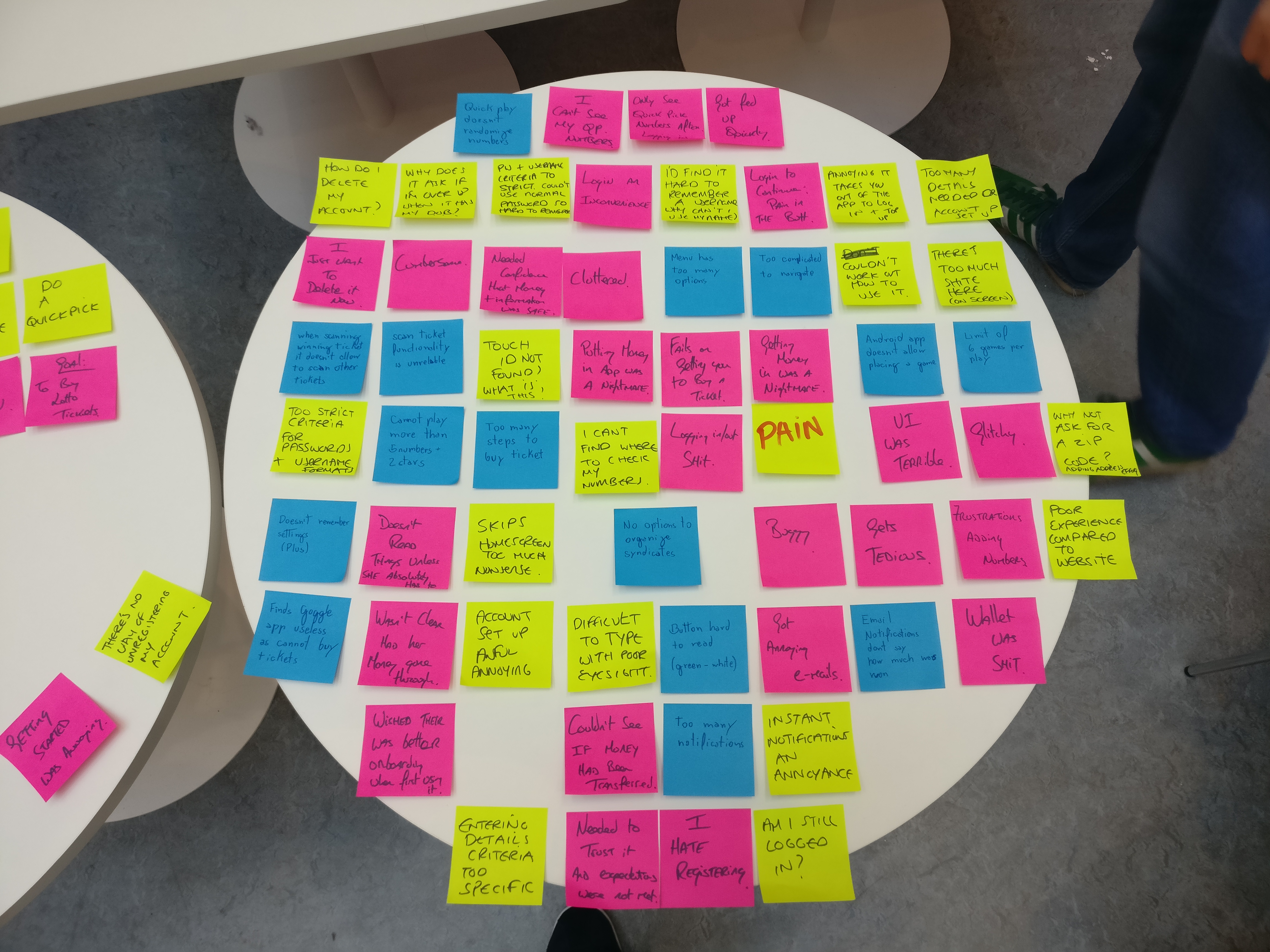
Initial Pain
Finding Pain
Final Pain
After the sorting exercise, we put all the notes in Mural.co and generate a digital version of the Empathy Map.
With the Empathy Map completed we noticed a few subjects coming up with a certain frequency in each section.
Hear
In this section some users never came across the Lotto app before and did not know of its existence, to fix this requires a marketing effort that is out of scope for this exercise.
Think & Feel
Trust was a big issue coming here in this section, some of the users did not feel they can trust phone apps or adding card details. Another pattern here is the convenience, some users felt frustrated using the Lotto app and that consequently led to users not having a good experience. These are issues that we could tackle.
See
Users felt that it could be handy to be able to play the Lotto within the app without the need to travel to the shop, specially under bad weather and in remote areas of the country.
Say & Do
Users that play the Lotto do not feel they are gambling and perceive that there is less chance of winning when playing online. The majority of the users find the experience on a desktop more agreeable than on the phone.
Pain
When defining what we called the pain points, the pattern became clear, while the goal of the app is allowing people to play on the go, there were issues in all steps involved: on-boarding, wallet (adding credits), there were issues with font sizes being too small, login and playing. All these are marked with a star in the Empathy Map.
Gain
Users feel that what they can really gain from the Lotto app is the convenience, they want to play wherever they are without having to go to the shop, they can manage syndicates online and they will be notified about the ticket purchased in the Lotto app if they won a prize or not.
[1] Rosenkranz, K. (2017, August 8). EMPATHY MAPS: THE BUSINESS OF PUTTING USERS FIRST. Retrieved from https://www.invisionapp.com/blog/empathy-maps-ux/

 After a quick discussion, we have chosen to redesign the Lotto app. We all shared a few pain points using the Lotto app and as we thought that the majority of people played the Lotto or had contact with the app at some stage, this would make it easier to gather information.
 From the previous chapter it became clear that there are many issues with the Lotto app, the lack of awareness of its existence is one, being afraid that playing Lotto somehow could affect the mortgage application was another. These issues are educational and marketing efforts that are out of the scope of this exercise. We wanted people that use the app but are not completely satisfied with it or have used the Lotto app at some stage and for some reason gave up on it. These two user descriptions are our proto-persona.