Crazy Eights
For the initial drawings it was suggested we could run a Crazy Eights Exercise[1] where each of us would select one of the task and design where we folded an A3 into quarters and used each area for one screen (8 screens in total), this has to be done in a total time of 8 minutes. After finishing this up we would vote for the favourite ideas.
The idea is to generate as many ideas as possible within a short timeframe, focusing on quantity of ideas and not quality, and then once you’ve got a bunch of divergent thinking on one topic, to begin converging on some winning ideas by voting on the favourites.
For the first Crazy Eights, we focused on the Onboarding process of the Lotto App.
And for the second Crazy Eights, we focused on the Playing Draw process of the Lotto App.
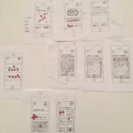
The Crazy 8s of my fellow researchers can be seen here.
Brainstorming
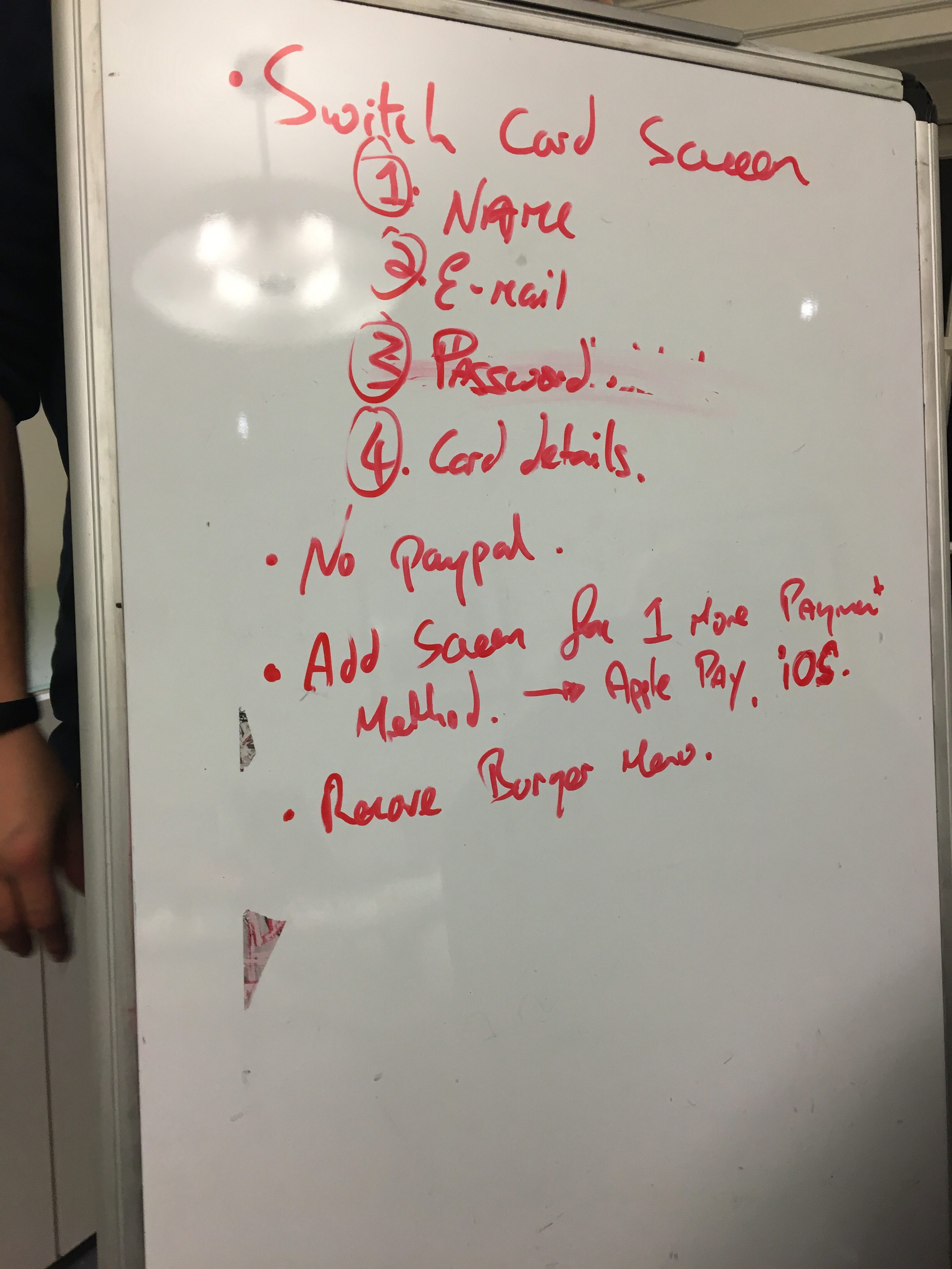
After discussing our favourite ideas in the Crazy Eigths we started to organize how the first prototype would look like, we sketched a few ideas in the whiteboard for 3 tasks:
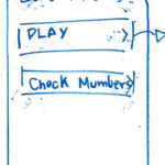
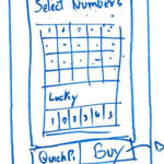
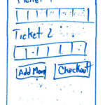
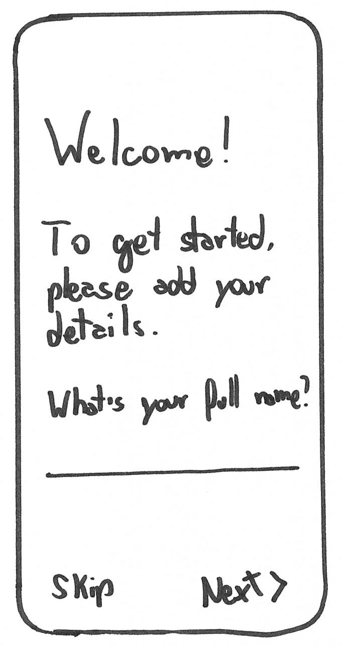
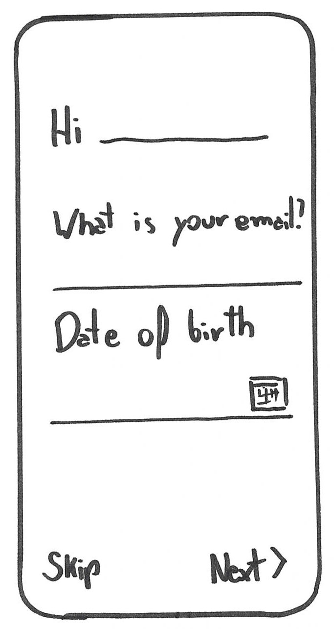
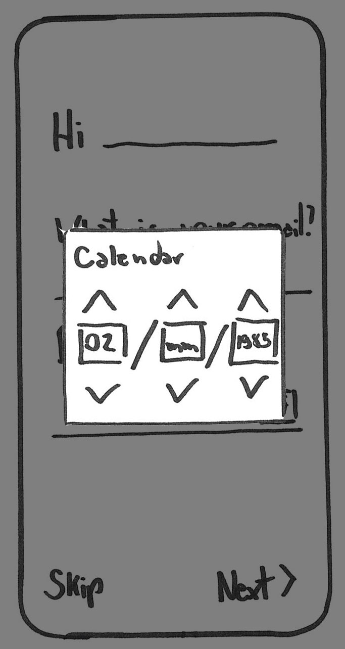
- Onboarding process (sign up for the Lotto app)
- Playing a draw
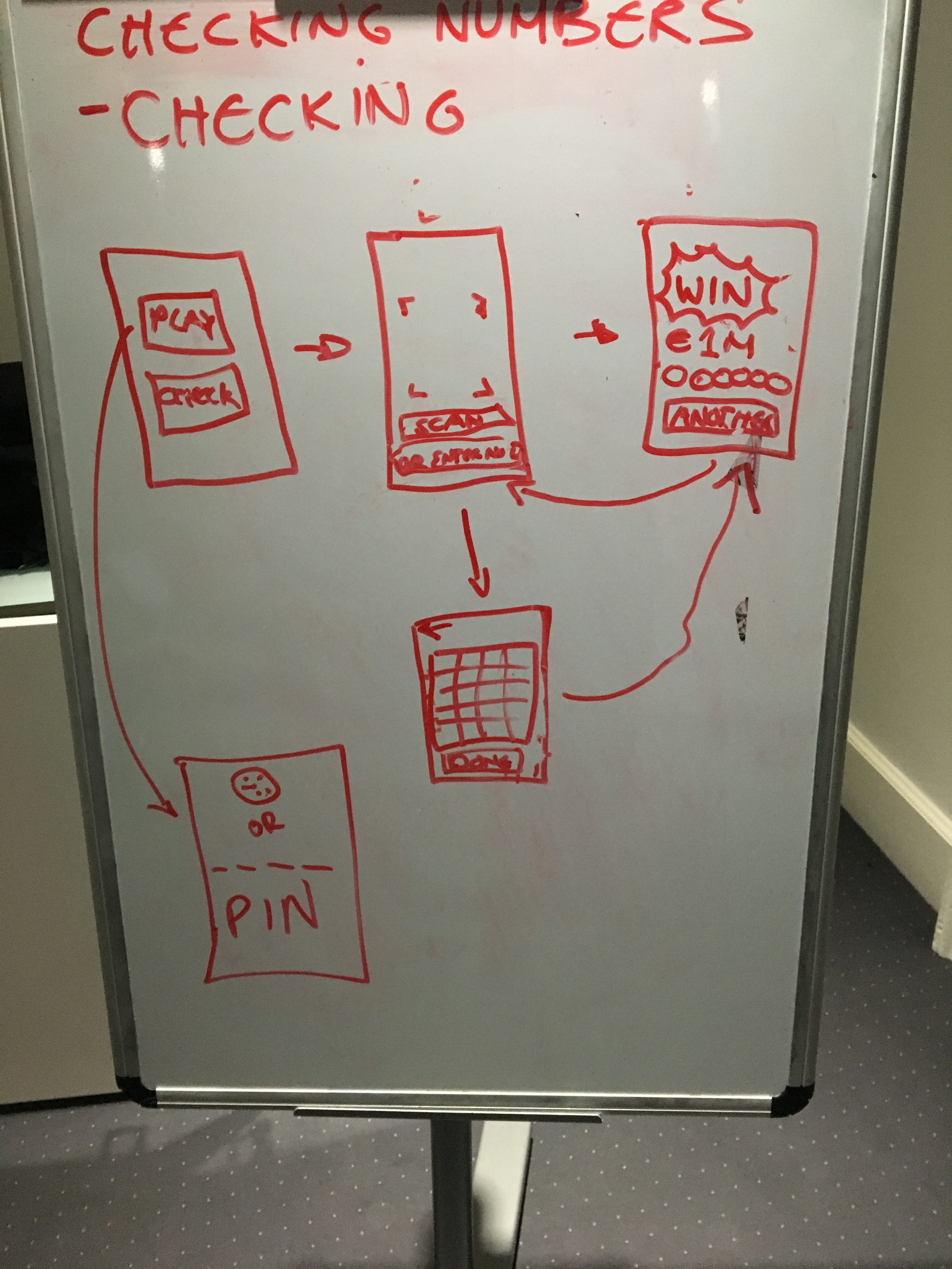
- Checking numbers
- Checking a physical ticket
- Checking ticket bought via app
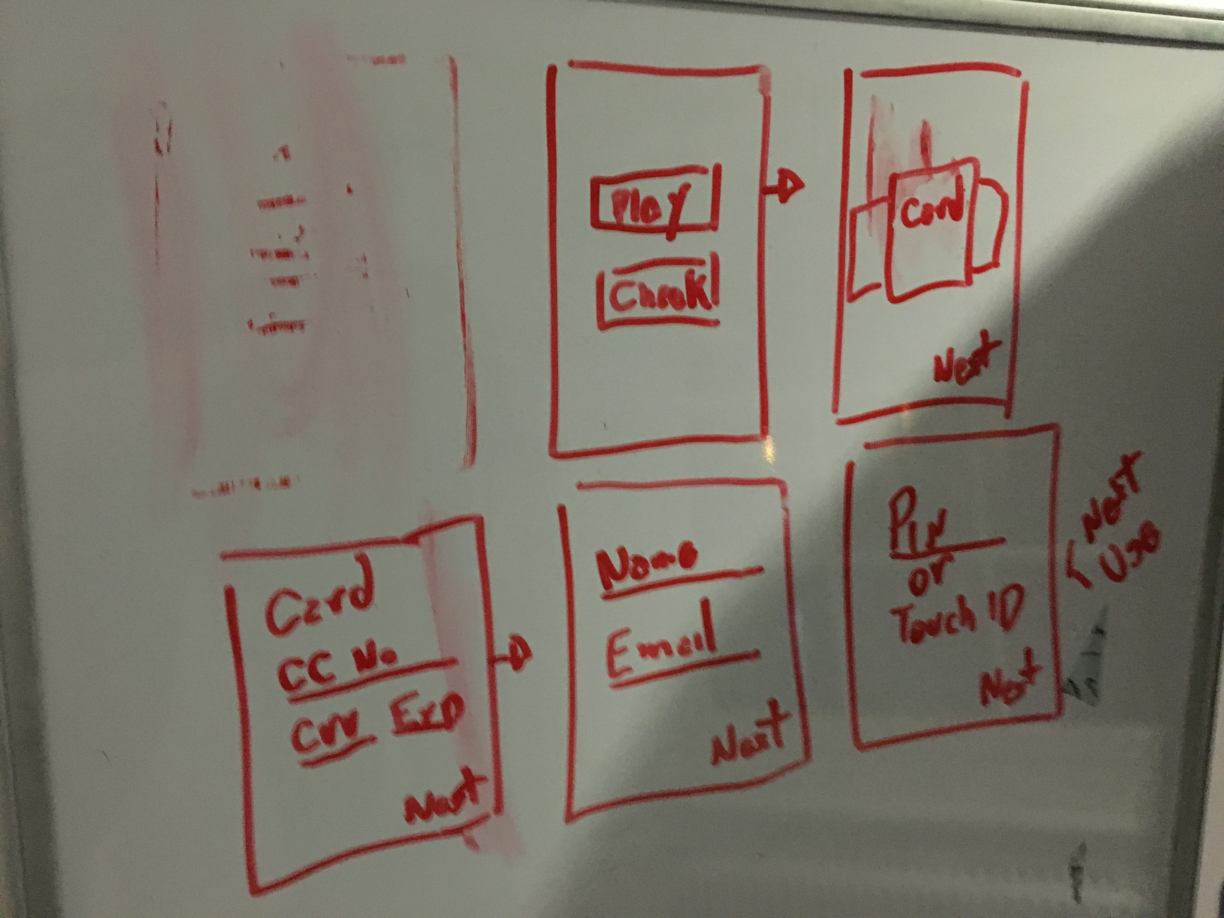
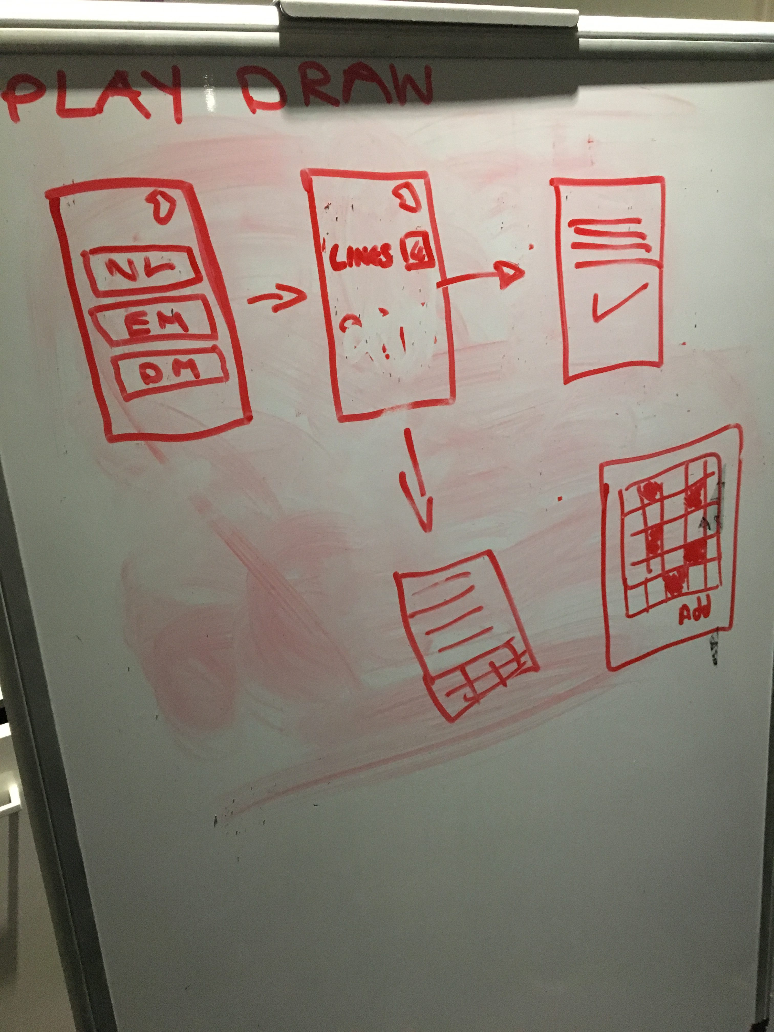
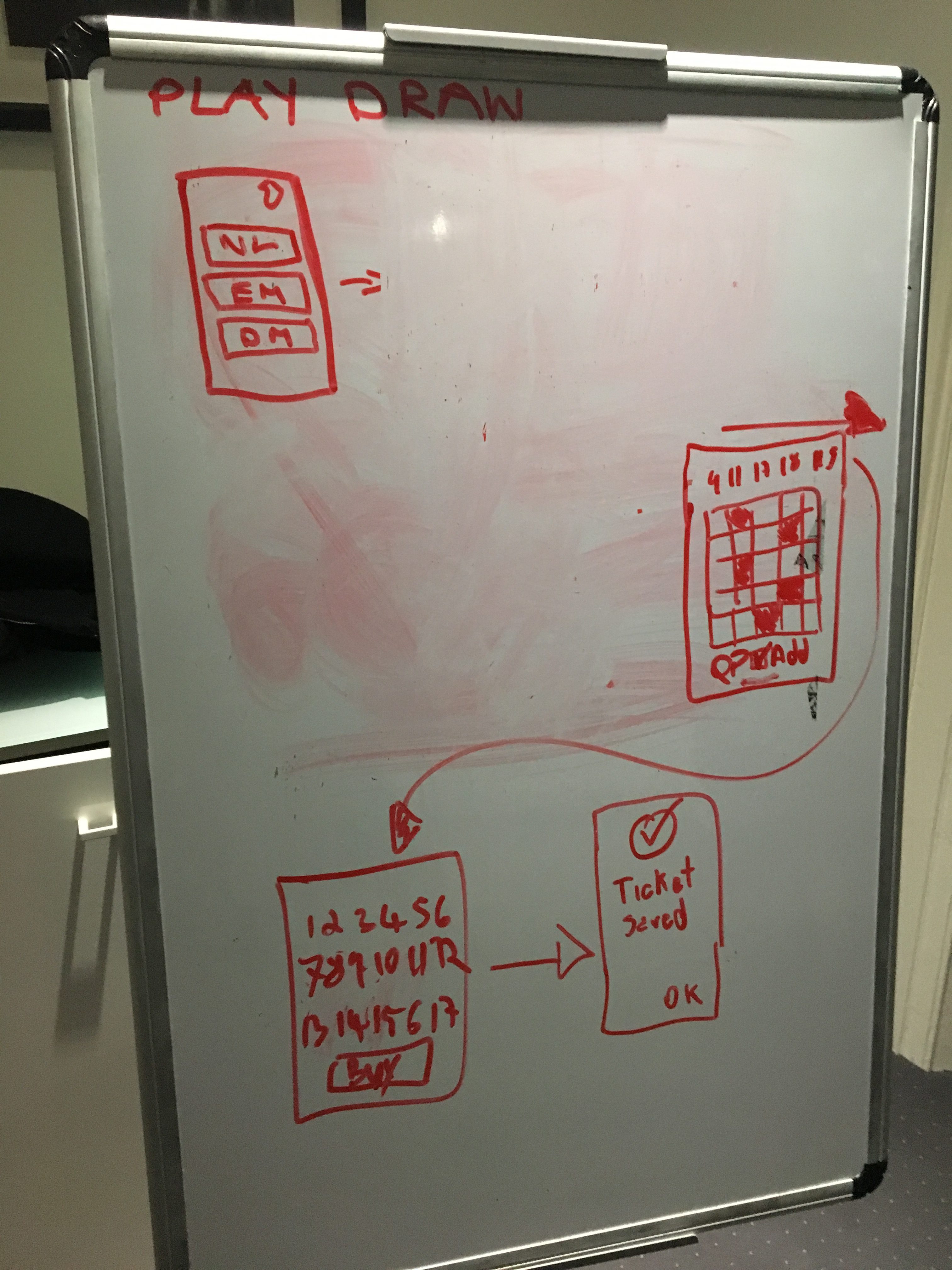
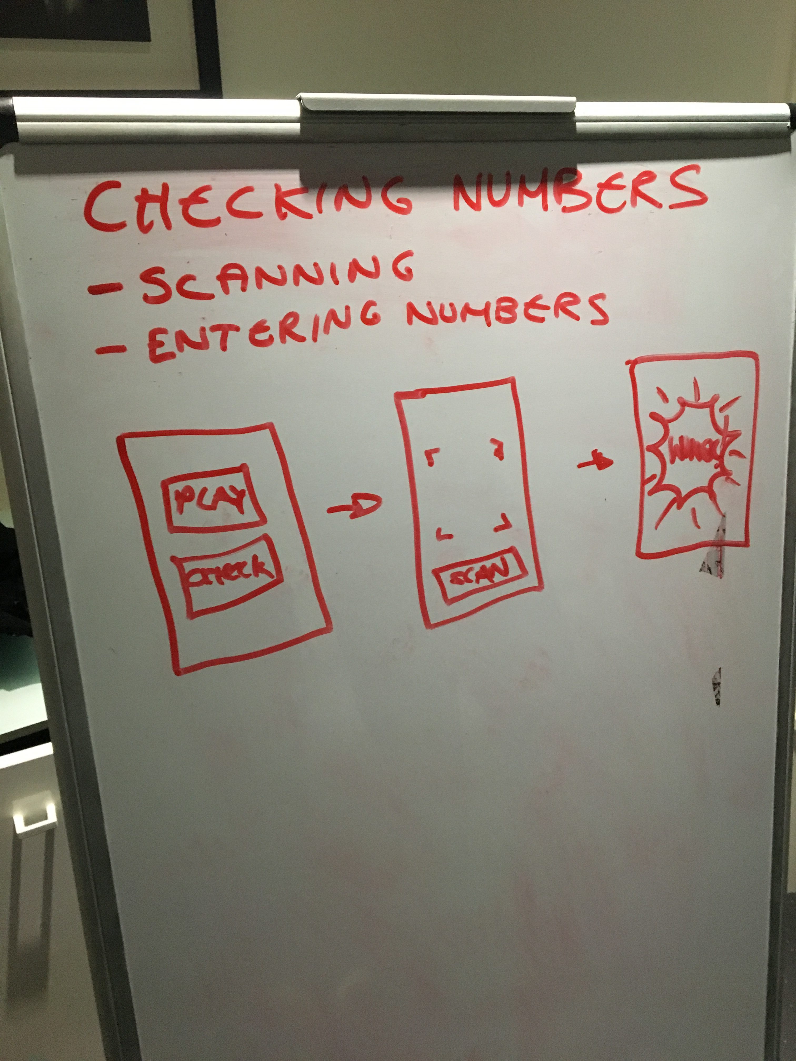
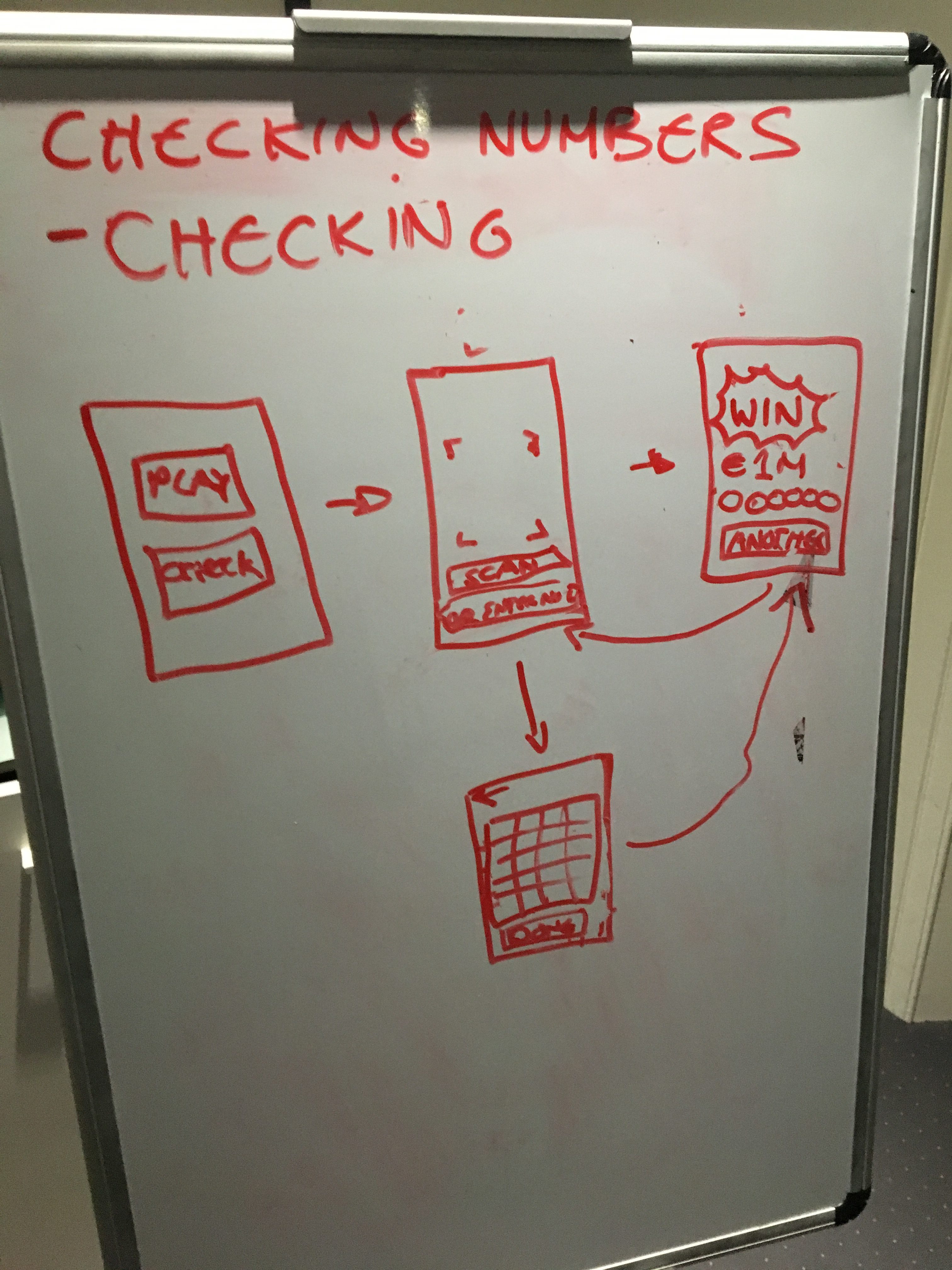
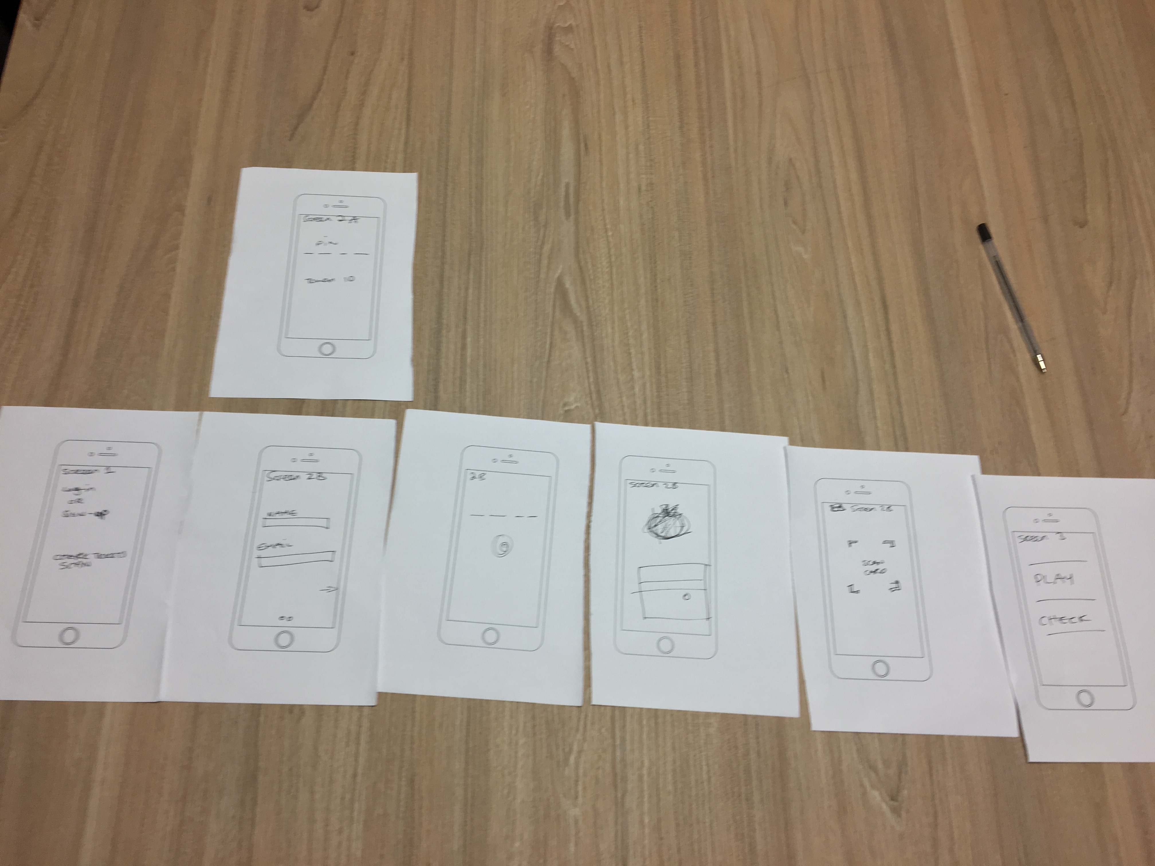
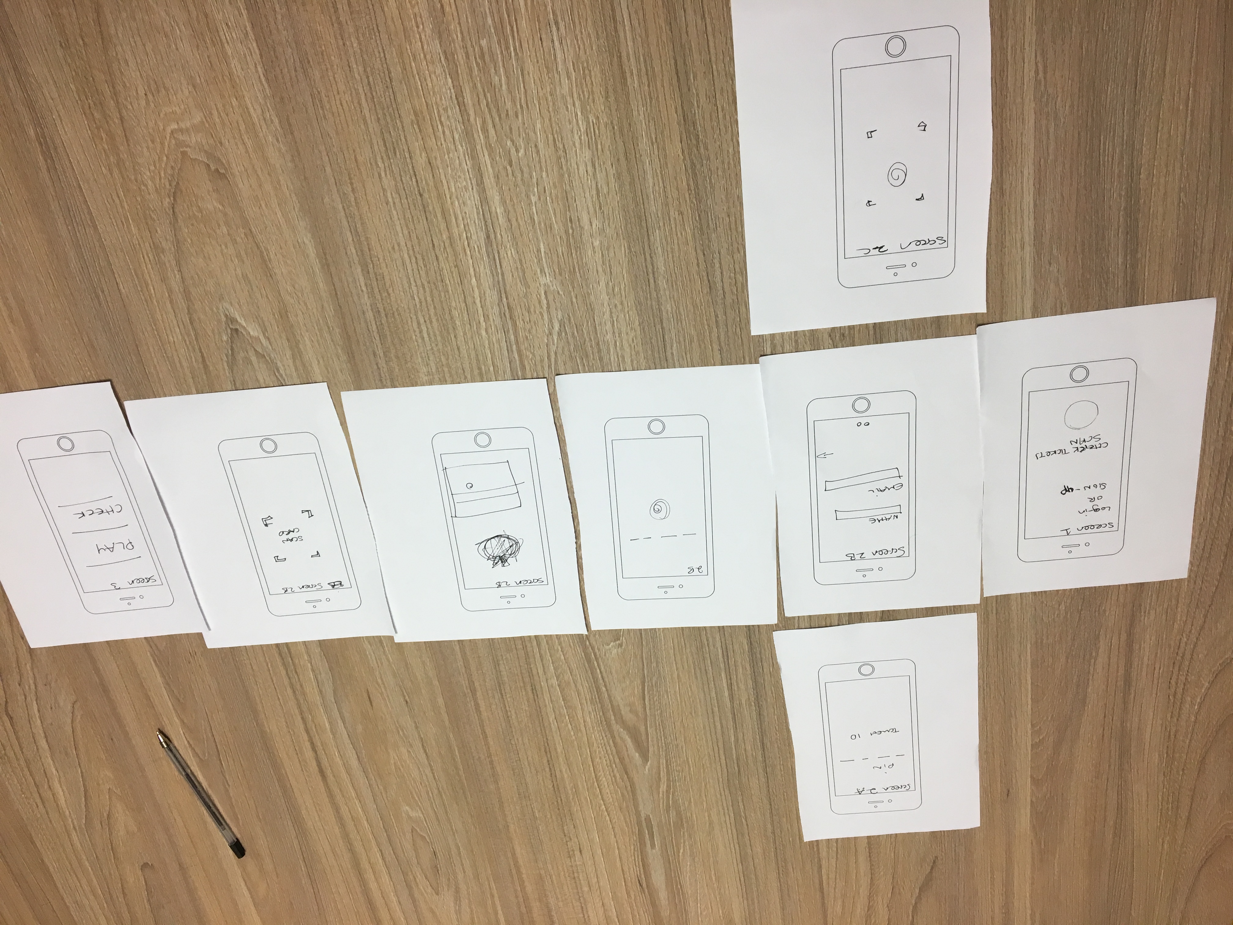
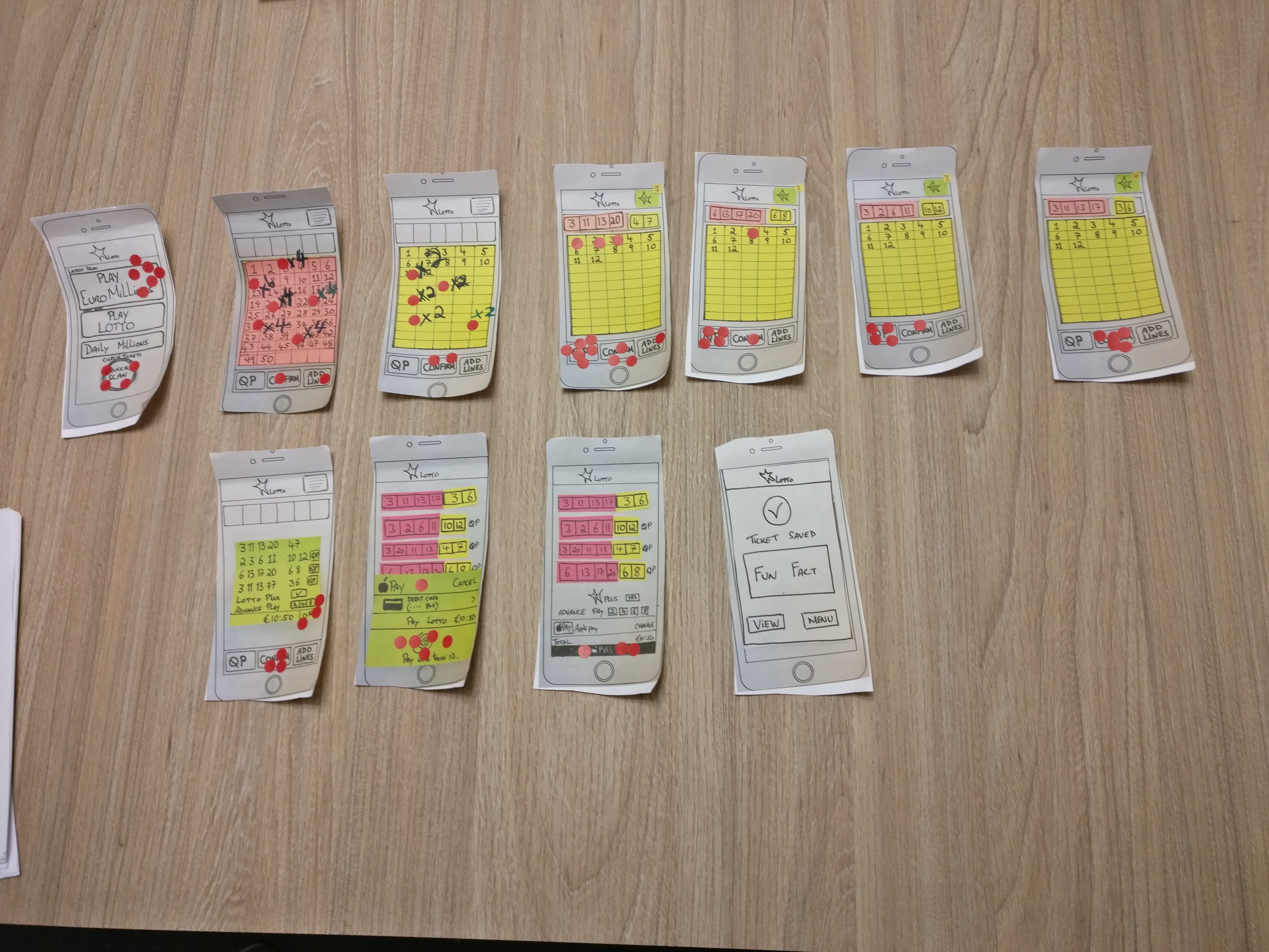
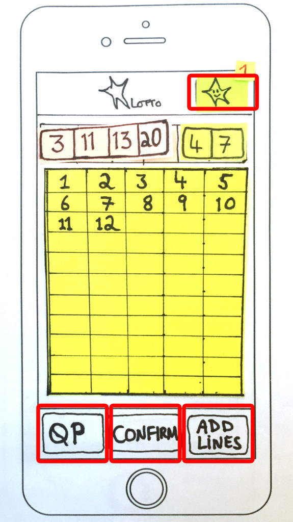
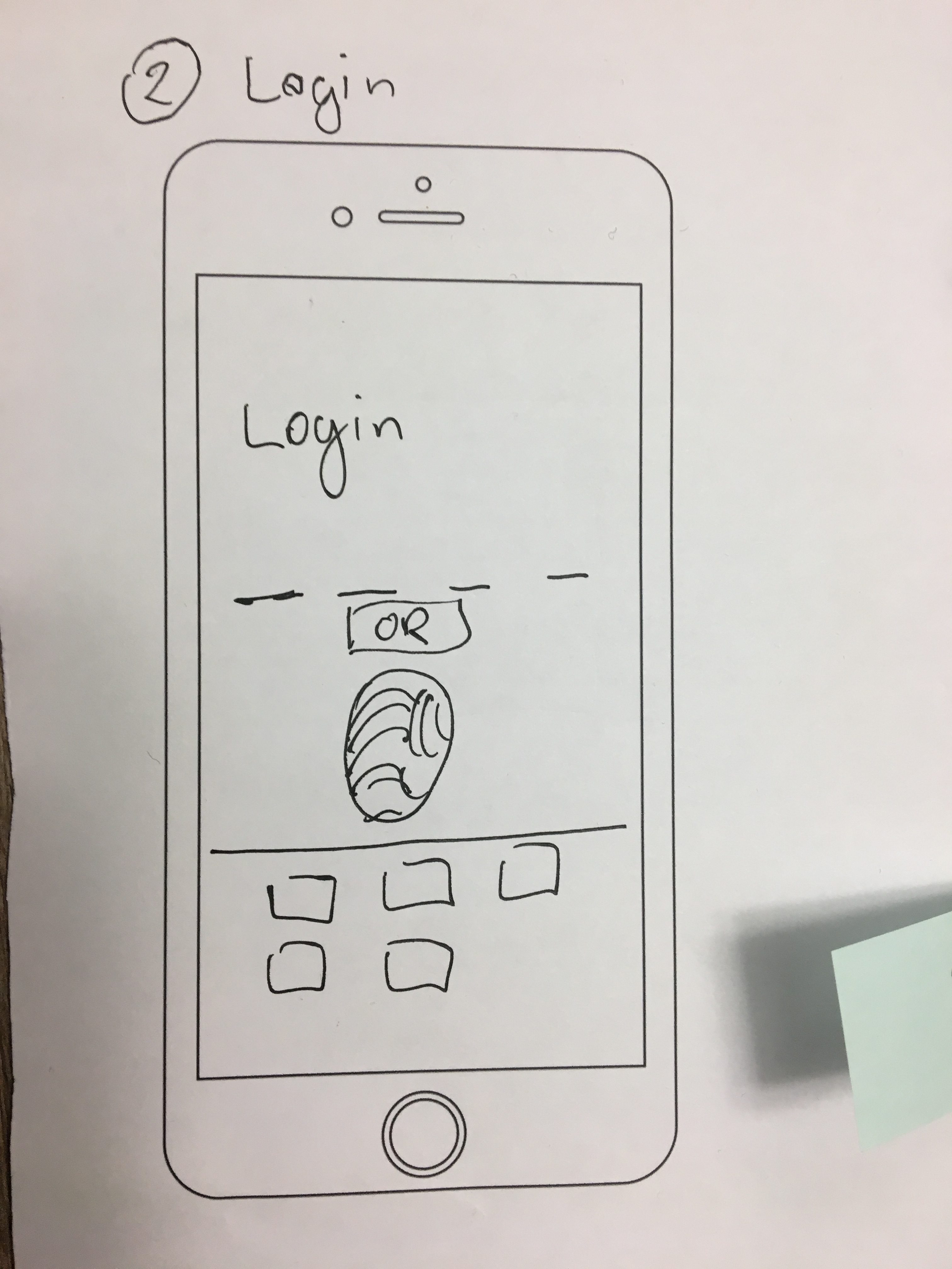
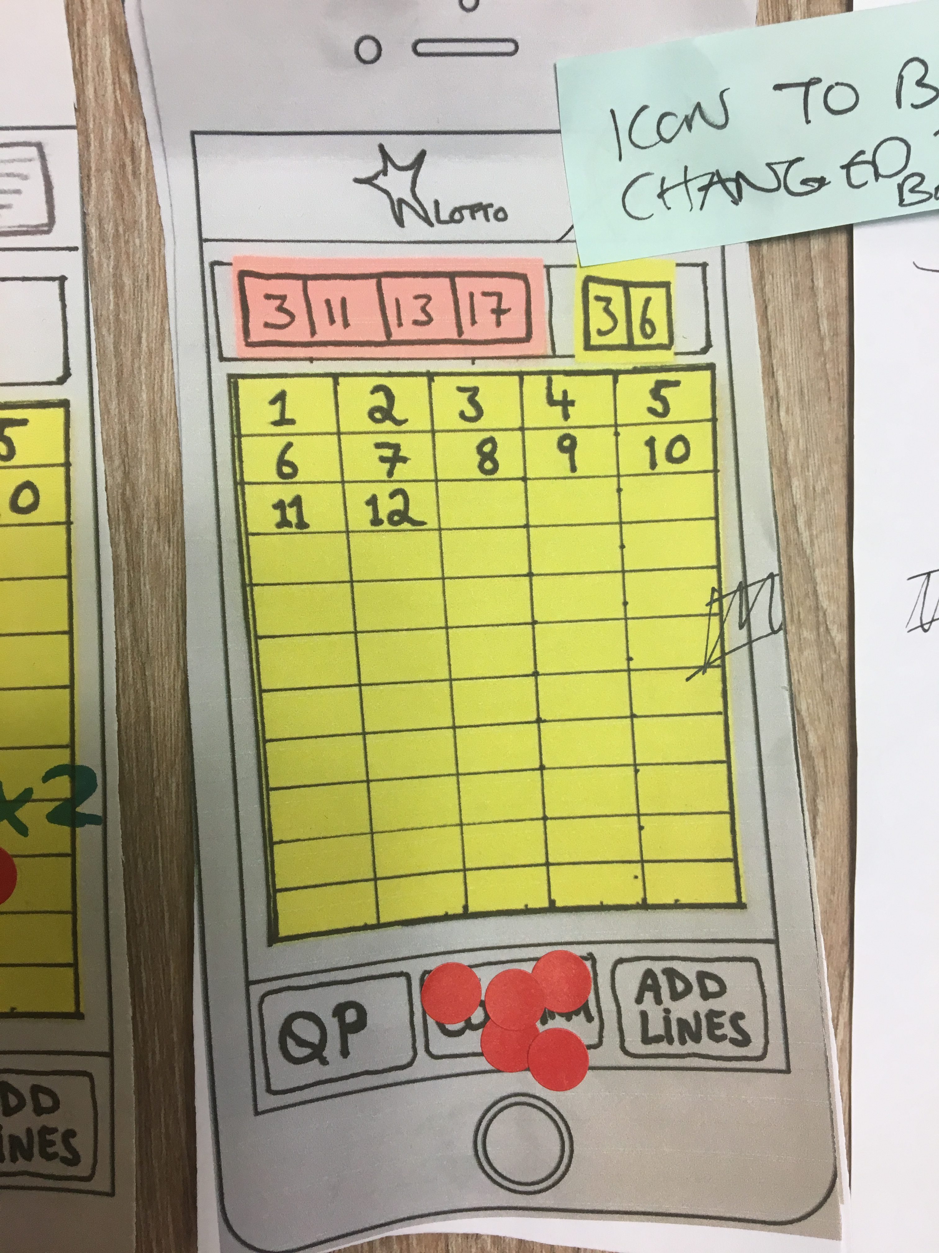
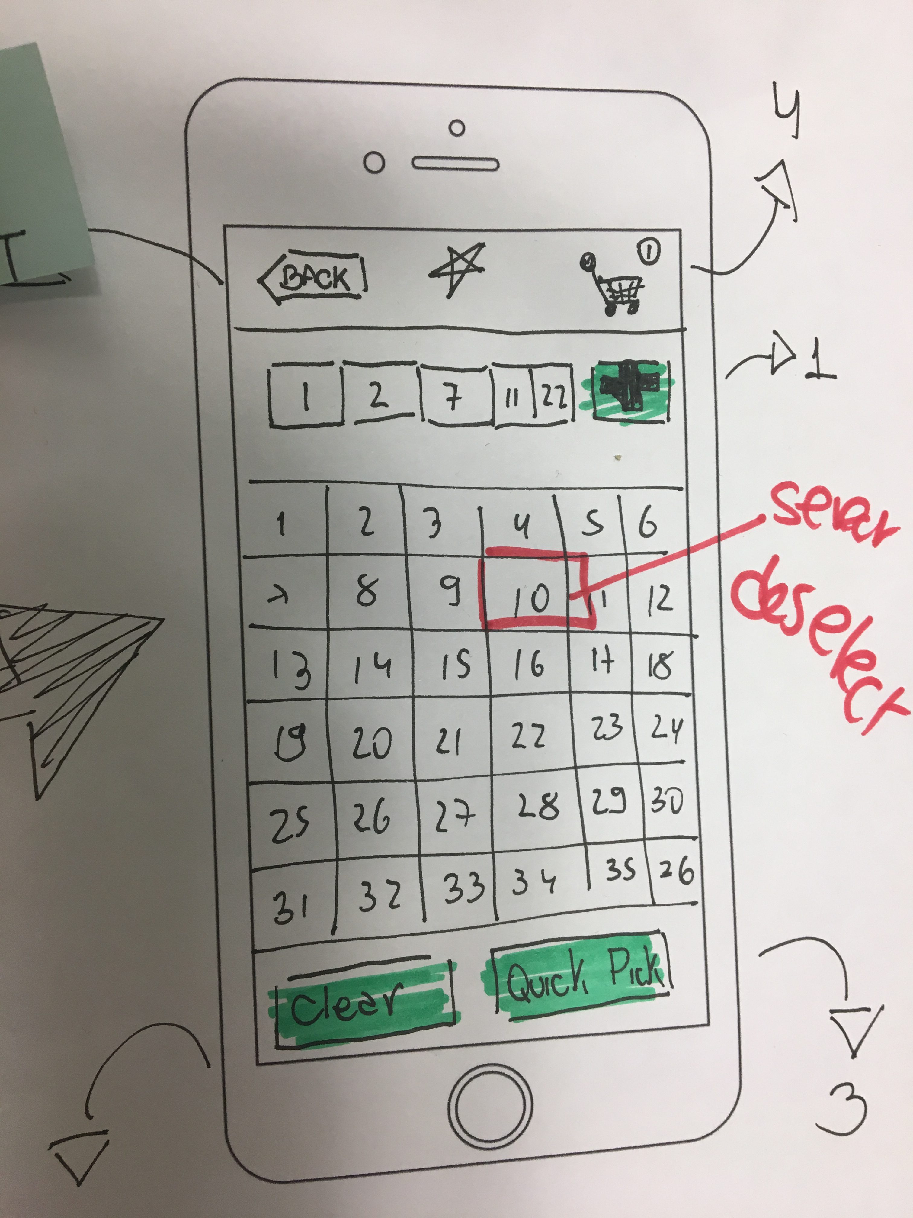
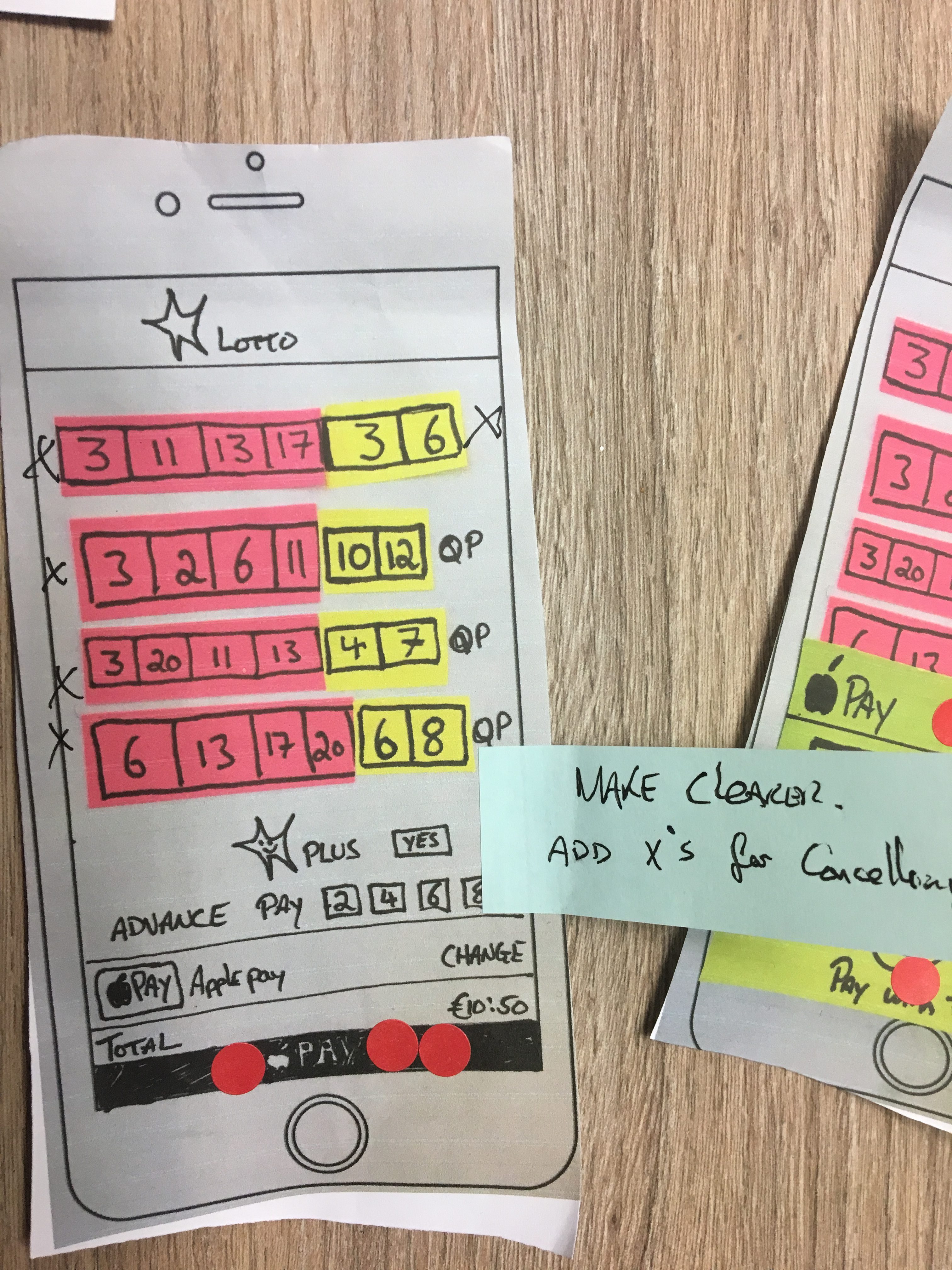
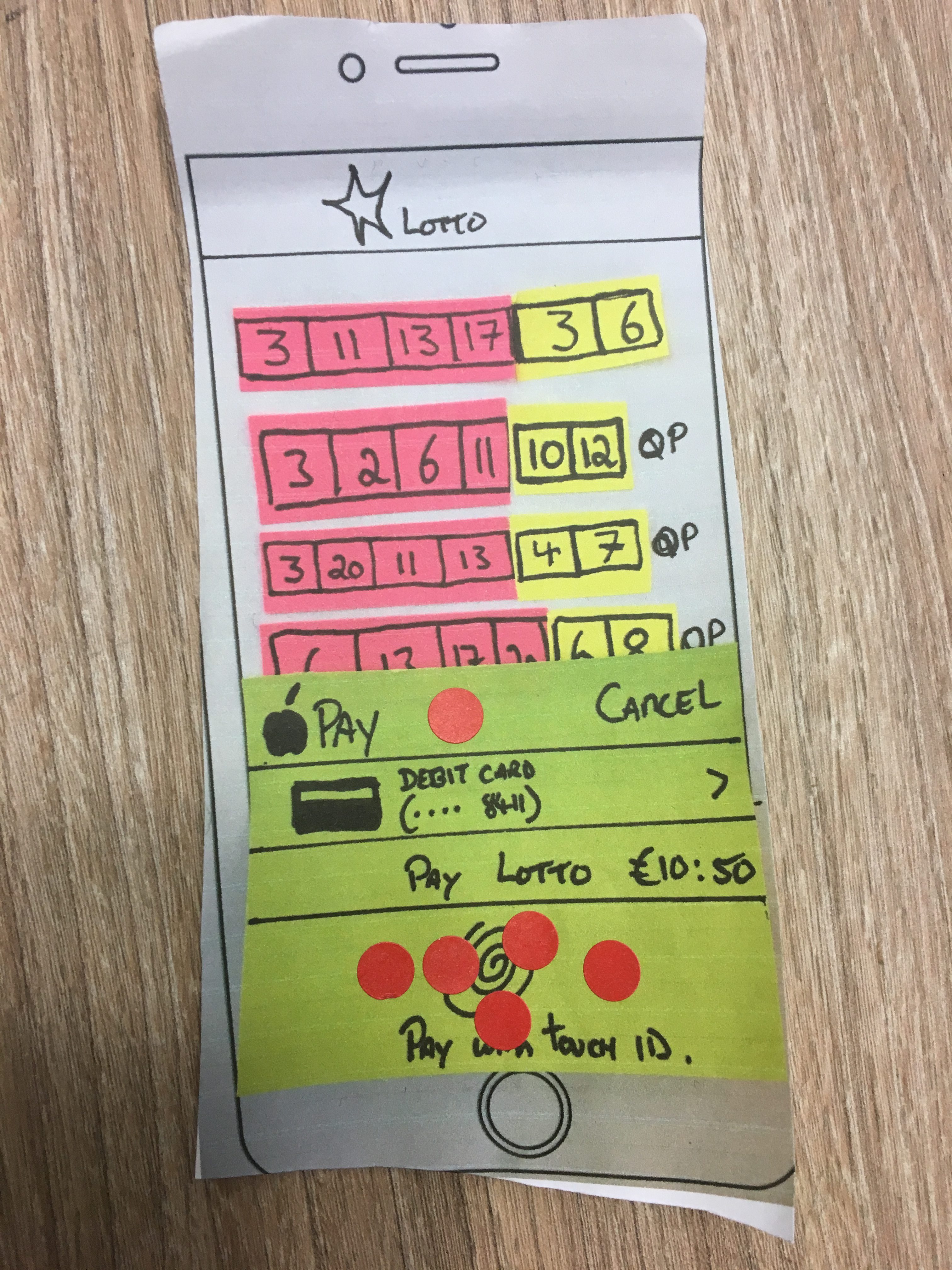
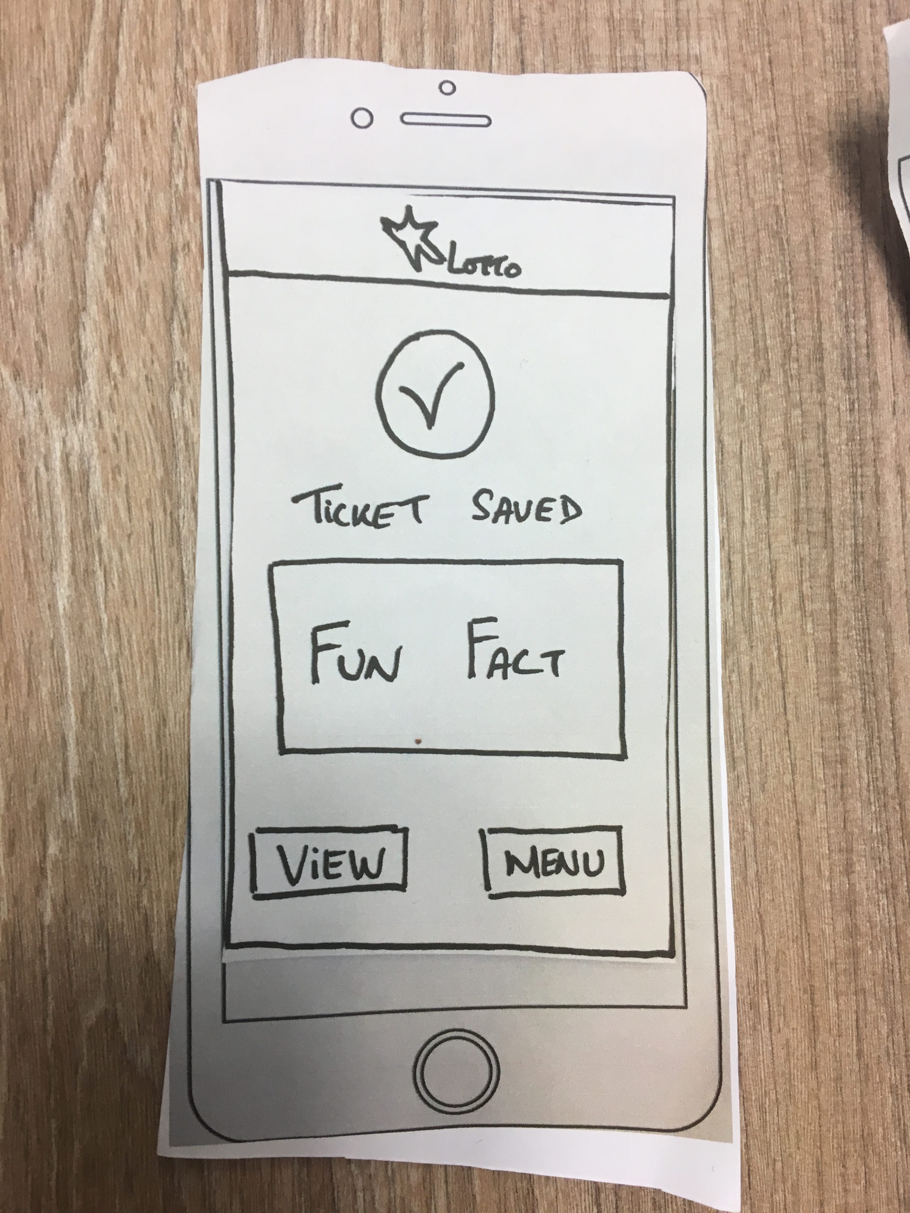
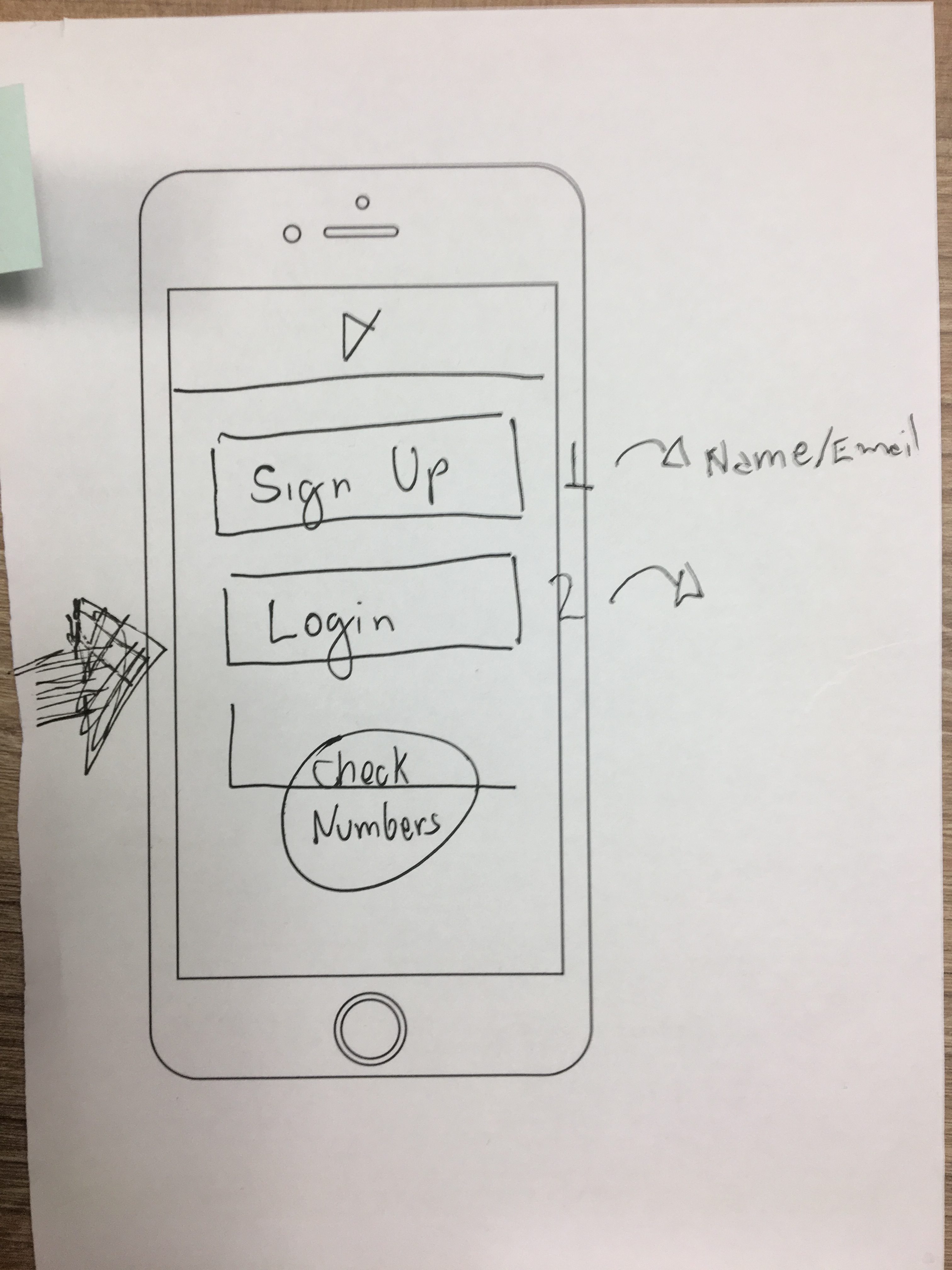
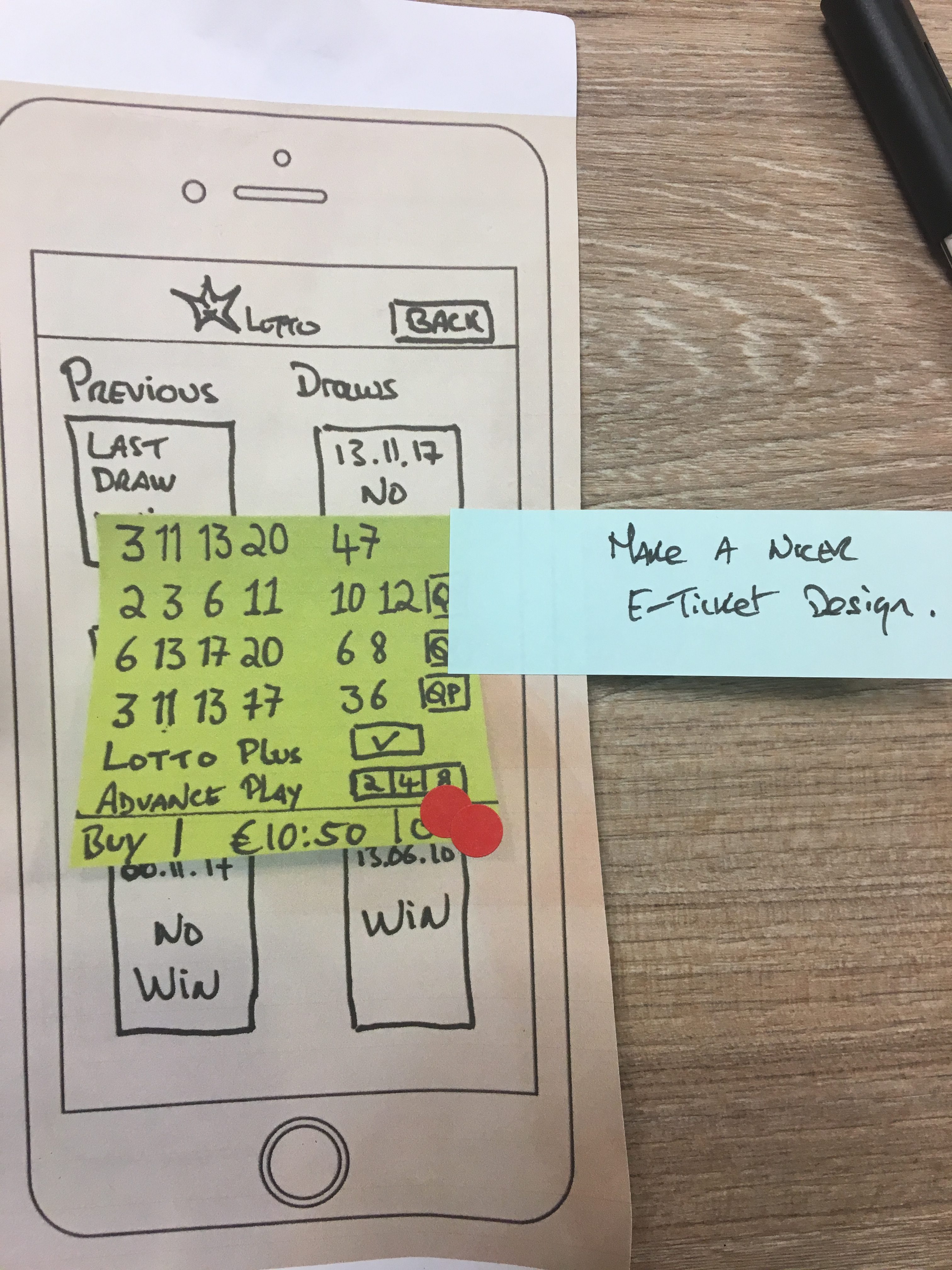
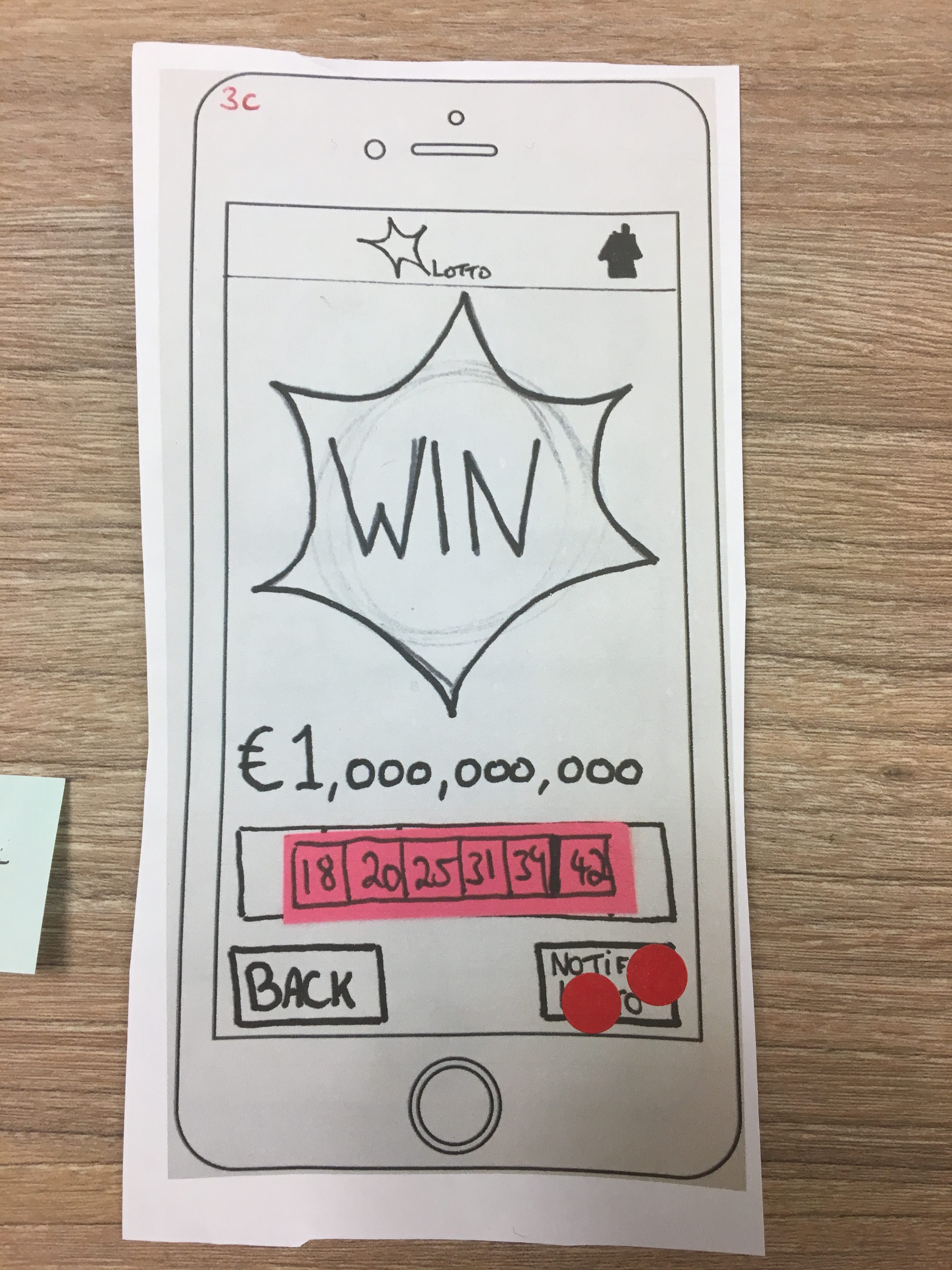
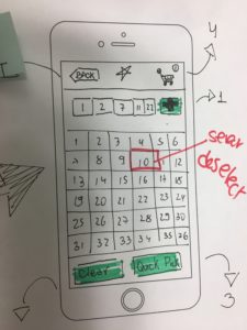
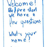
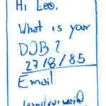
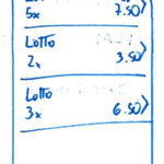
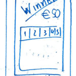
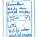
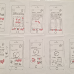
We took the approach of looking into the personas, their frustrations and goals, and asked if we were solving each of the issues that came up during the user interviews. Each of us designed the screens based on the brainstorming session and designed the screens for each of the tasks. Below are my paper prototypes resulting from the brainstorm:
My fellow researcher’ screens can be found here.
First Prototype
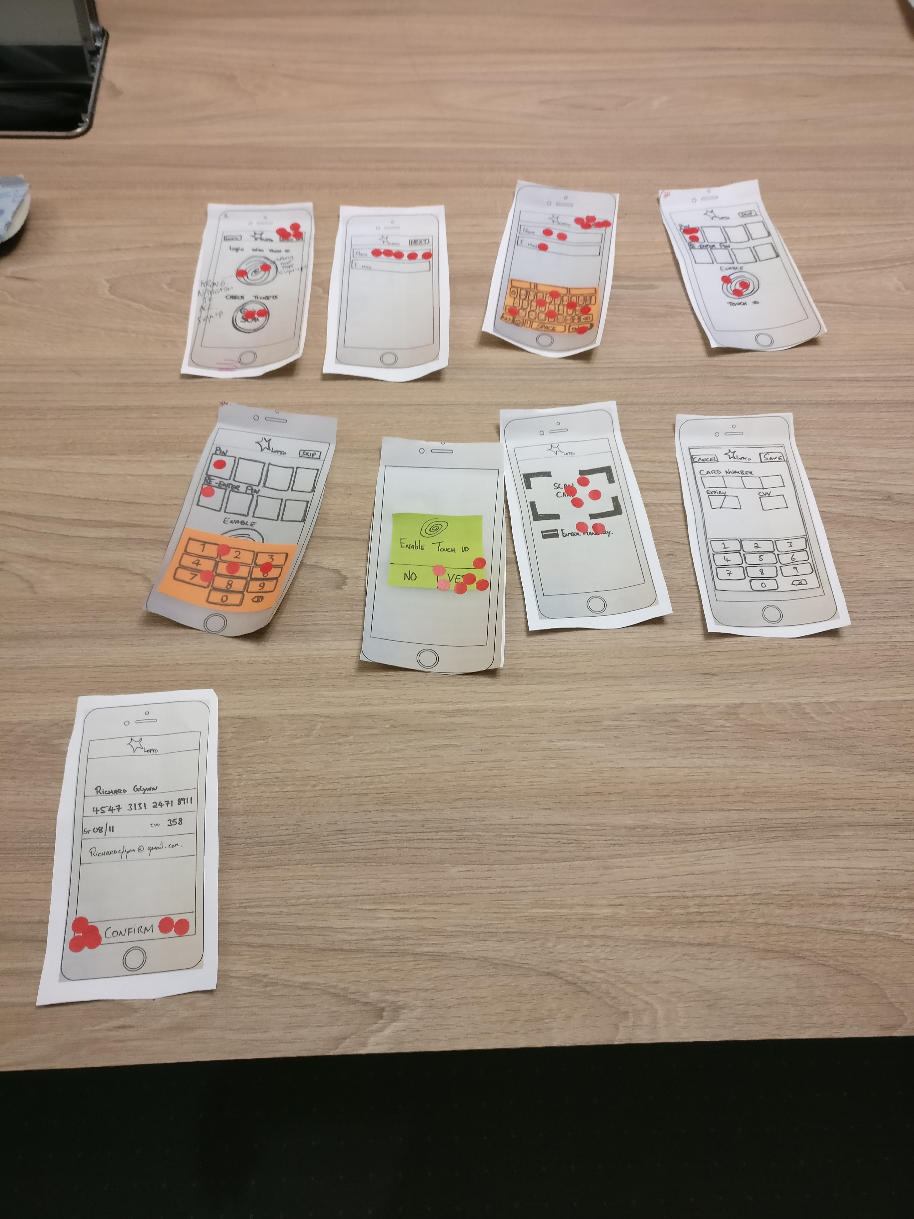
 After we put all our designs together we prepared our first prototype. The screens can be seen in Marvel. We ran a pilot, made a few adjustments on the screens and scheduled the interviews with our users.
First Iterations
For the first iteration, we decided to set our screens on Marvel and link them to create the navigation flow. For the recording, we decided to use Lookback. After a few interviews, we saw that the feedbacks from using Marvel would not be as rich in feedback as recording the user with the phone in his hands, so after a brief talk, we decided to change the recording approach for the last iteration we made. Also before each interview, users were asked to sign a consent form.
Users were being asked to perform some tasks on the app and were told that this exercise was to evaluate the design of the app and not themselves, to put them at ease while iterating with the app. Users were also asked to provide a verbal feedback as they were performing the tasks; this information can be used after to formulate recommended design changes [3] to the Lotto app.
The tasks to be performed by the users were:
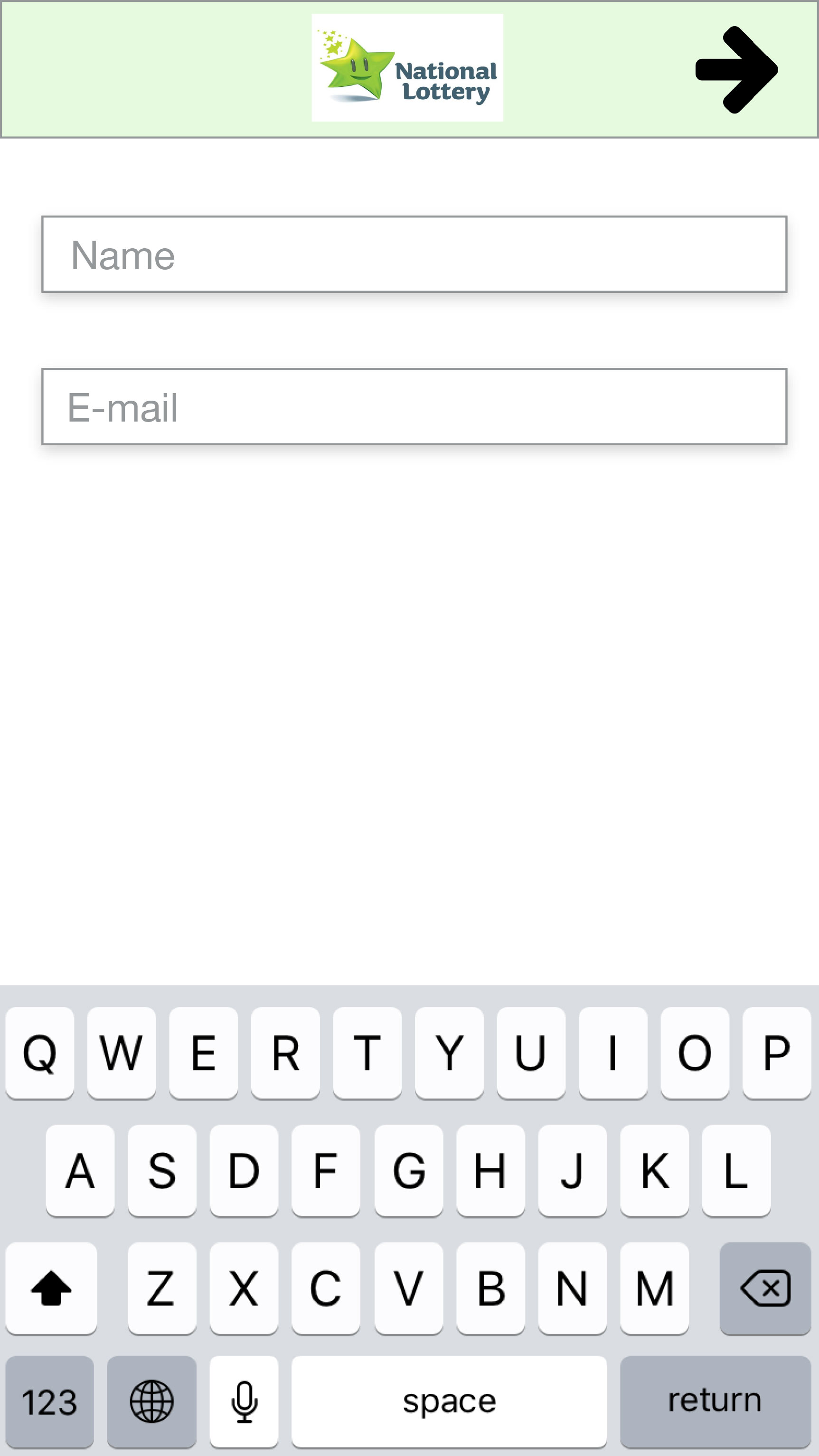
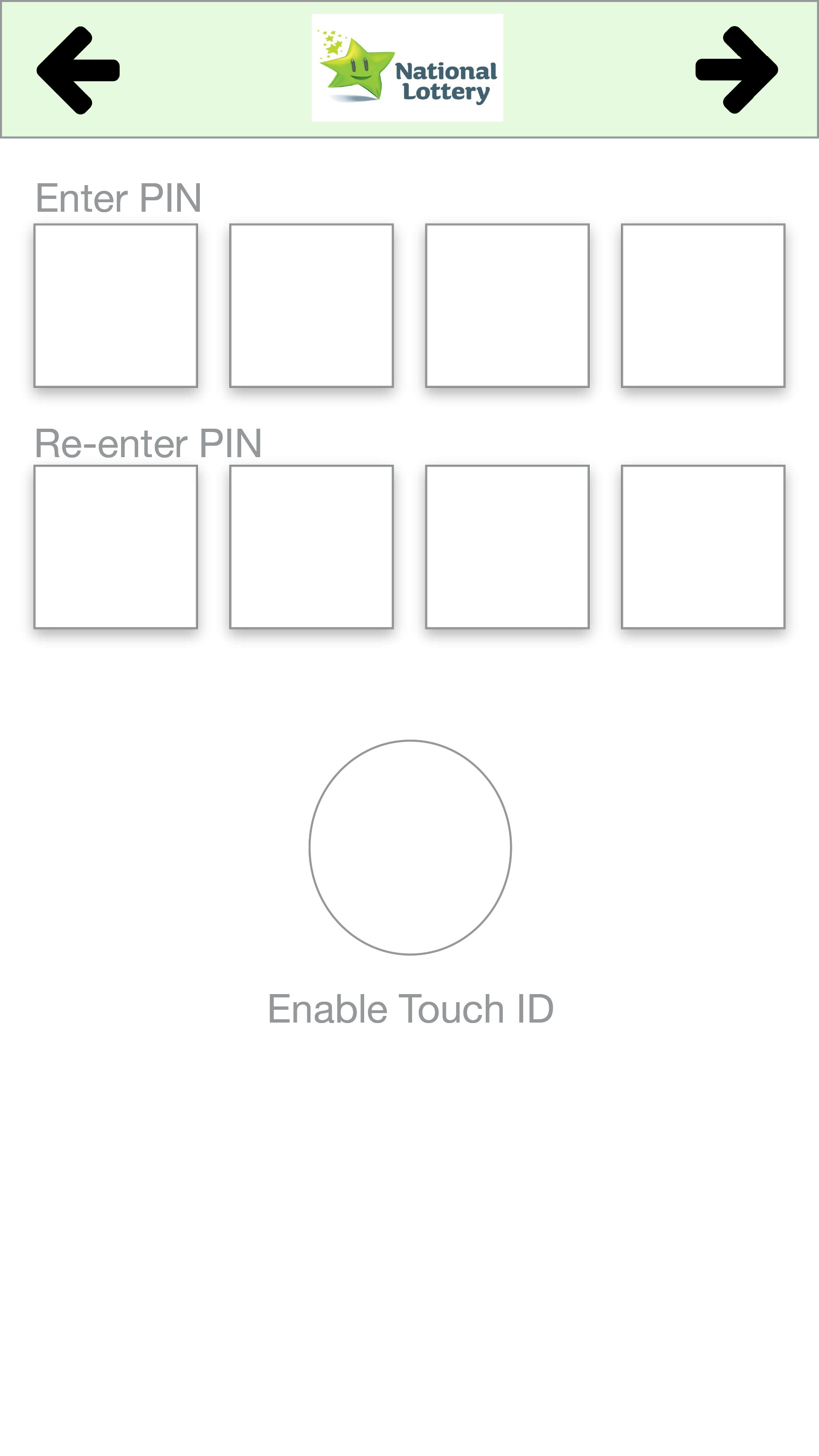
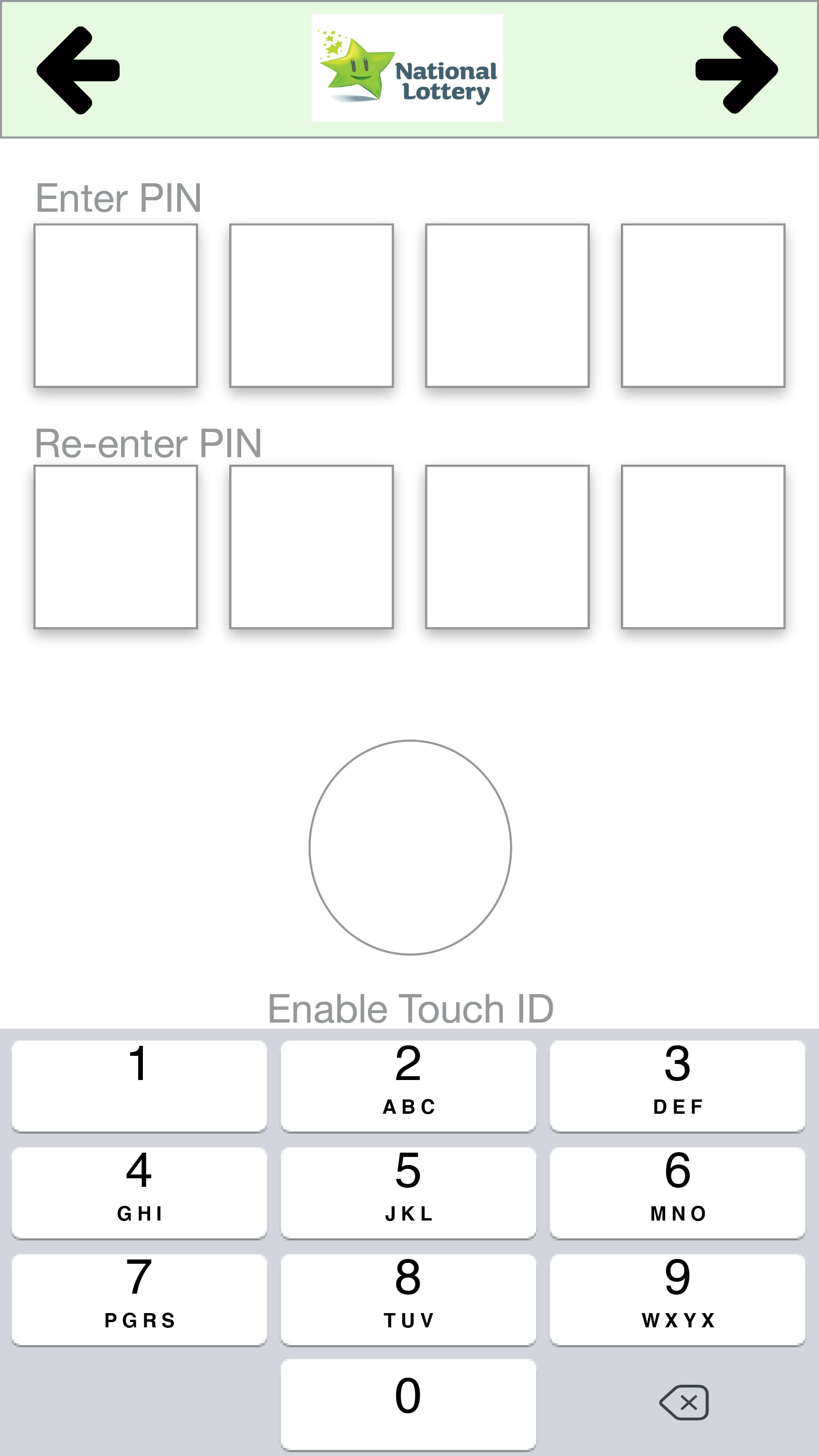
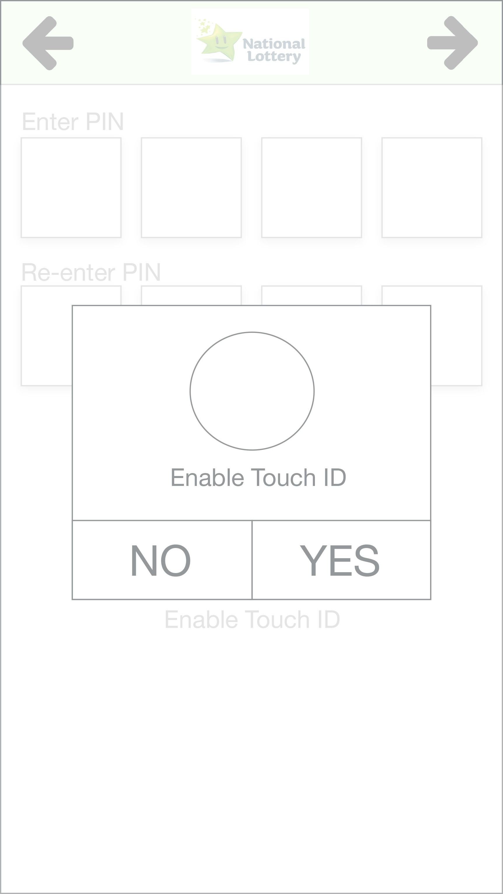
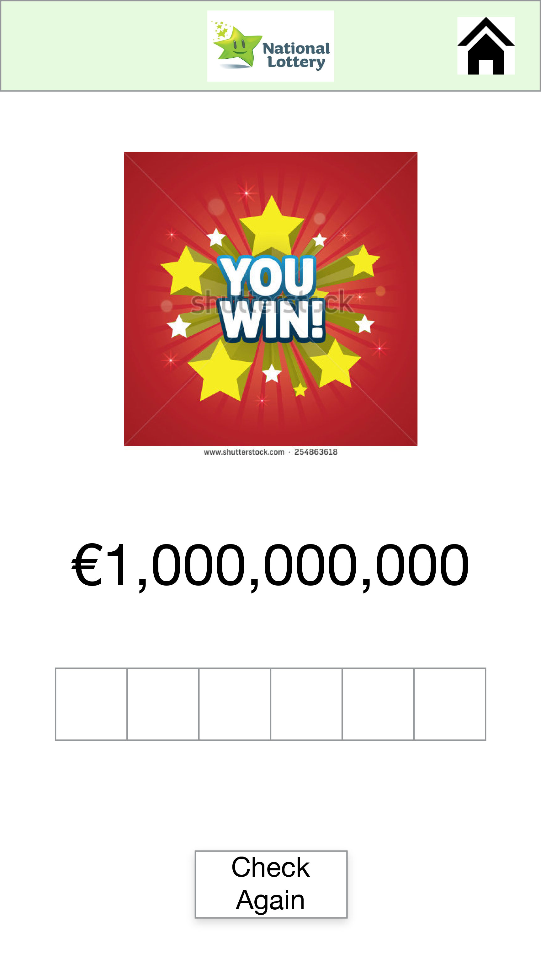
- Sign-up to the Lotto app.
- Play and buy 3 lines of the Lotto draw.
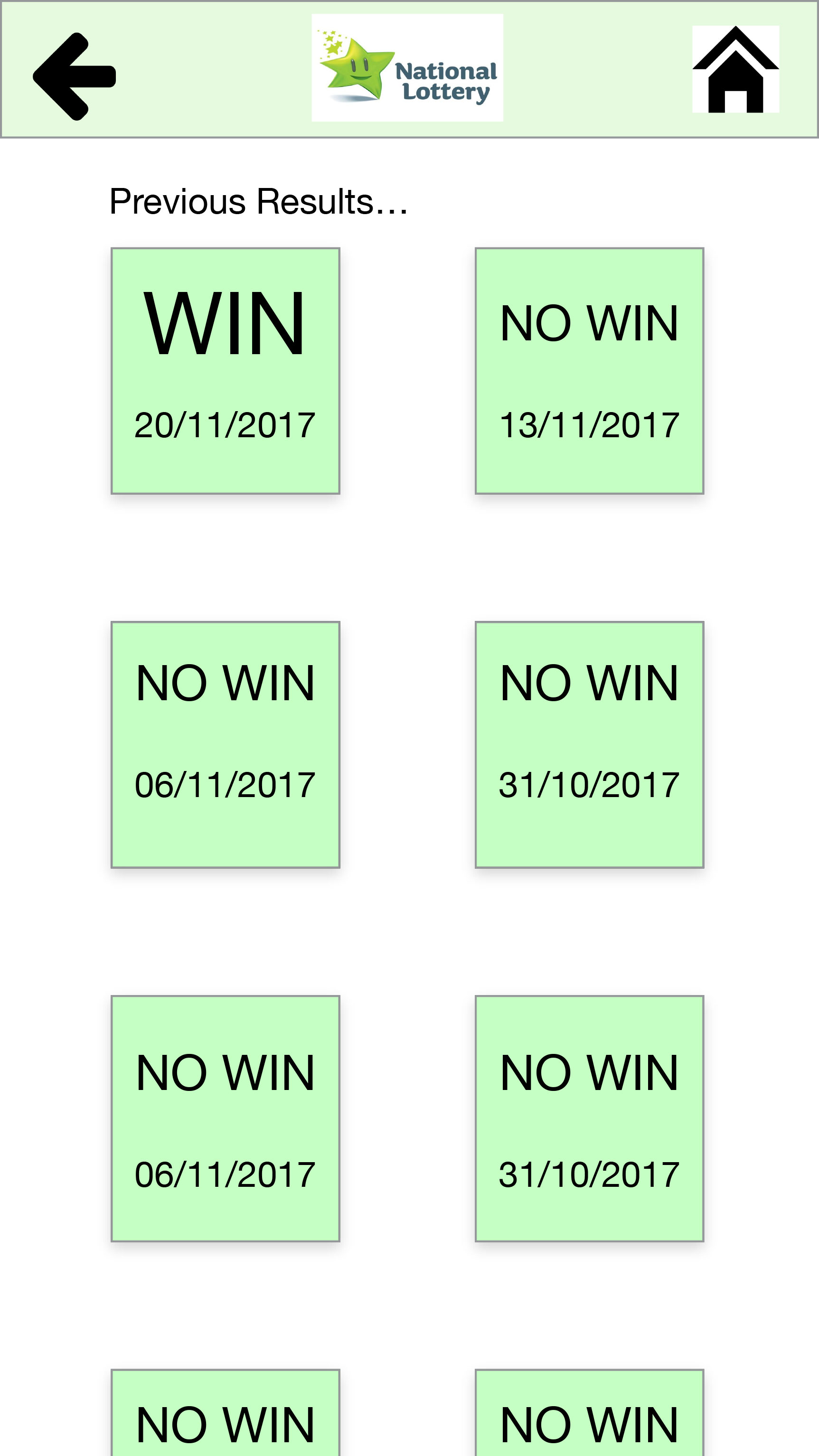
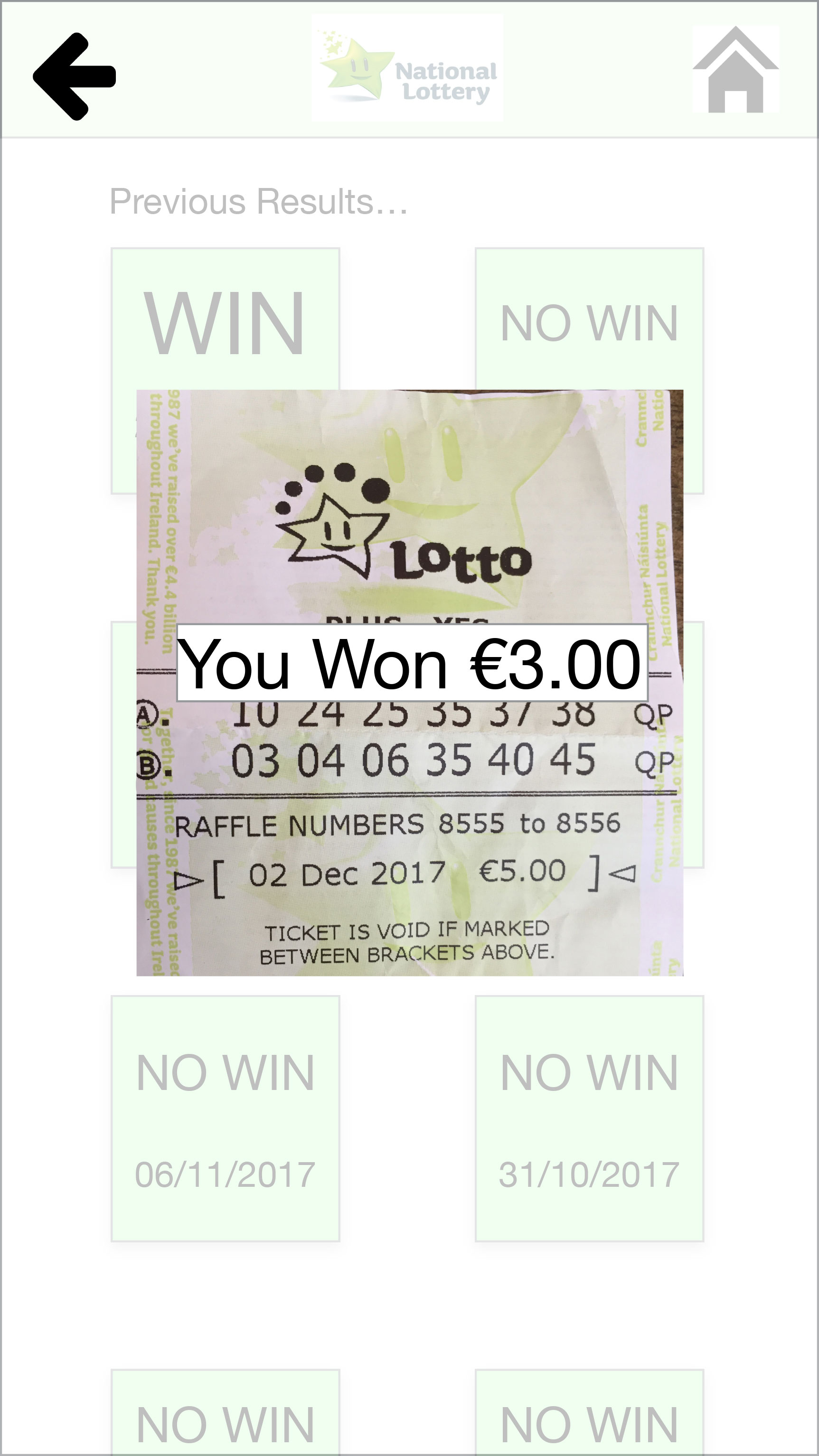
- Check the numbers of a physical ticket.
- Check the numbers of a ticket bought on the app.
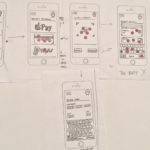
And below the different approach to record the user interacting with the paper prototype.
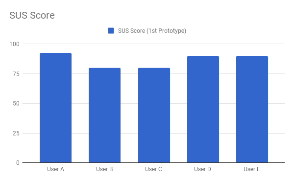
Just after each of the interviews, we applied a questionnaire, with a slightly modified version of the SUS questionnaire and its raw results will be discussed in the next section.
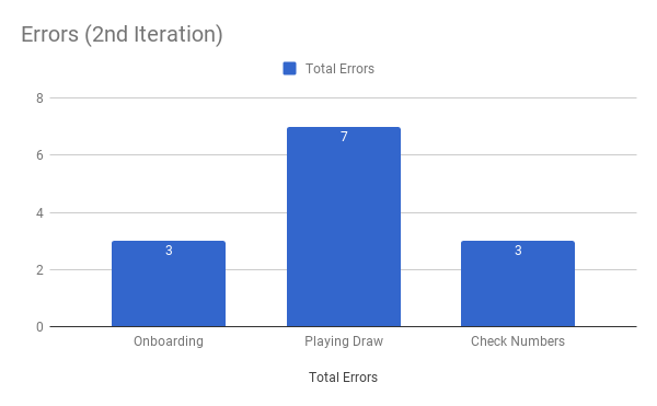
Results and Logs
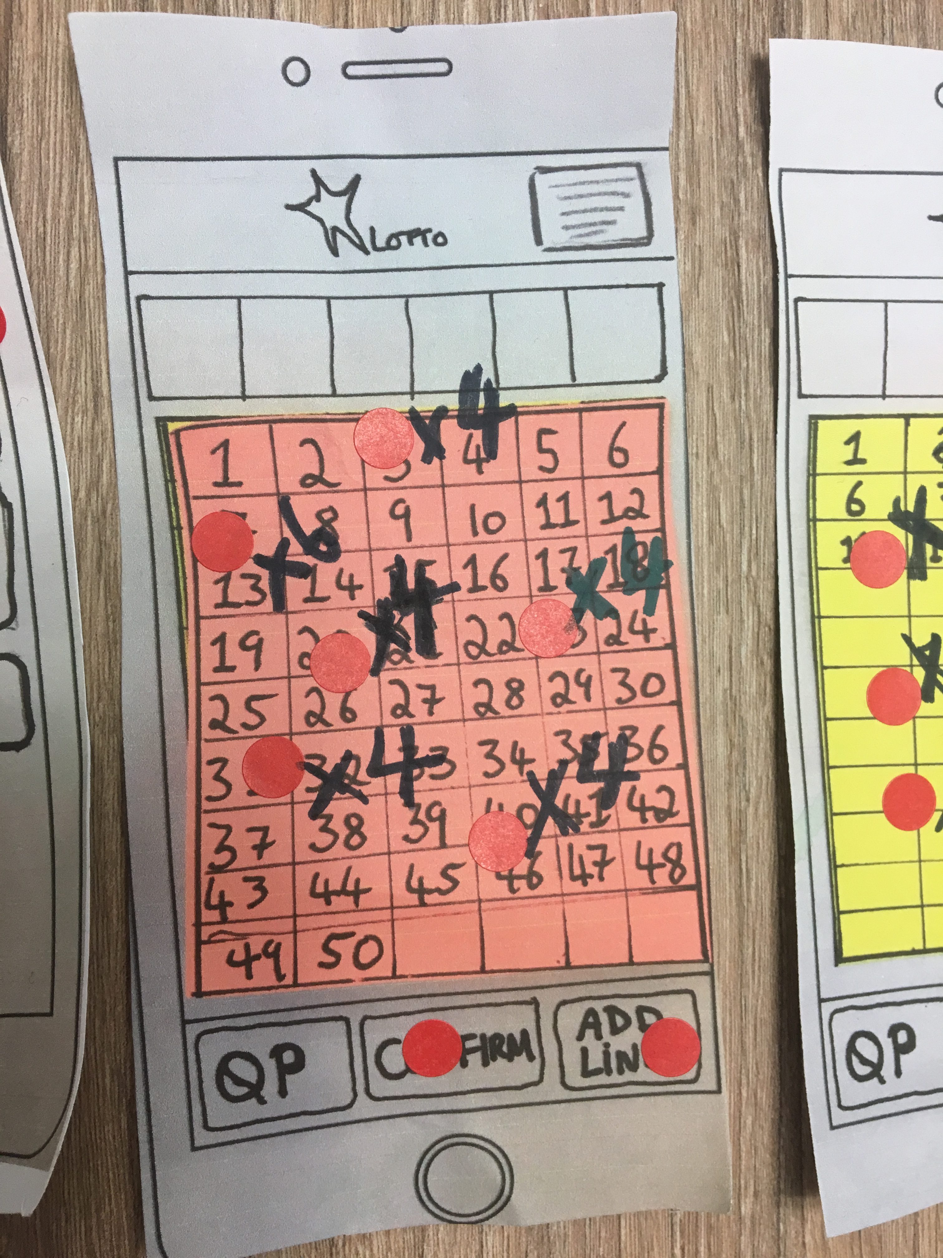
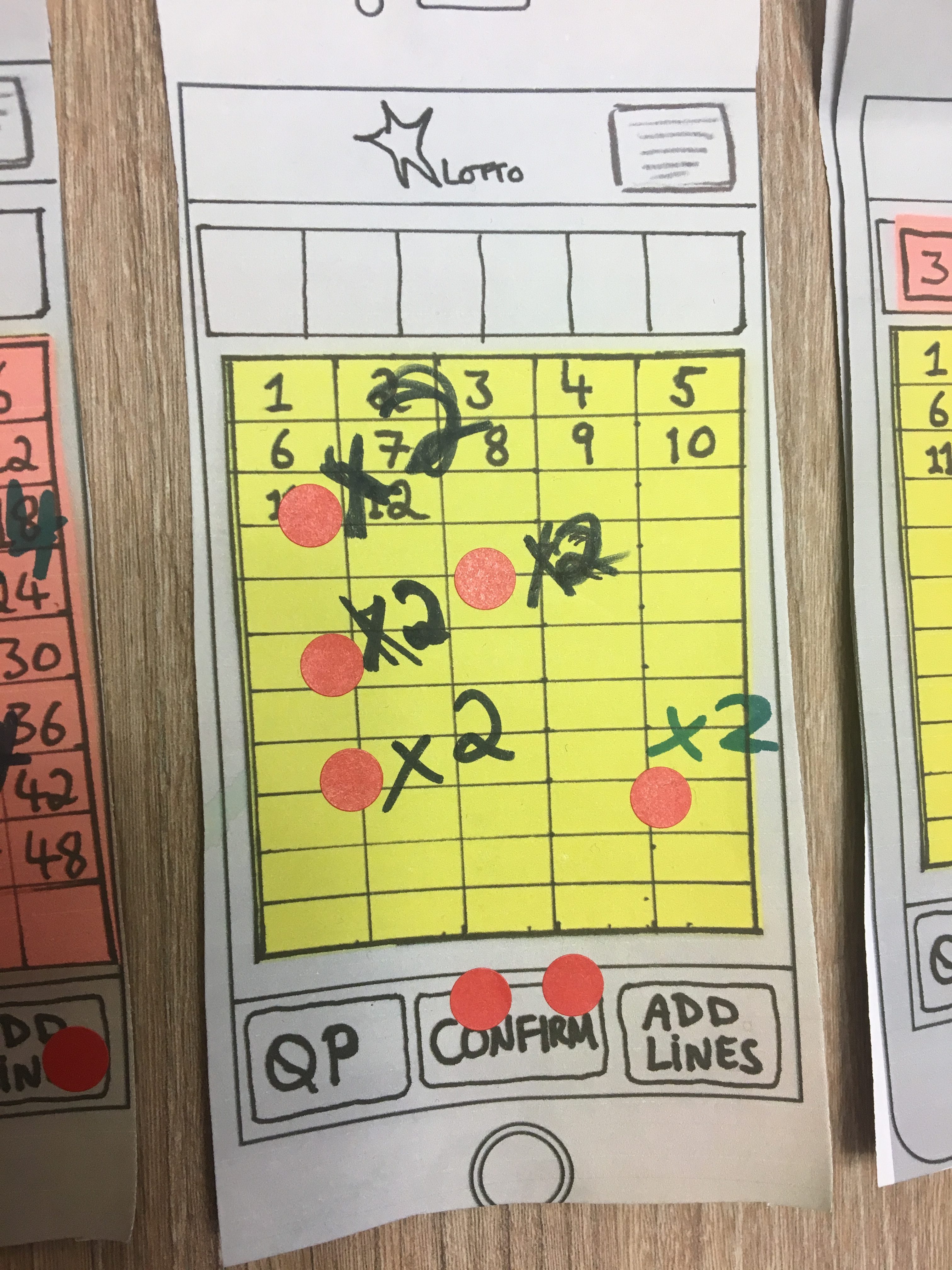
After analyzing the videos, we generated a heat map of all the screens used during the interviews, that allowed us to visualize any actions that were not expected by us.
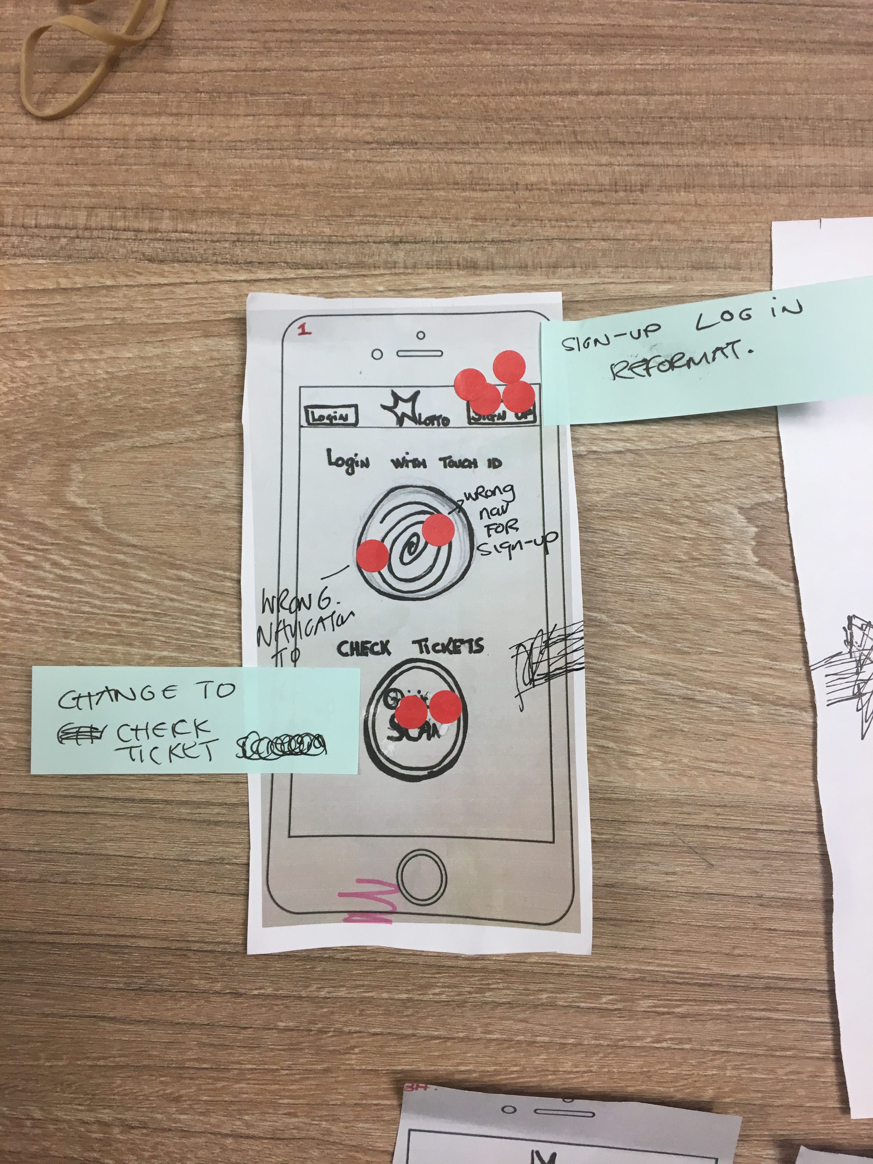
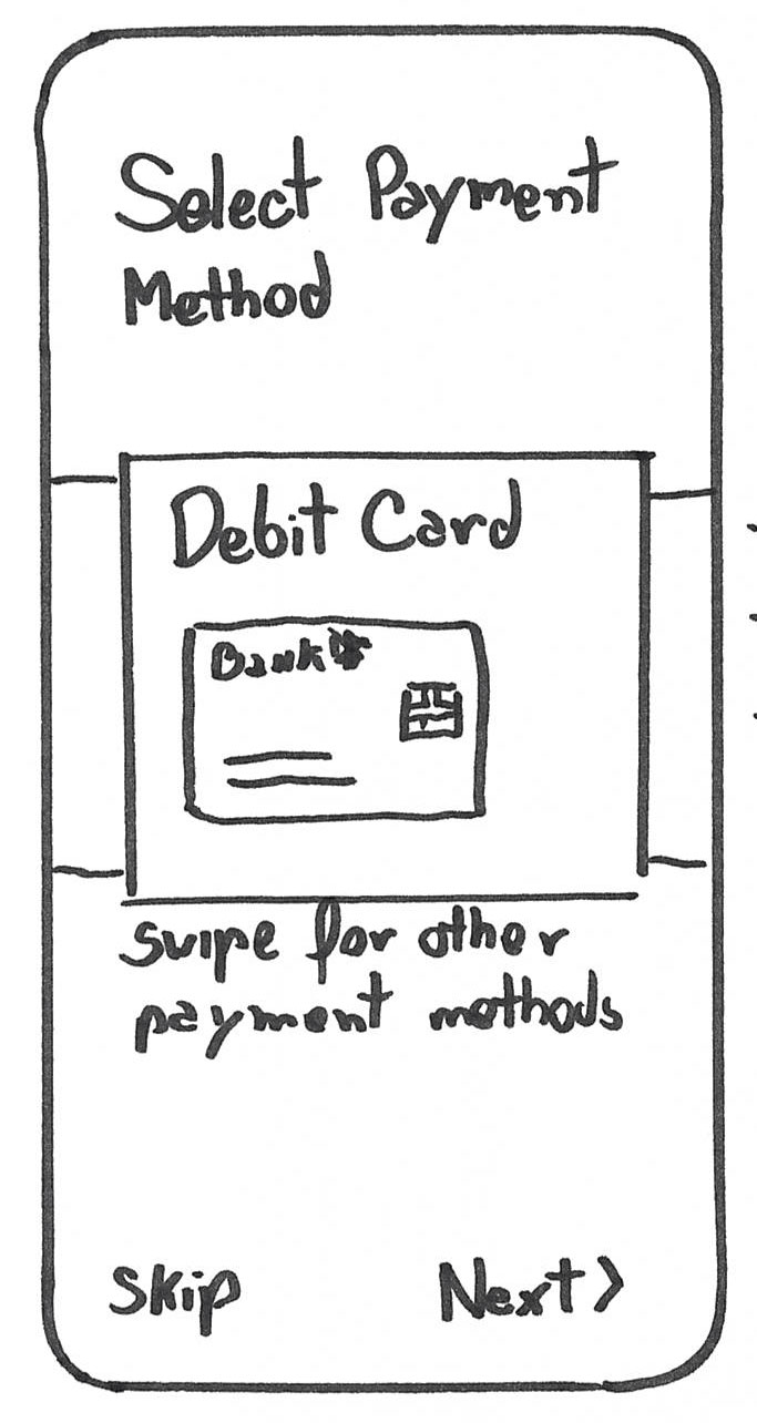
Sign-up process
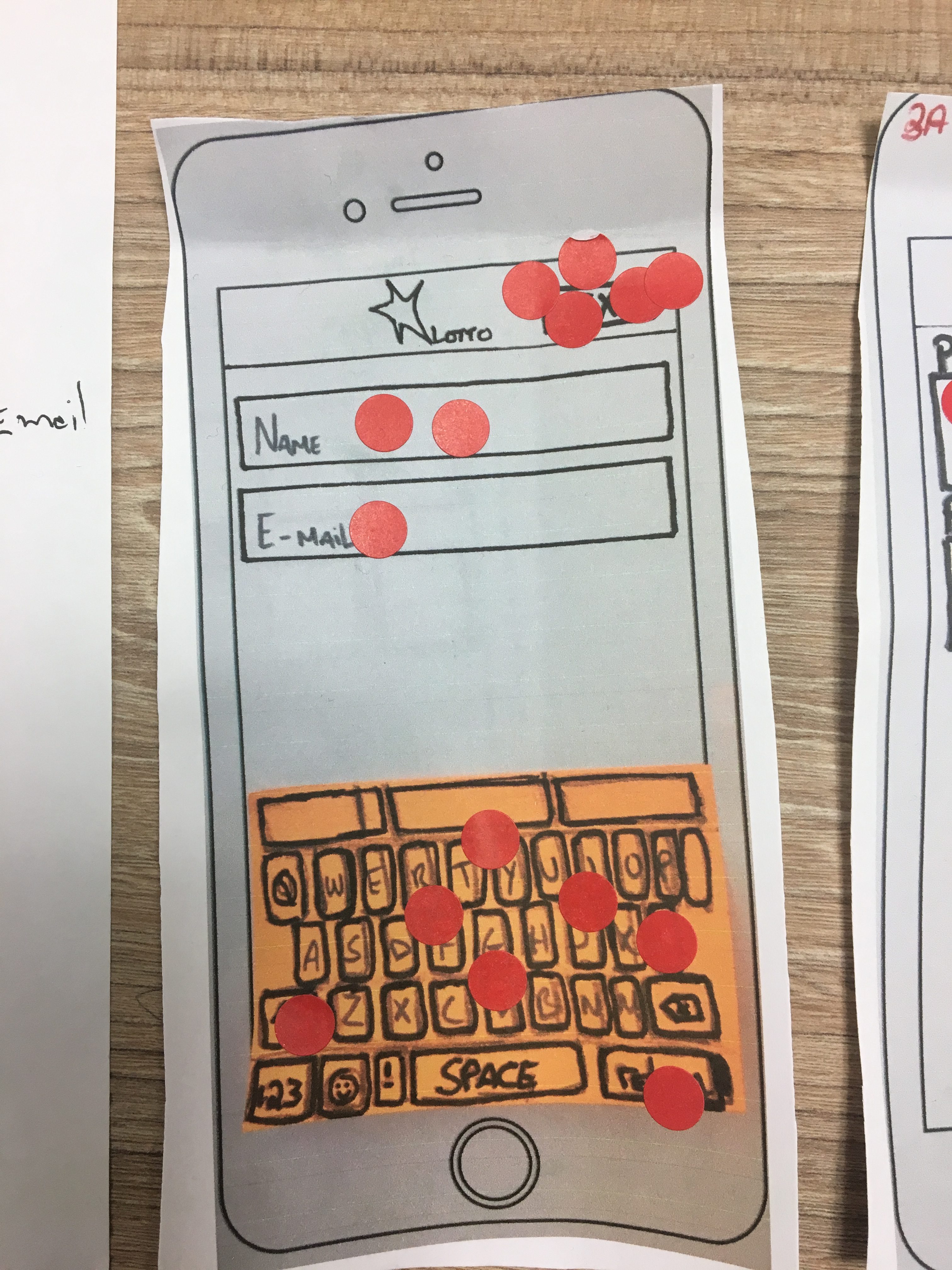
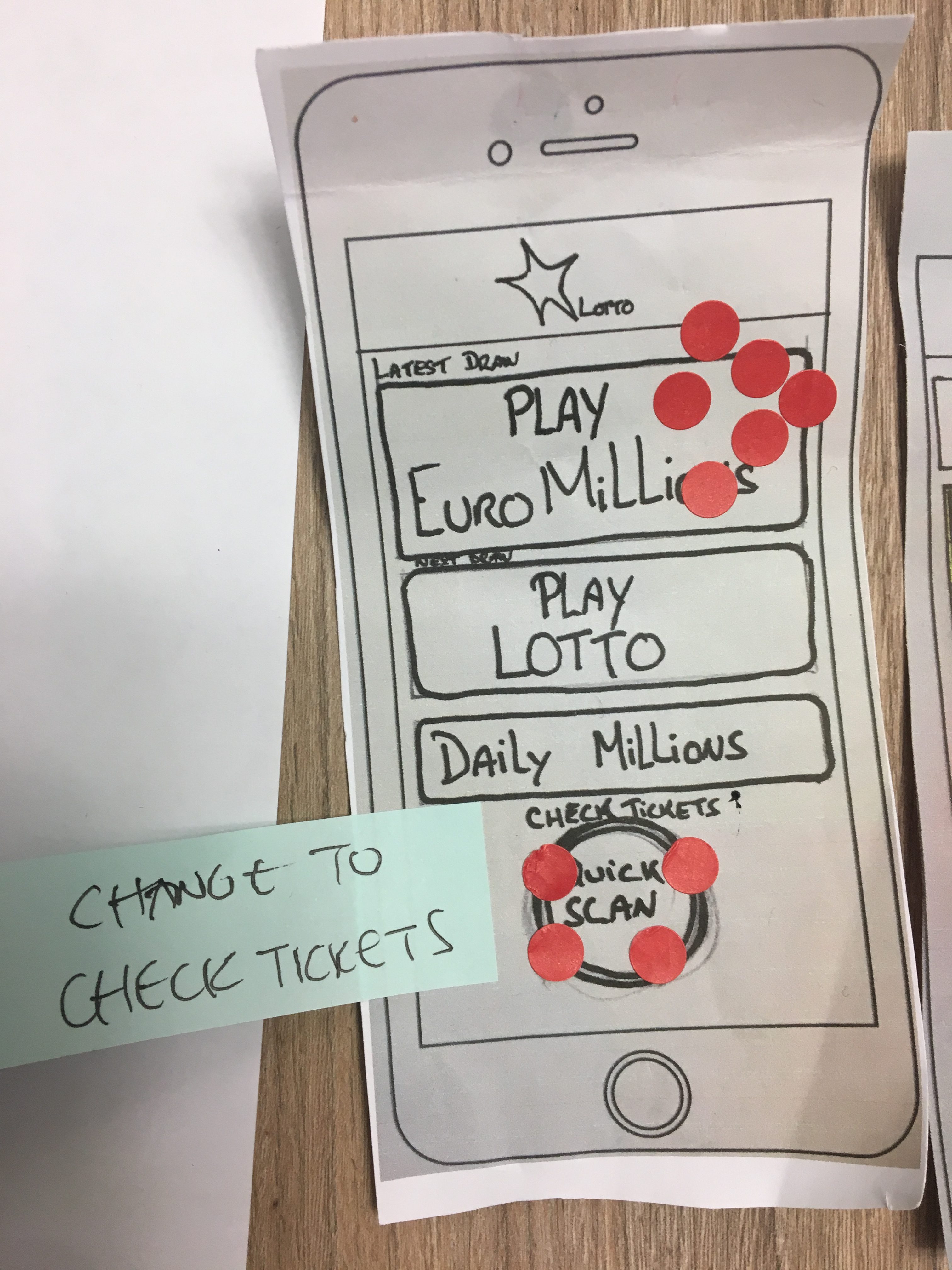
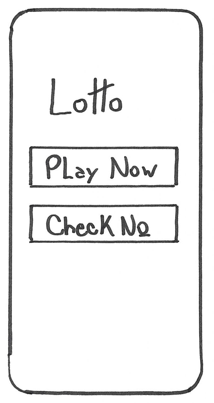
An issue with no sign-up button on the first screen, users clicked on the burger menu.
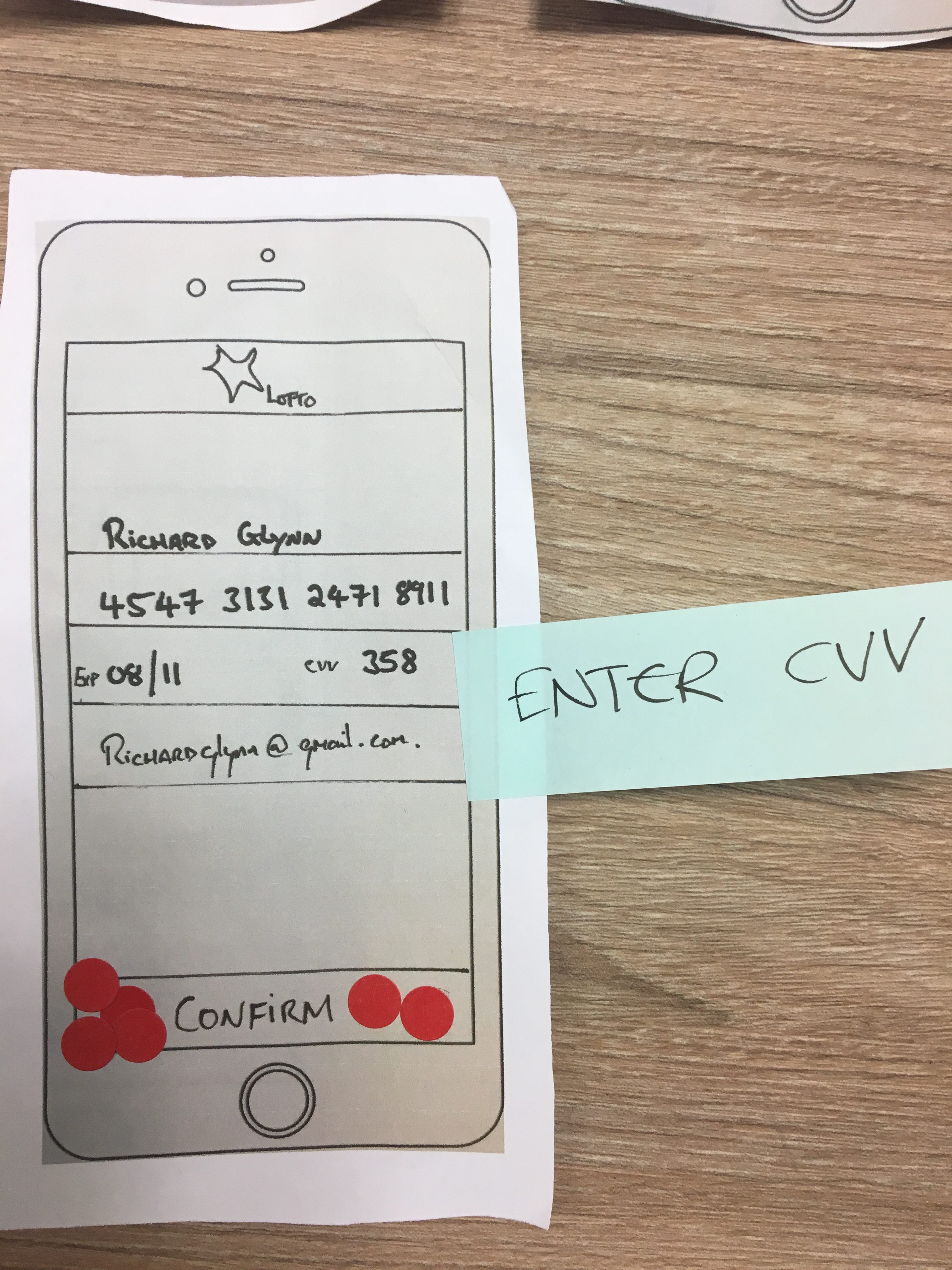
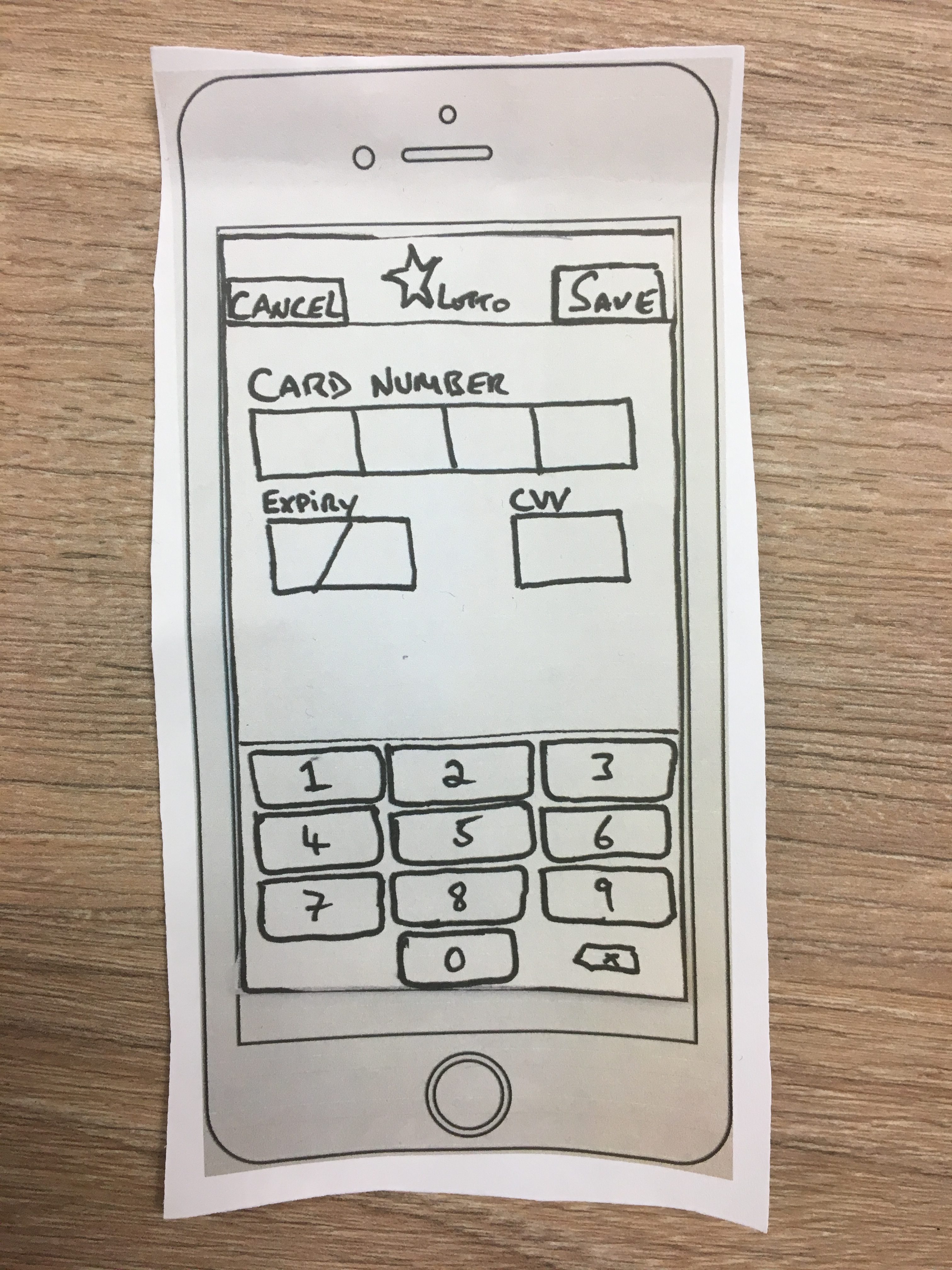
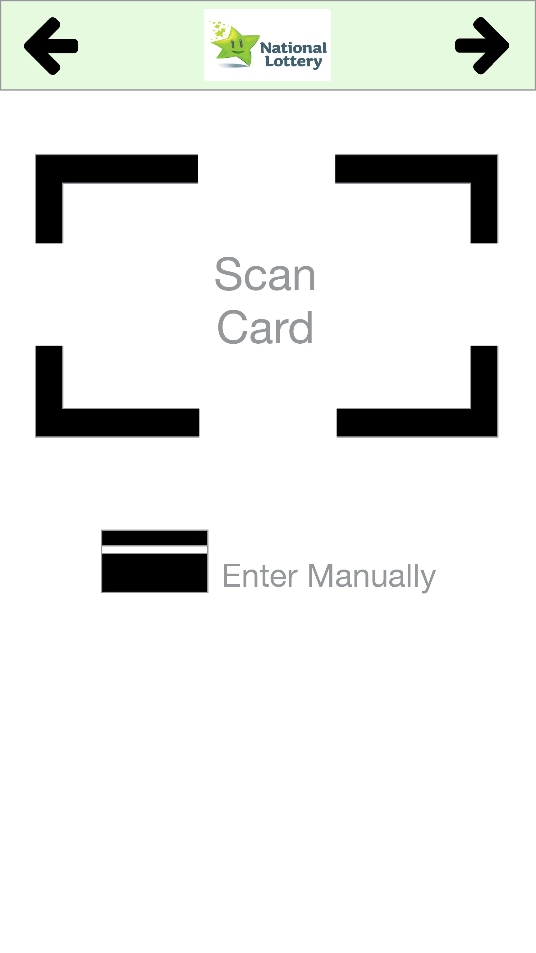
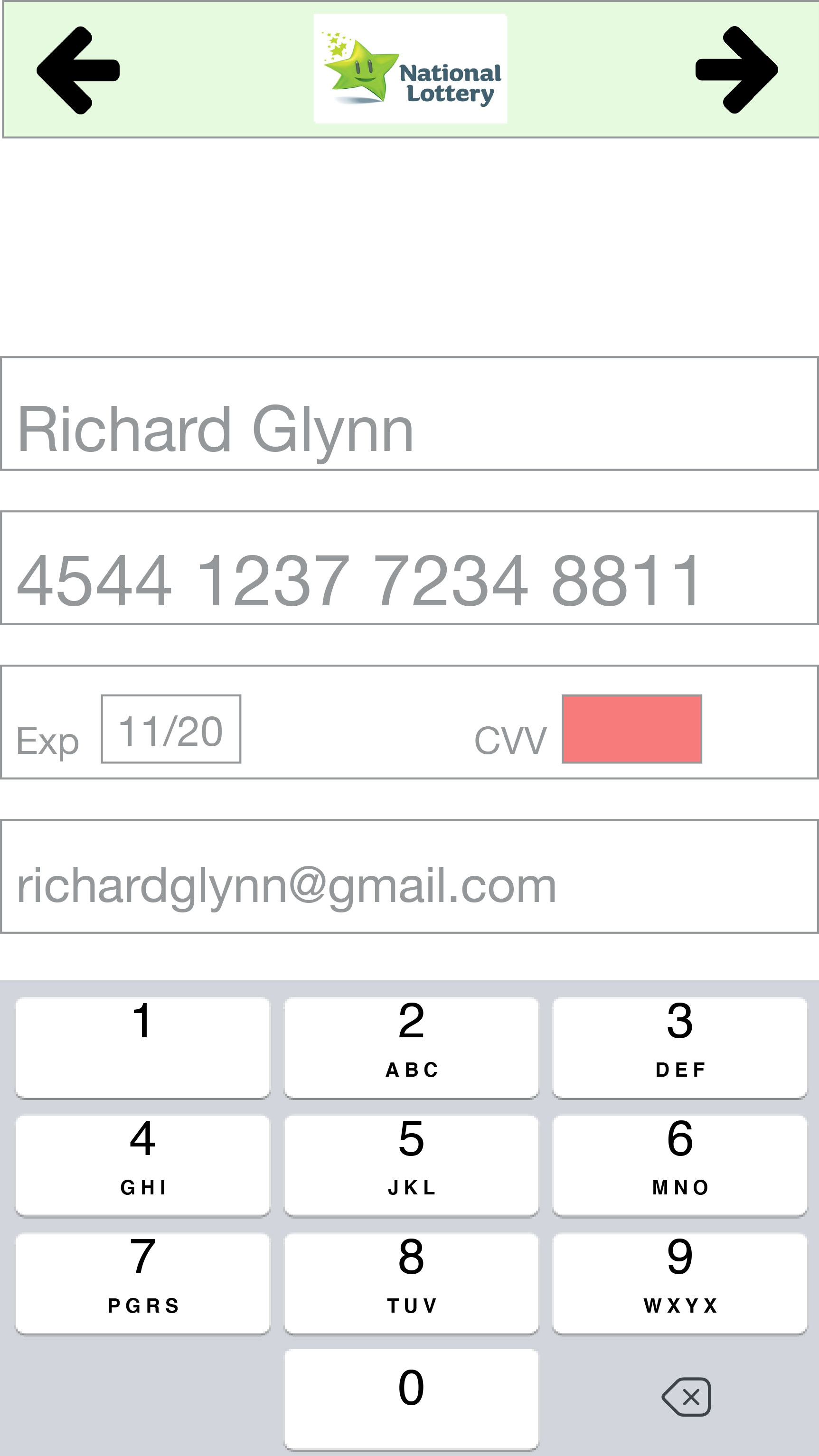
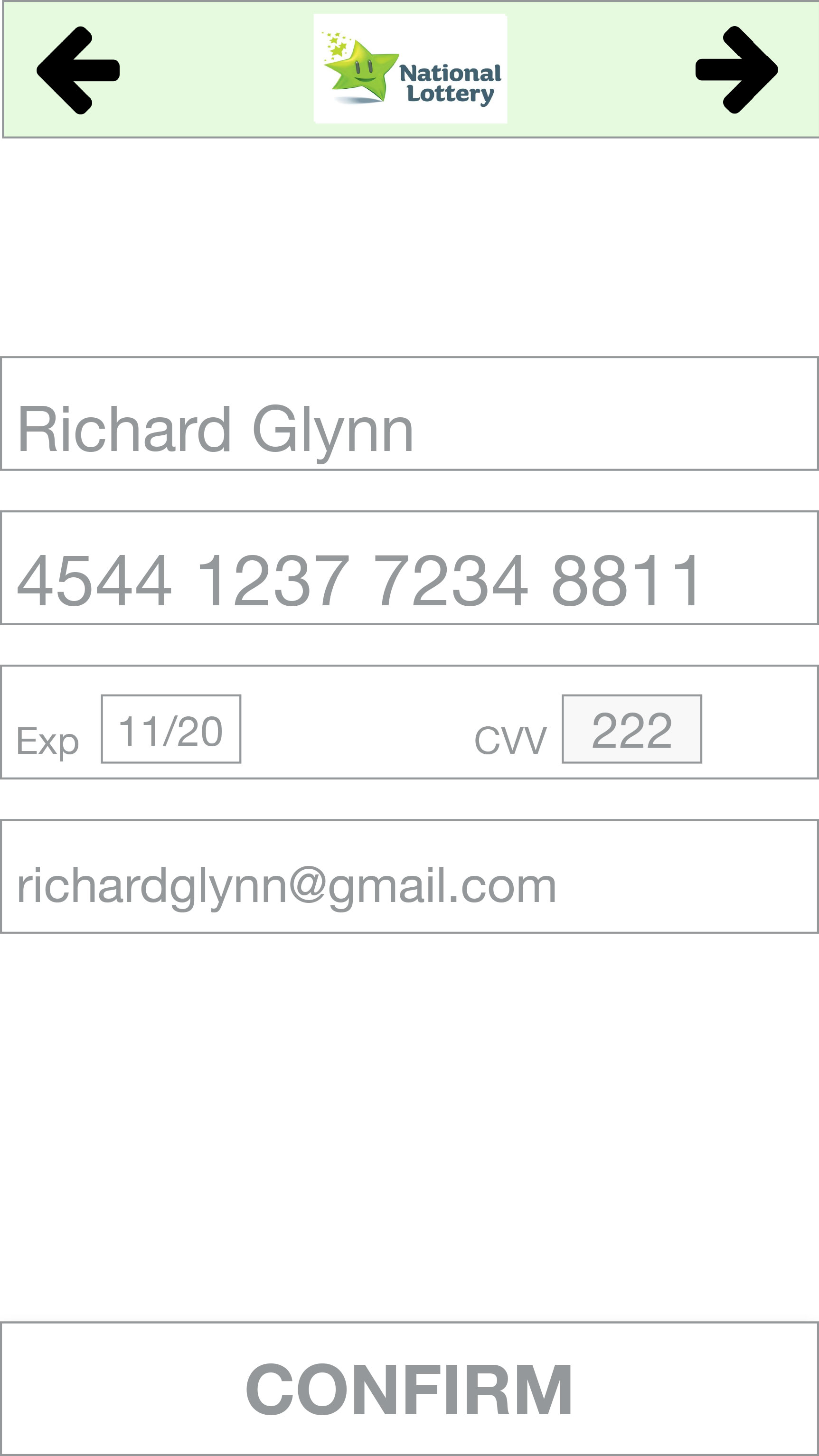
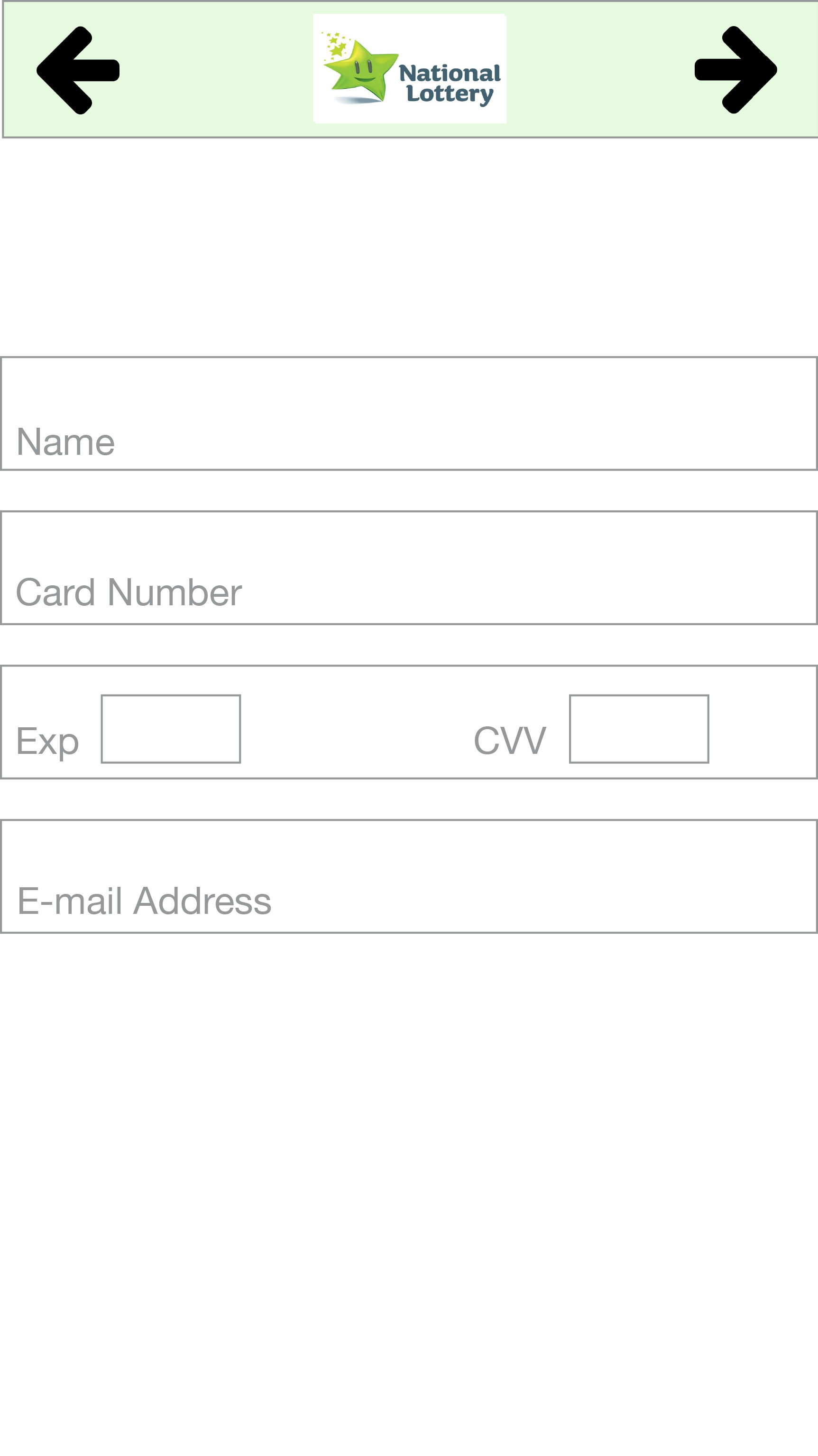
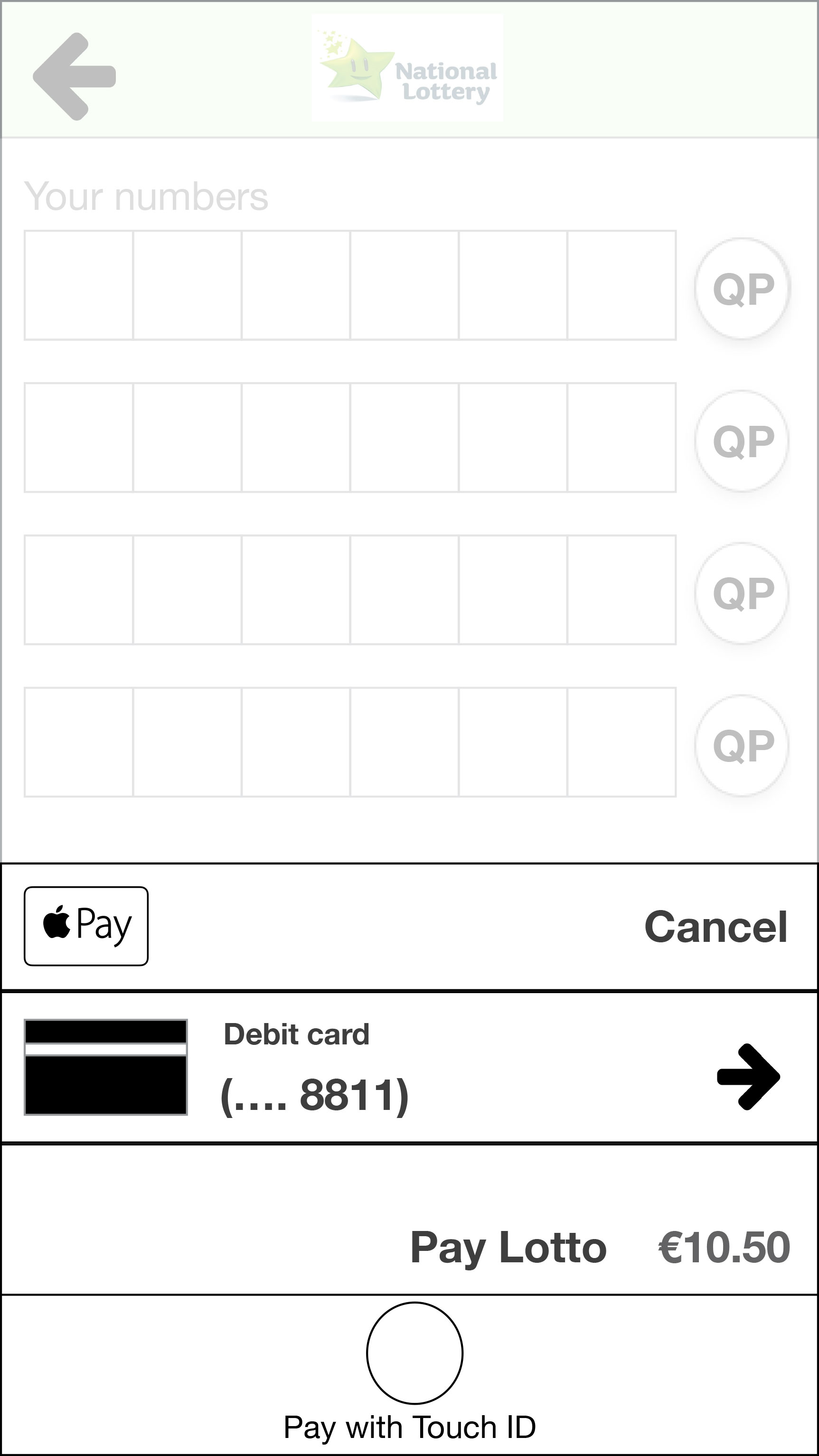
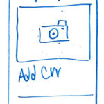
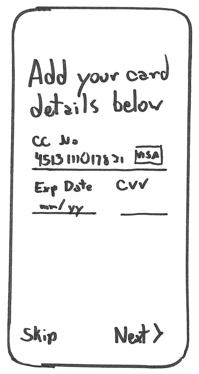
Users were surprised when asked credit card at first part of sign up
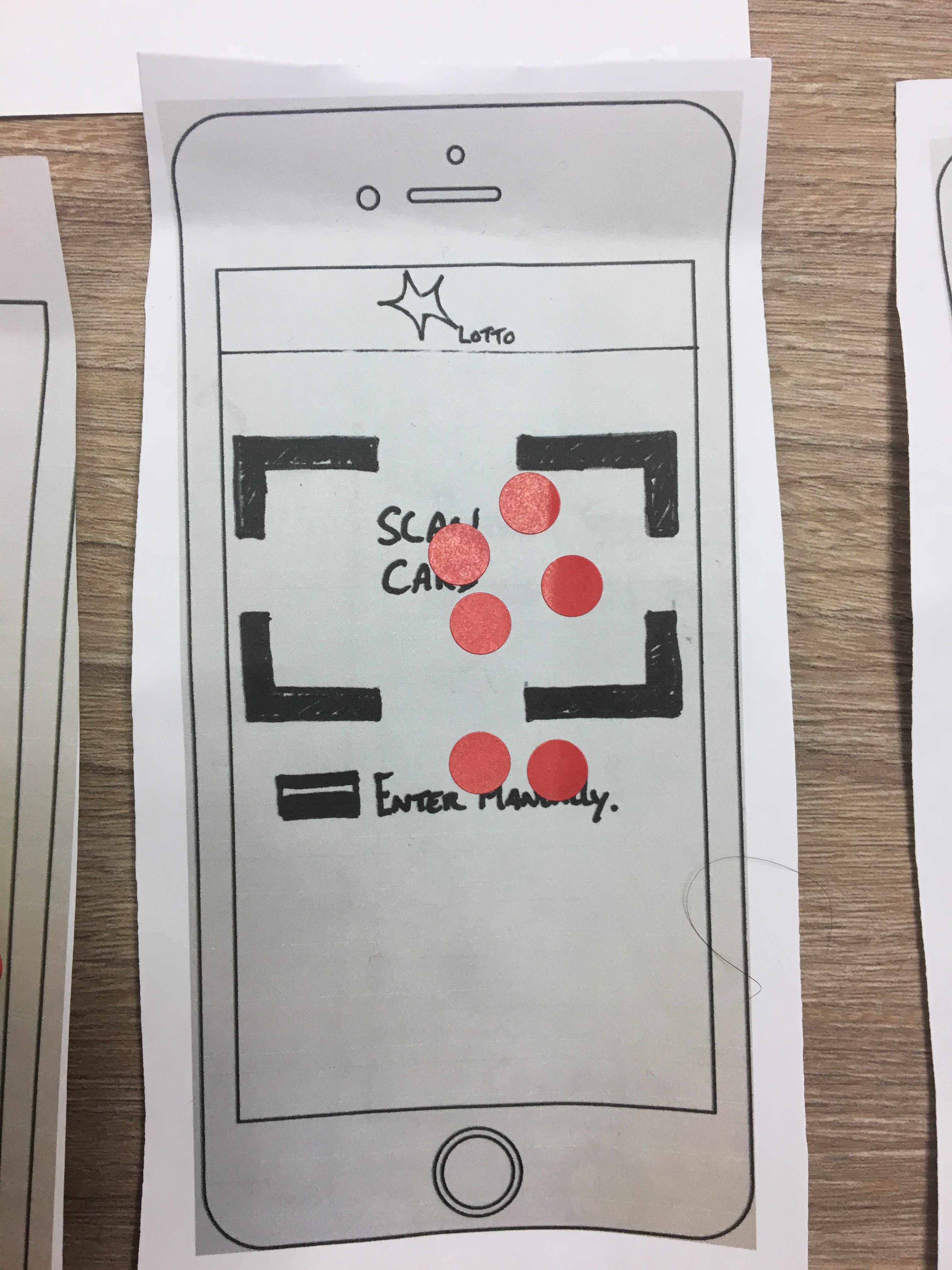
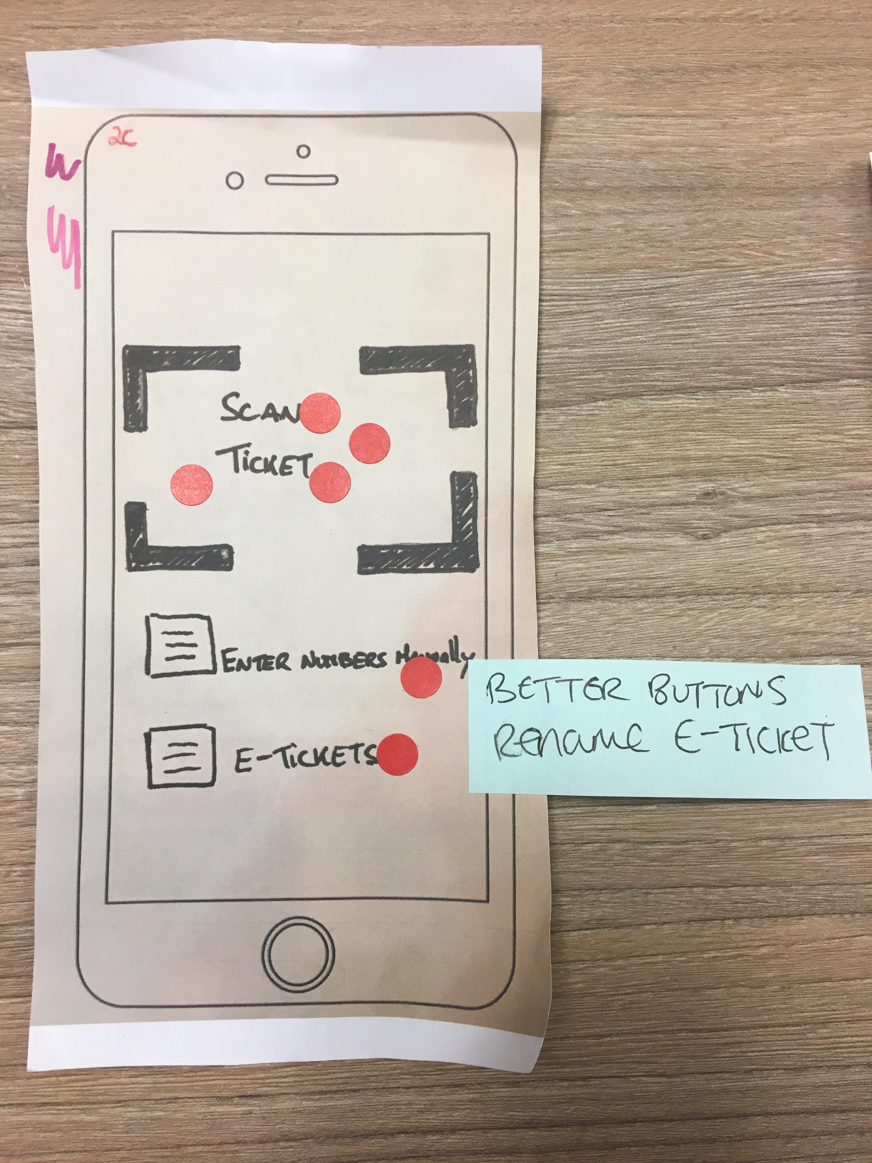
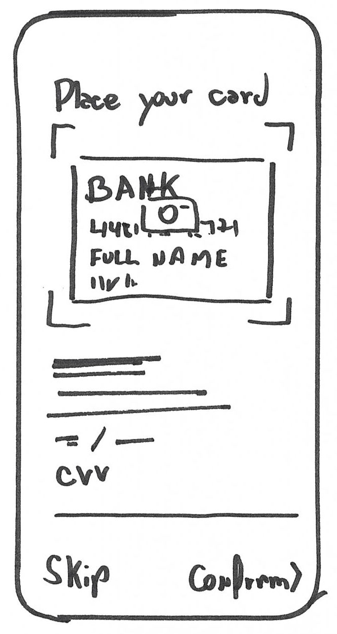
All users chose to scan the card than trying to input the card details on the keyboard.
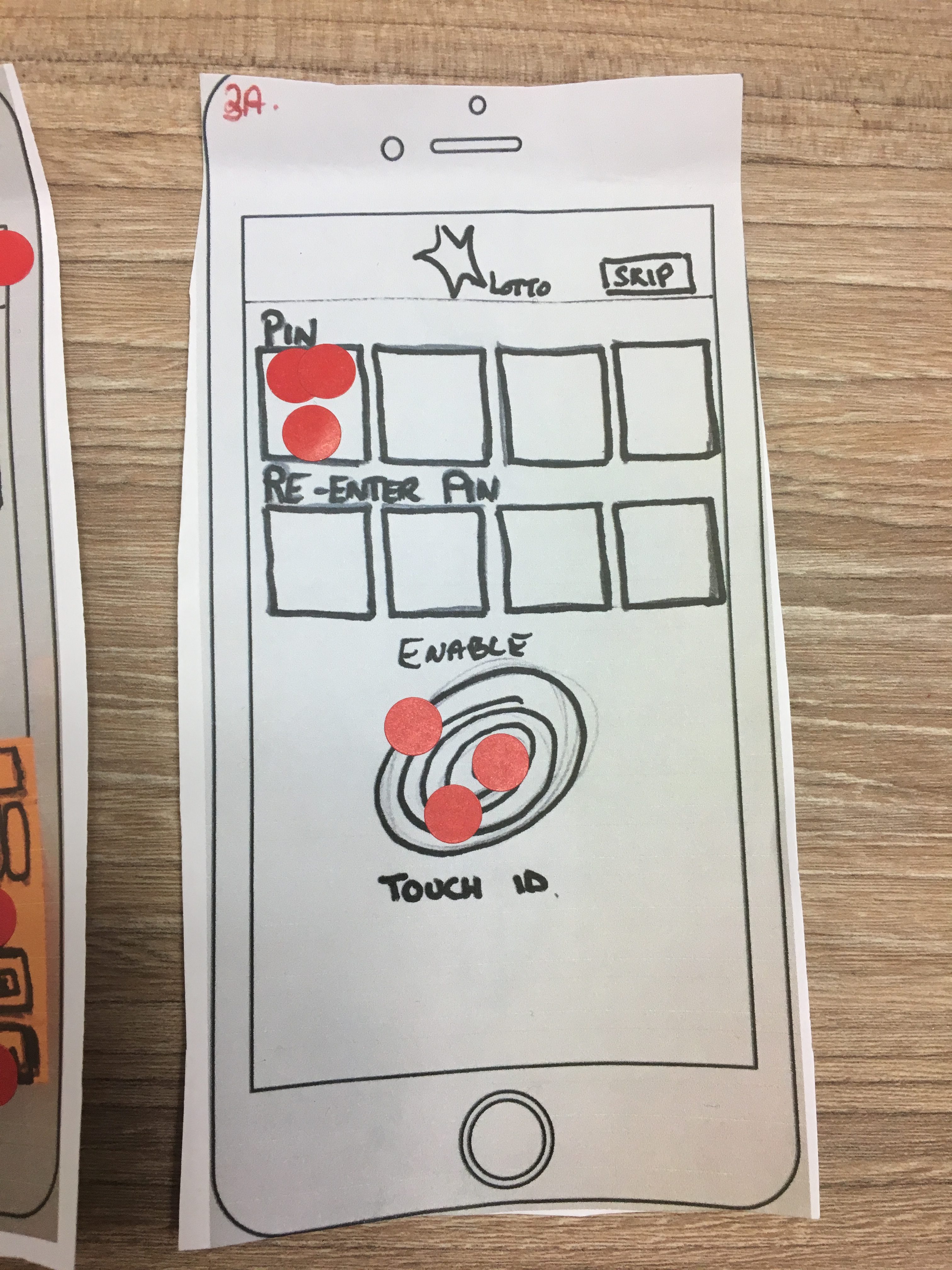
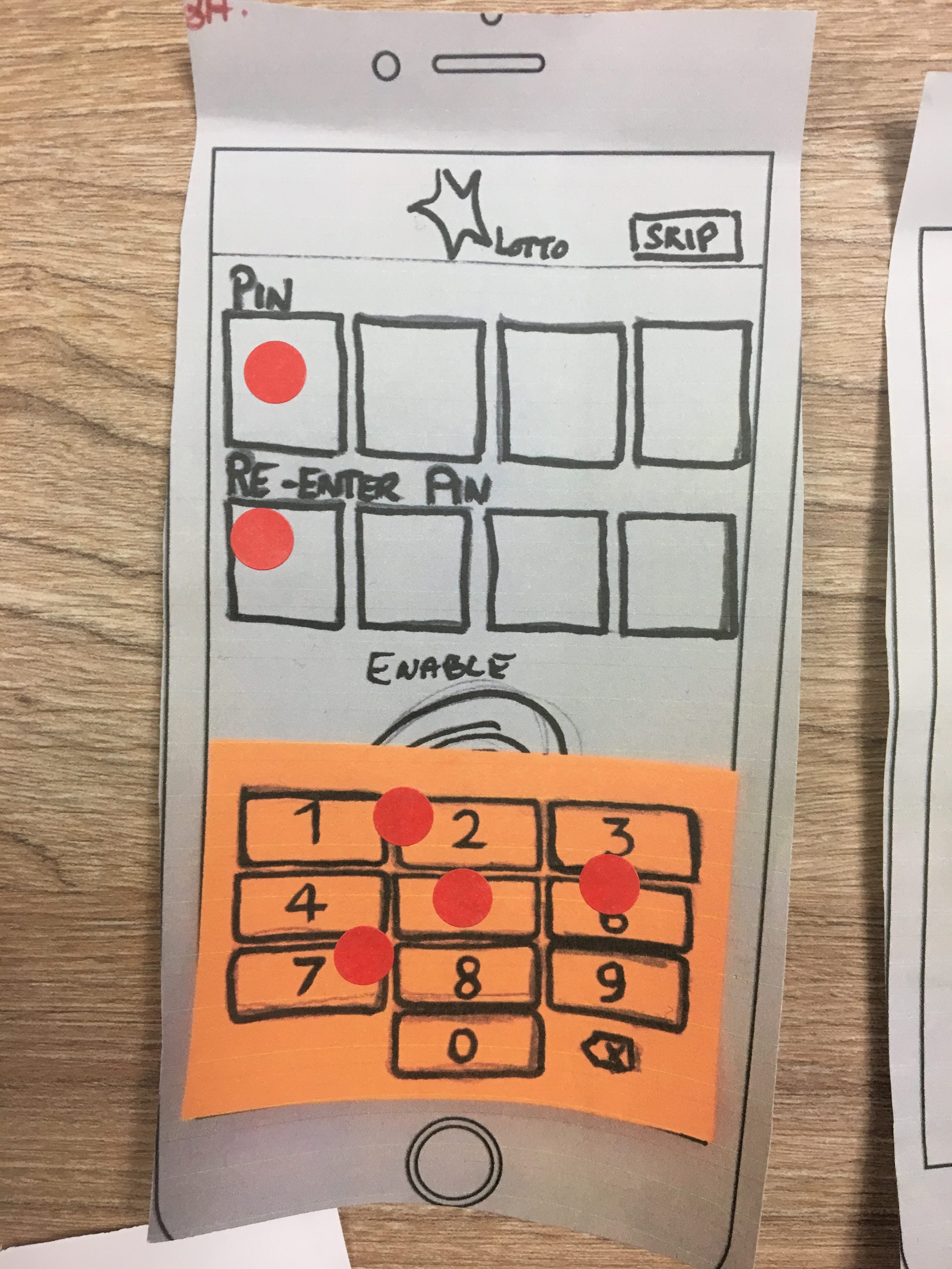
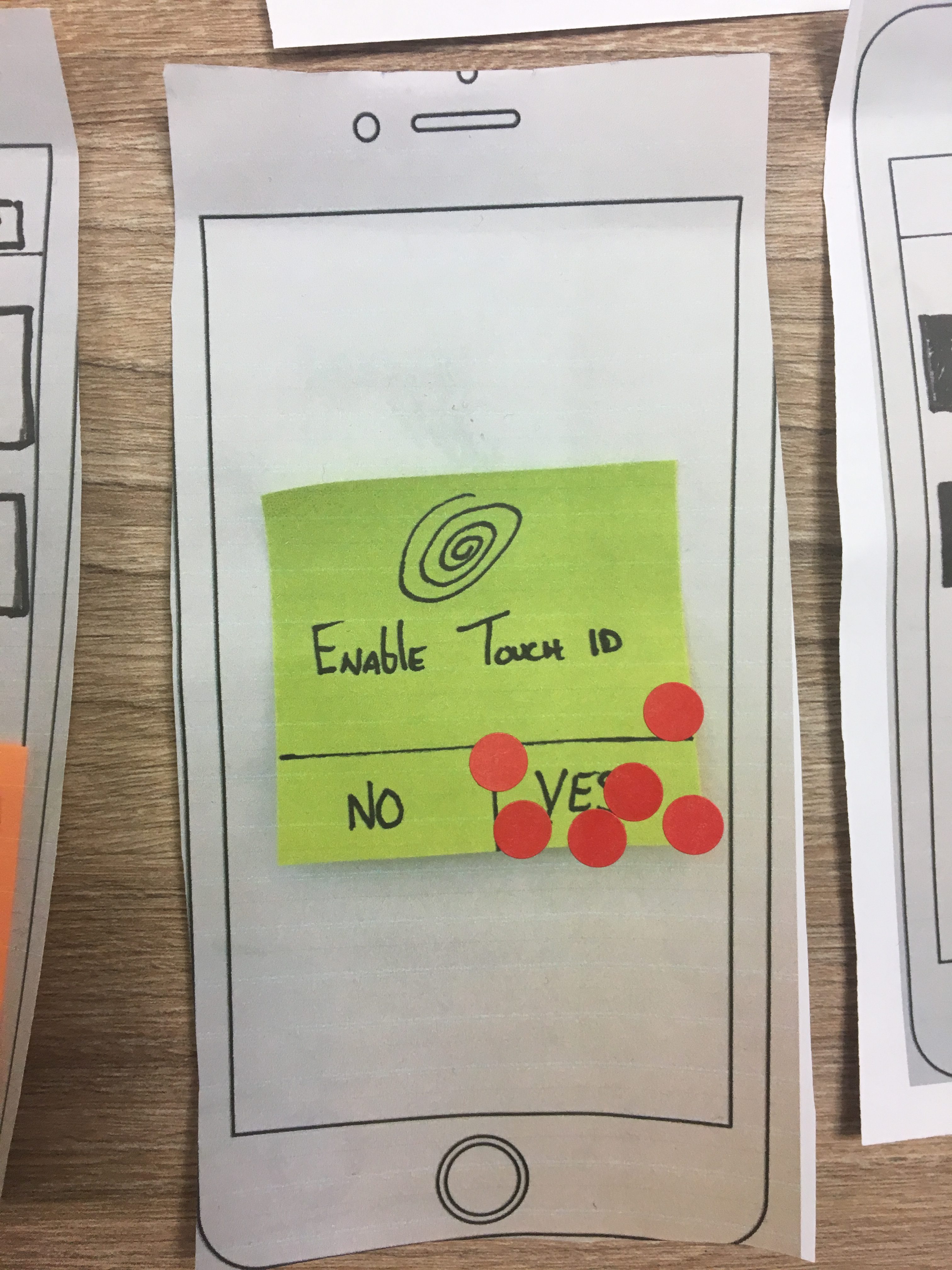
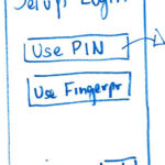
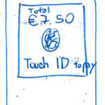
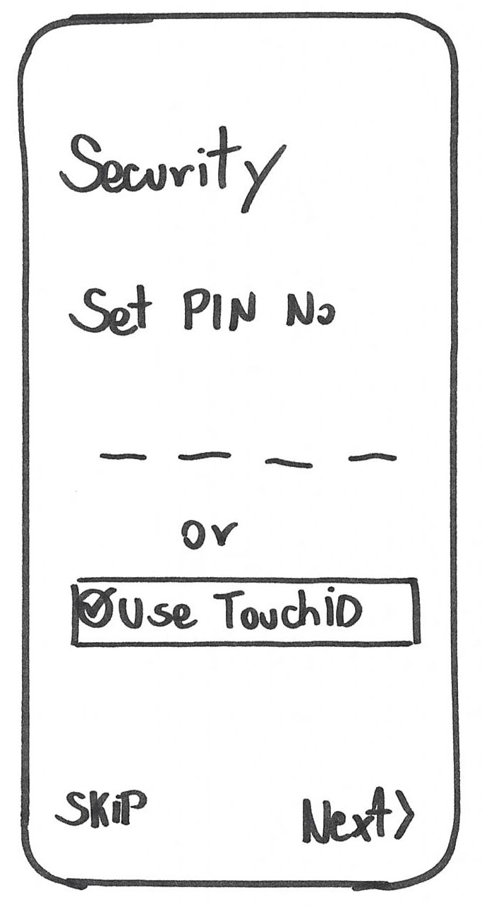
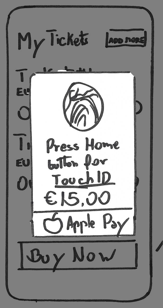
Most users preferred to use Touch ID as a login method than the PIN number.
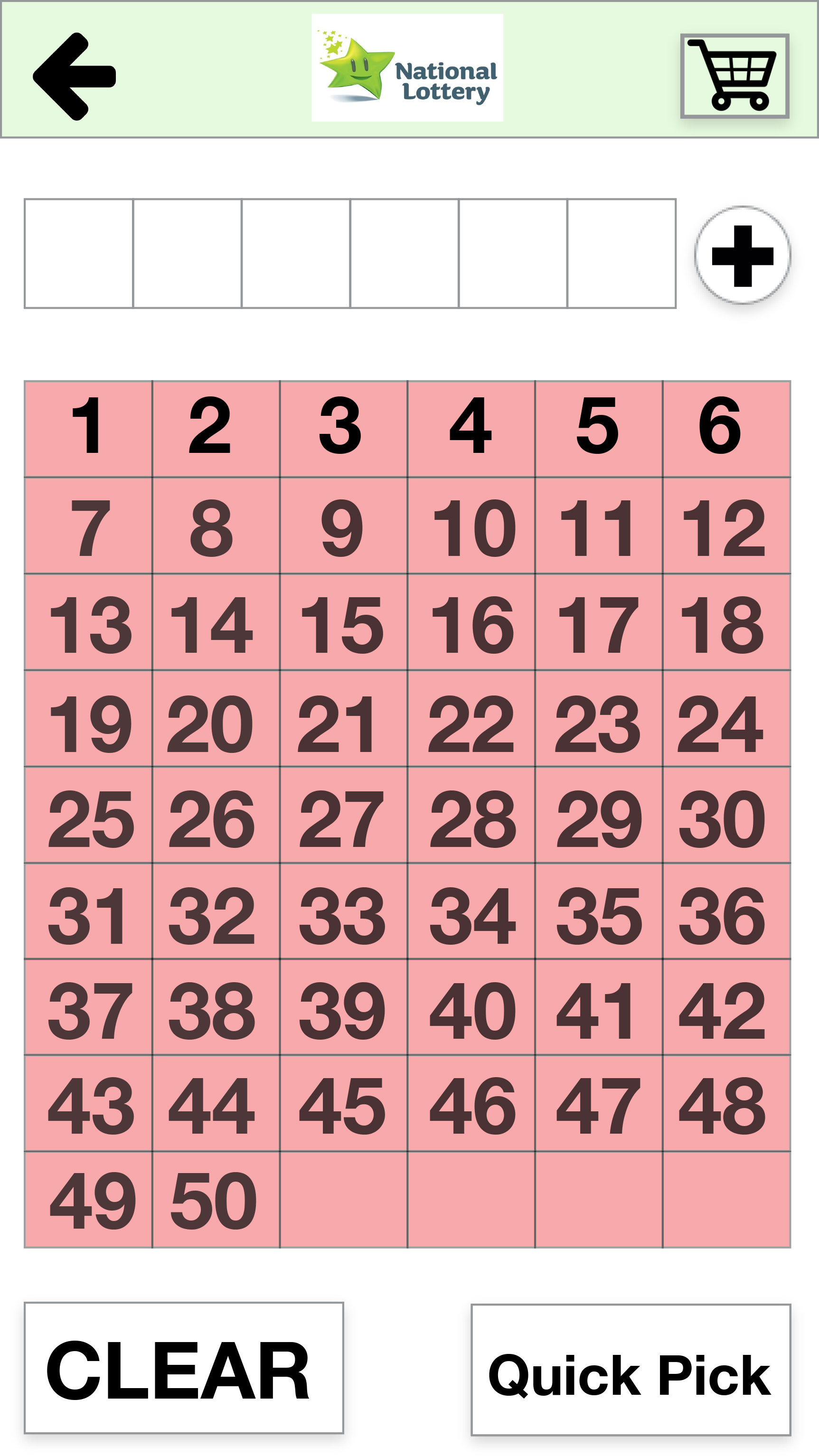
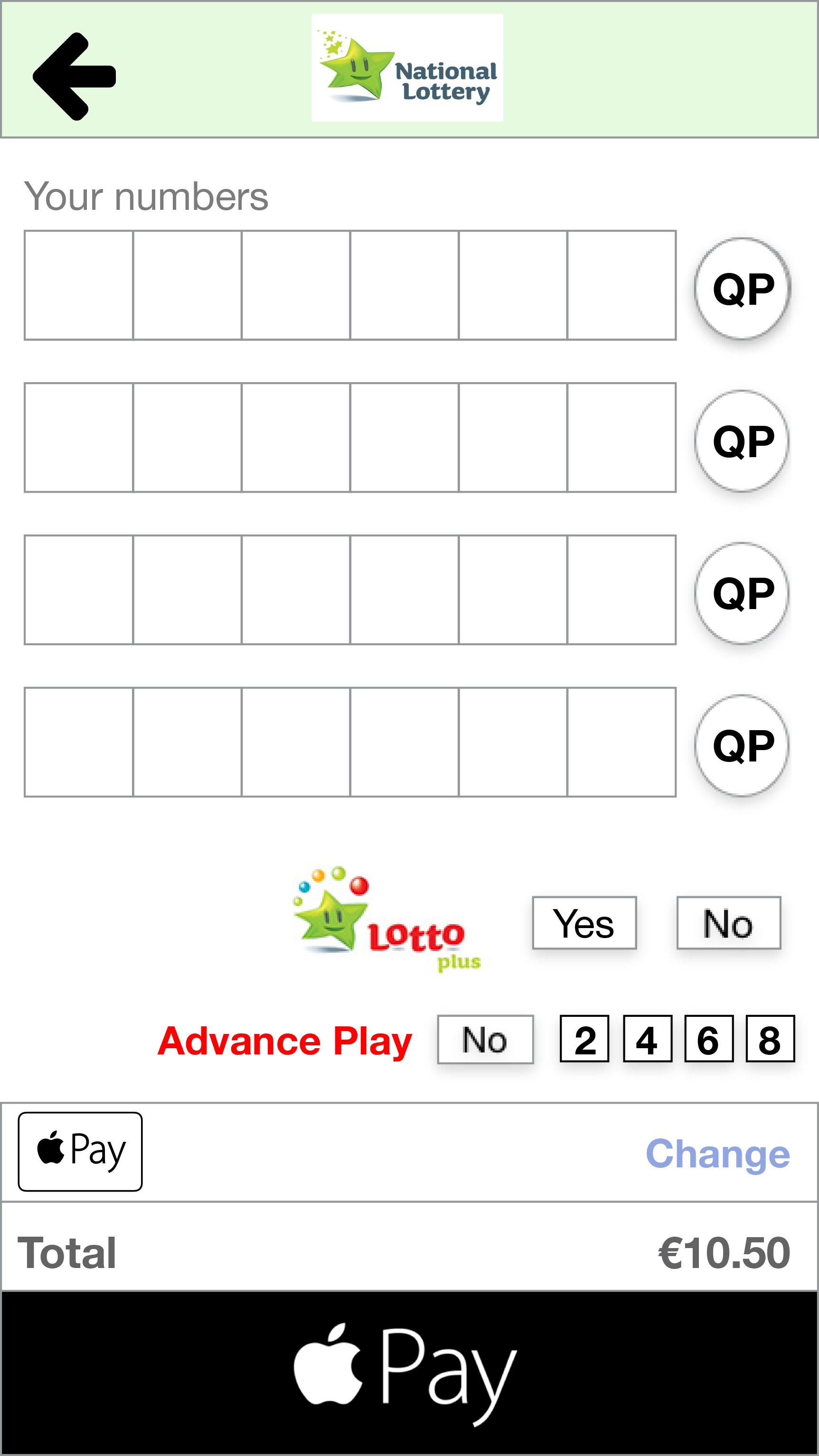
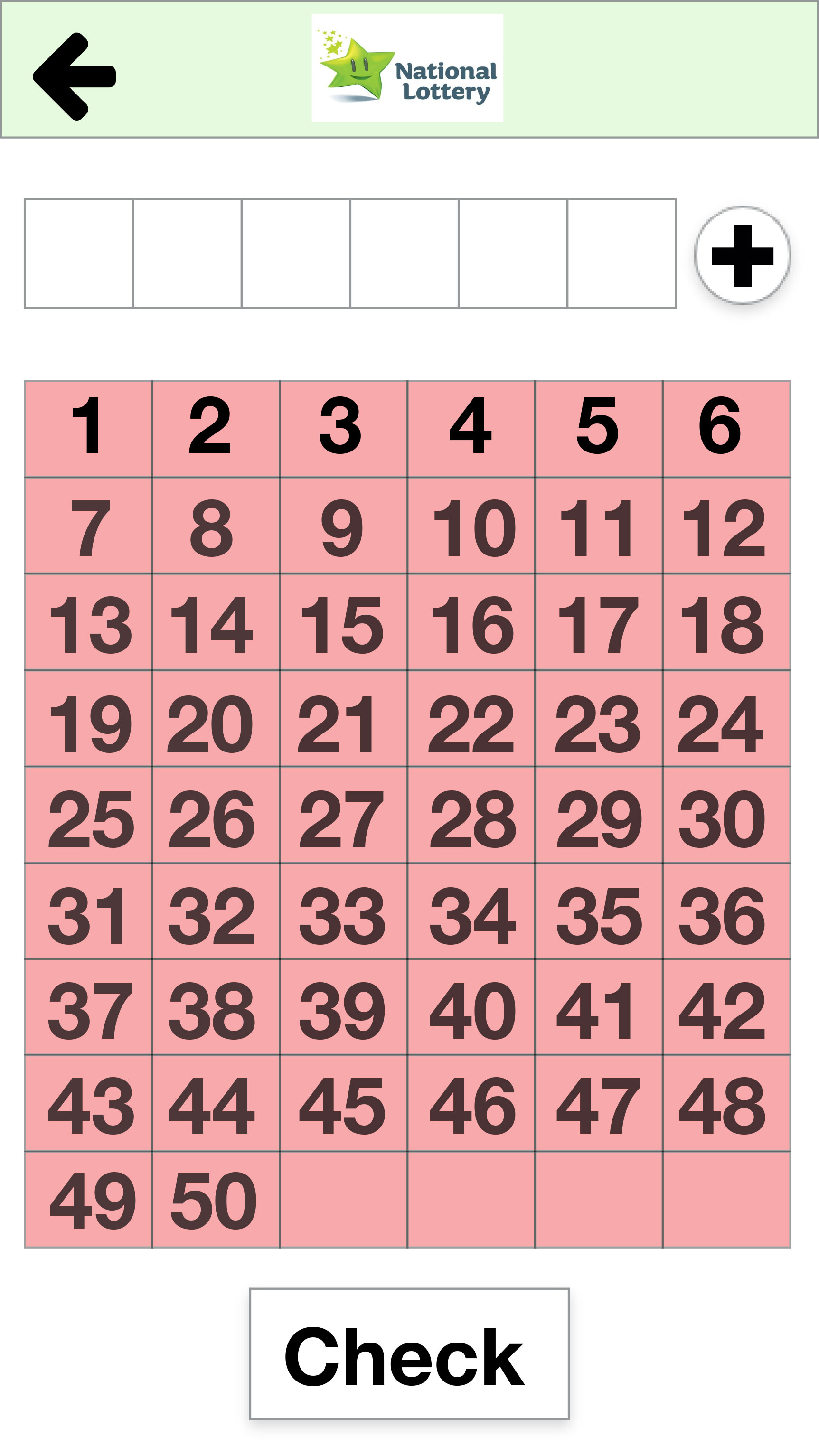
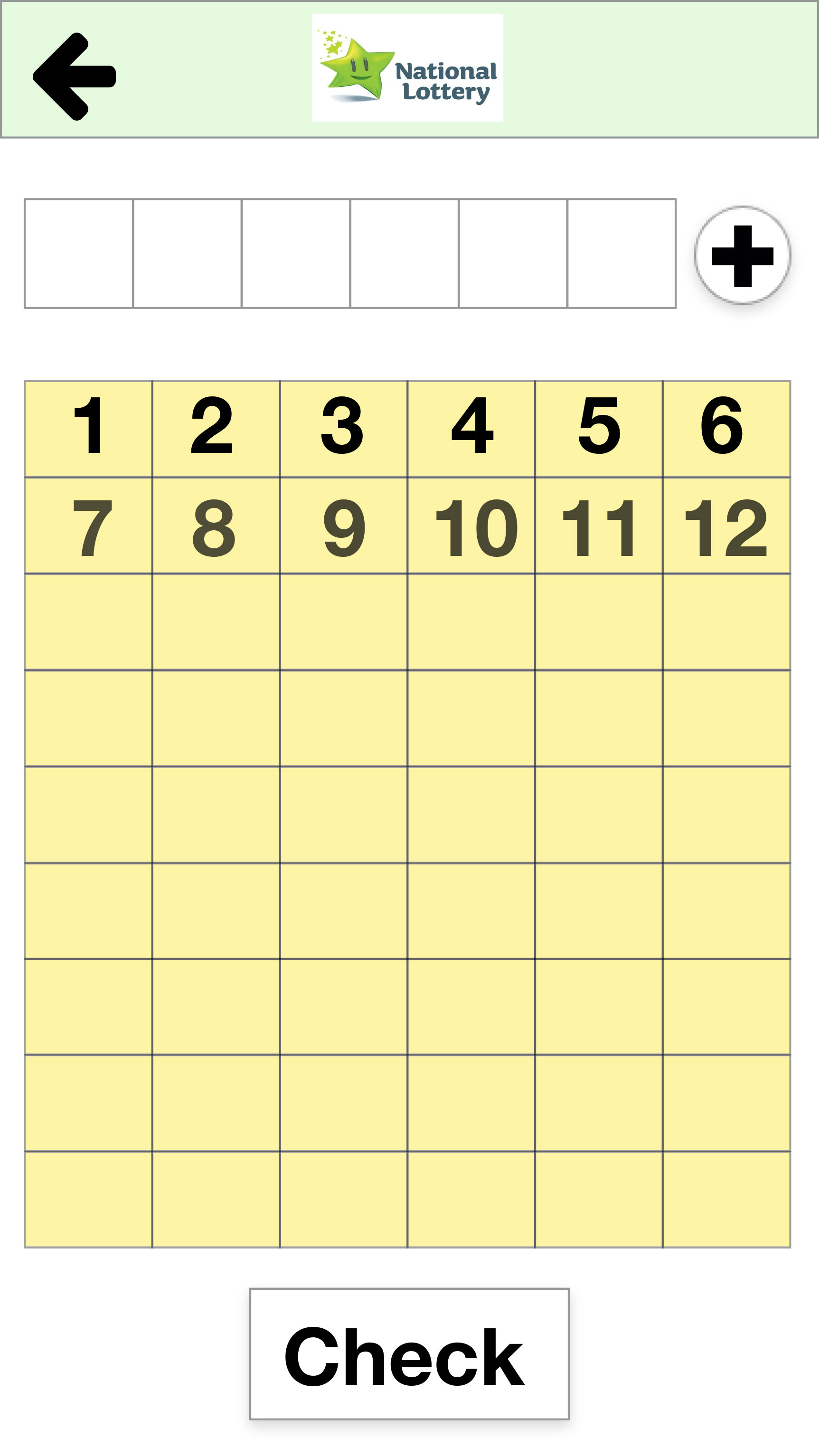
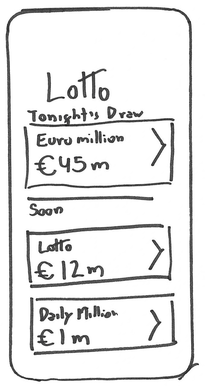
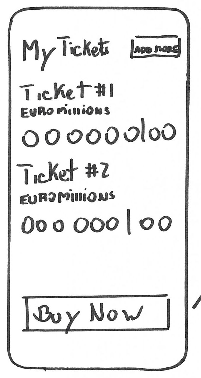
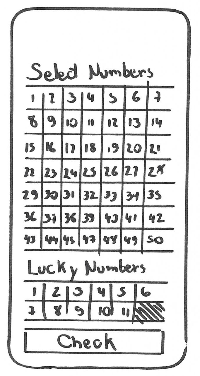
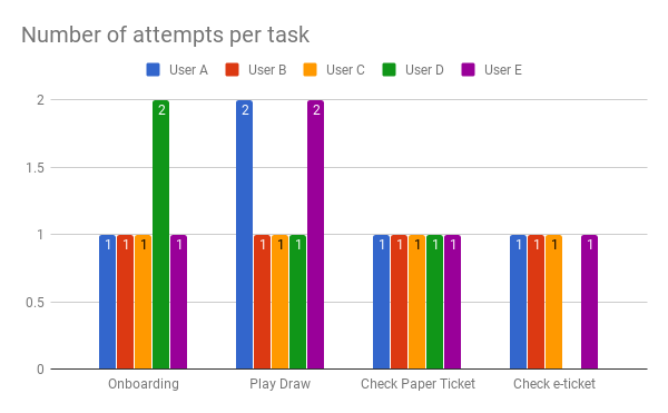
Play a draw
When asked to play, one of the users clicked on the burger menu.
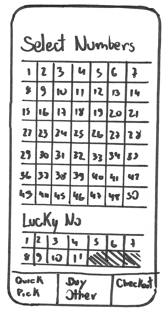
Users had no issues selecting numbers and adding lines to their basket on the heat-map but during the videos there was a certain hesitation about the correct procedure.
When the last screen was presented to buy the tickets, all users pressed the buy button.
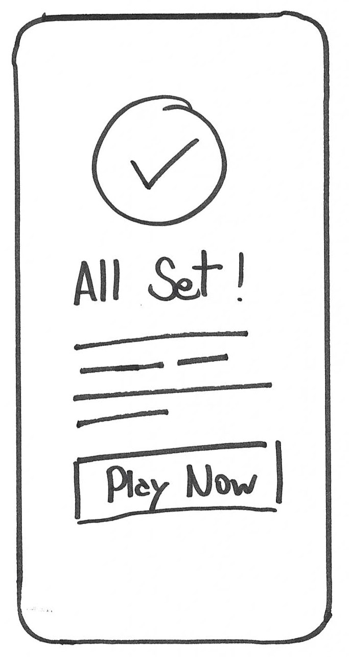
When asked about being notified about the game they just played, all users clicked in the correct button.
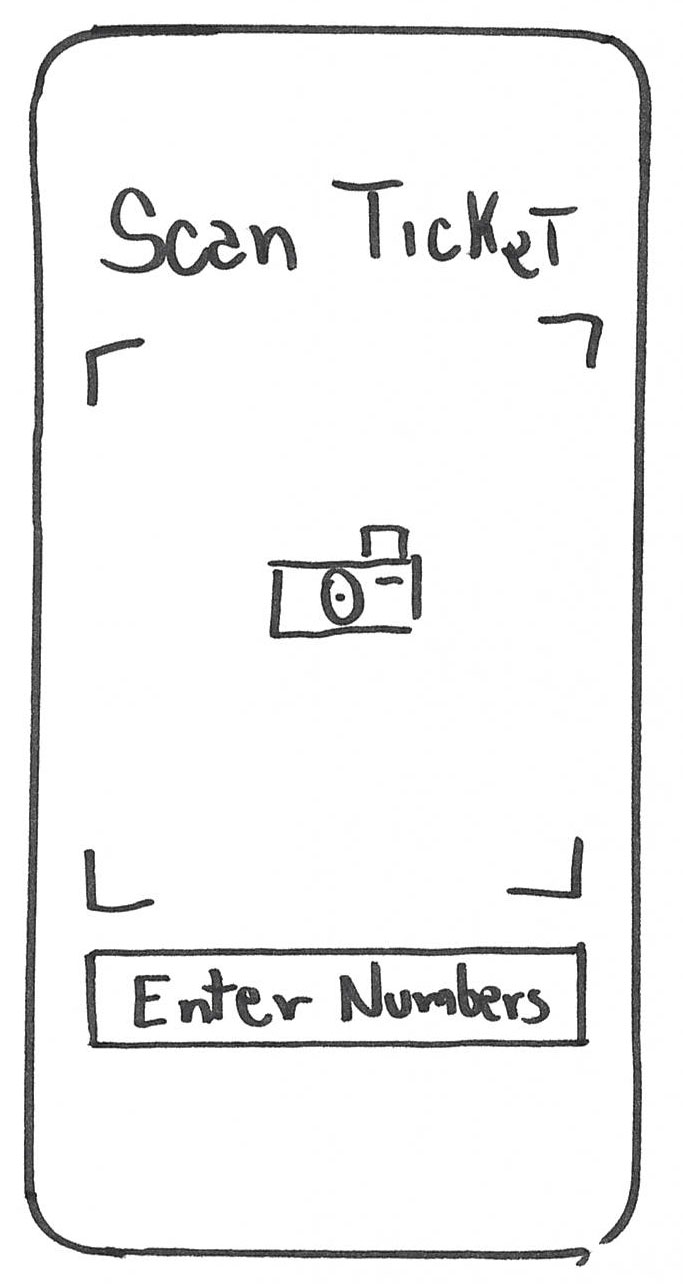
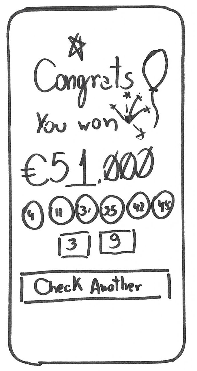
Check Numbers
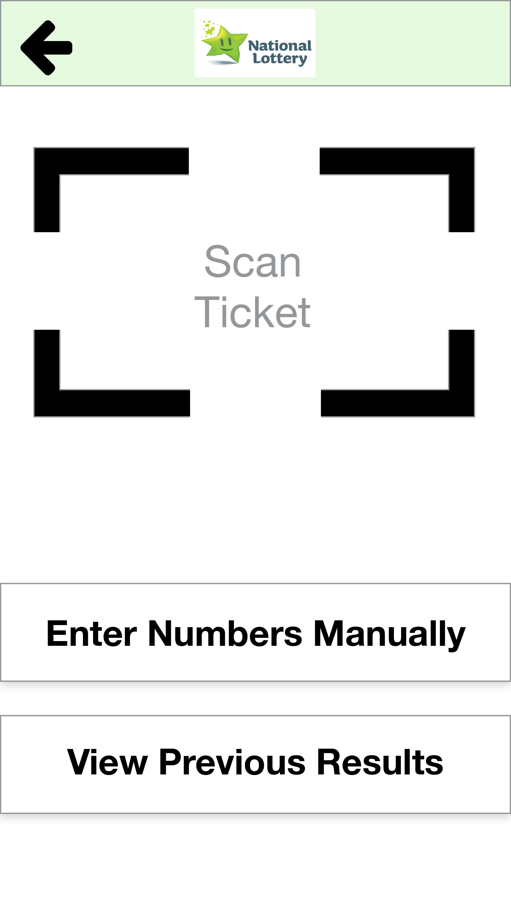
To check the numbers on a physical ticket, all users selected Scan instead of inputing the numbers manually.
When asked to check the e-tickets, they all proceeded to the Touch ID button apart from the only user that selected to add a PIN Number during the registration.
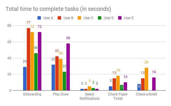
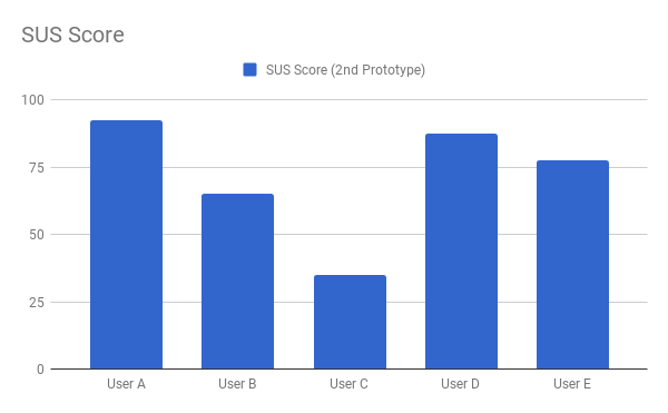
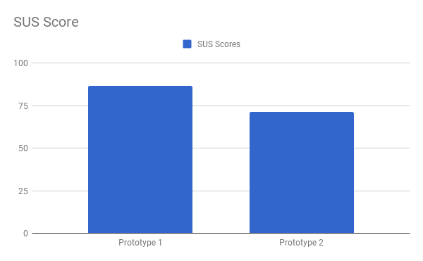
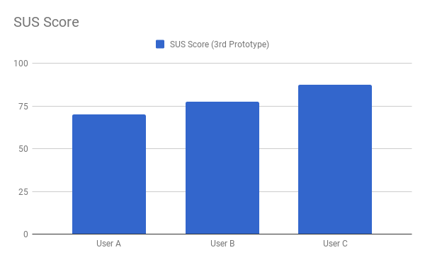
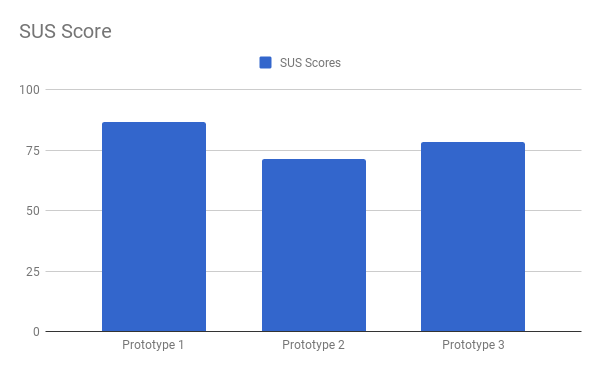
The responses of the SUS questionnaires were positive. For the Onboarding process, the users found the process easy and one user found that it was worth mentioning that the process to scan the card is a nice feature. A positive feedback also came from the Play Draw task and the Check Numbers task, “easy and fun” and “easy and straight forward” was one of the responses. The SUS score for this prototype was 86.5, well above 68, which is considered the average mark [2].
[1] Levey, Y. (2016, July 27). How to: Run a Crazy Eights exercise to generate design ideas. Retrieved from https://www.iamnotmypixels.com/how-to-use-crazy-8s-to-generate-design-ideas/
[2] Brooke, J. (n.d.). SUS – A quick and dirty usability scale. Retrieved from http://www.usabilitynet.org/trump/documents/Suschapt.doc
[3] Lewis, C. H. (1982). Using the “Thinking Aloud” Method In Cognitive Interface Design (Technical report). IBM. RC-9265.