
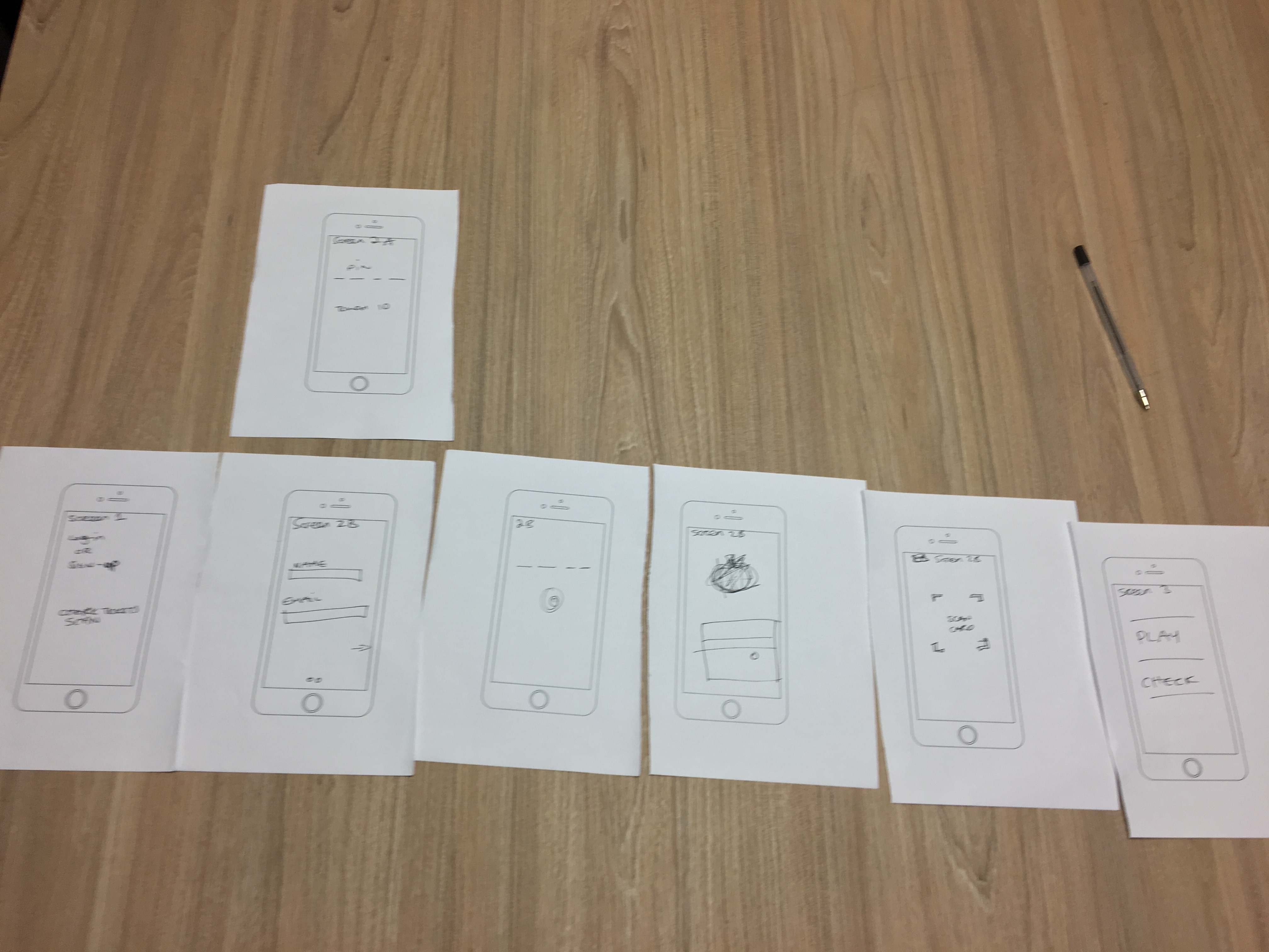
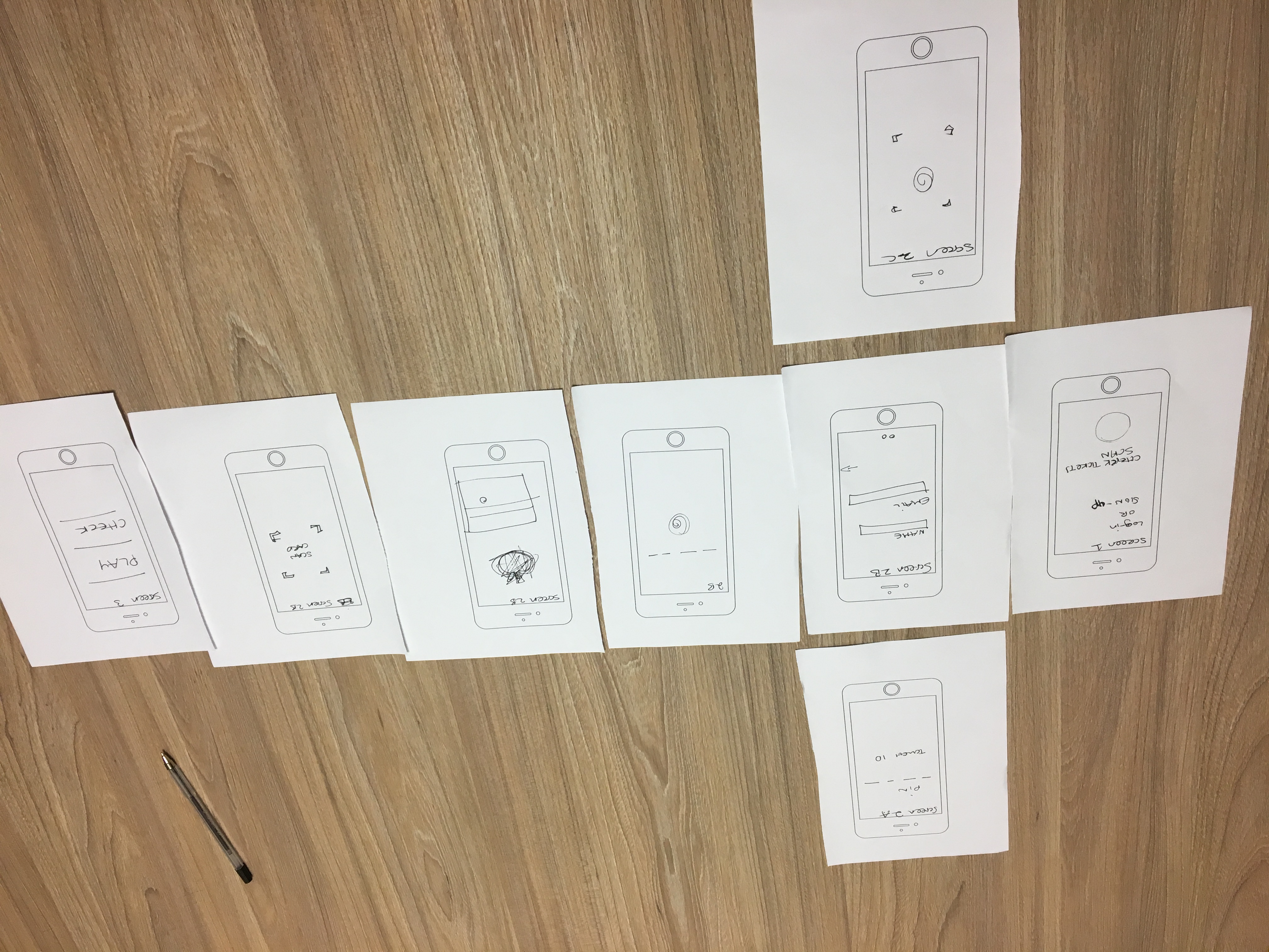
Preparing Second Prototype
After the analysis of the user feedback and the questionnaire, we gather the information and the pain points found during the iterations and started to brainstorm for the second prototype.
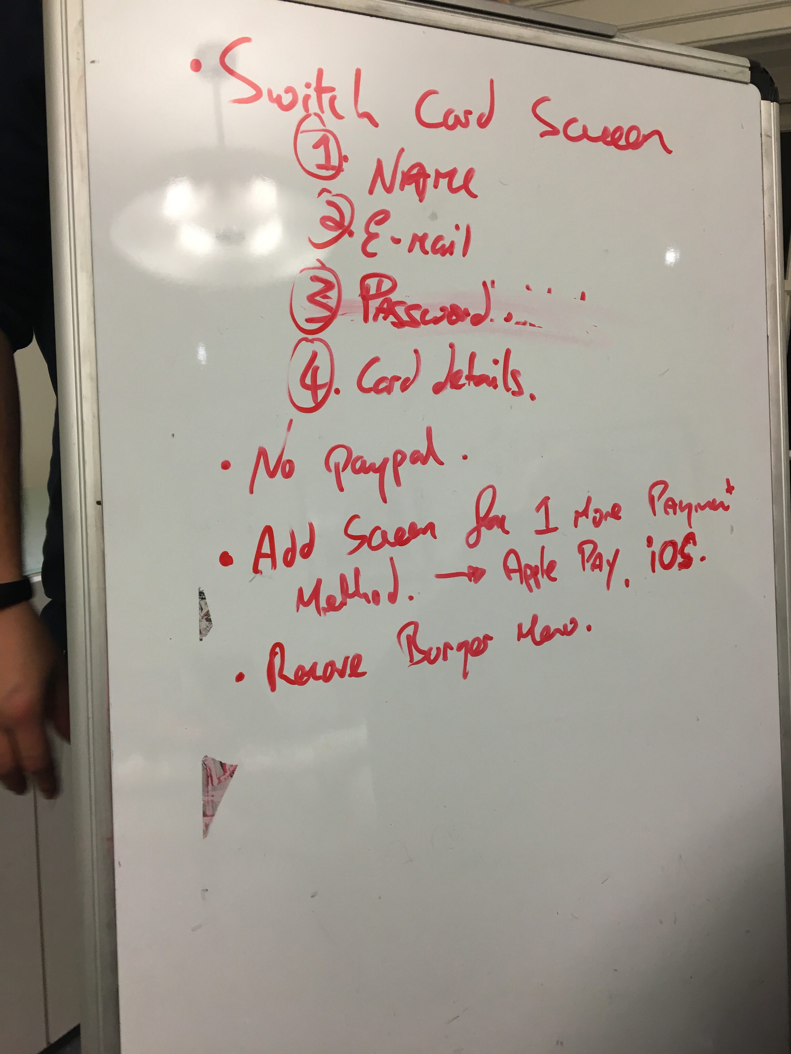
For the pain points of the first iteration, we had many clicks on the burger menu that was unnecessary and could be removed. Users also went with a debit/credit card payment instead of an alternative payment method but also placed payments with Apple Pay, so we decided to keep that.
During the onboarding process, many users were surprised that the first screen was asking for a payment method, so we switched the onboarding process to ask for Name and E-mail first, Password and then finally Card Details. The results screens were sequenced in the example videos below.
User Iterations
We ran a total of 6 tests for the second prototype. We decided to run with paper prototypes for the second iteration, placing the screens in front of the user one by one. Again, before the interviews, we asked users to sign a consent form. The videos were shot with our phones on a support and pointing to the paper prototypes in a table.
All videos can be seen here:
User A: Onboarding | Play Draw | Check Numbers
User B: Onboarding | Play Draw | Check Numbers
User C: Onboarding | Play Draw | Check Numbers (Part 1 / Part 2 / Part 3)
User D: Onboarding | Play Draw | Check Numbers (Part 1 / Part 2)
User E: Full Test
User F: Onboarding | Play Draw | Check Numbers
Analysis
After watching the videos, we created a heat map of the clicks performed during the interview for each screen, adding small notes to clicks that were performed by mistake or were designed to have another behaviour than expected by the user.
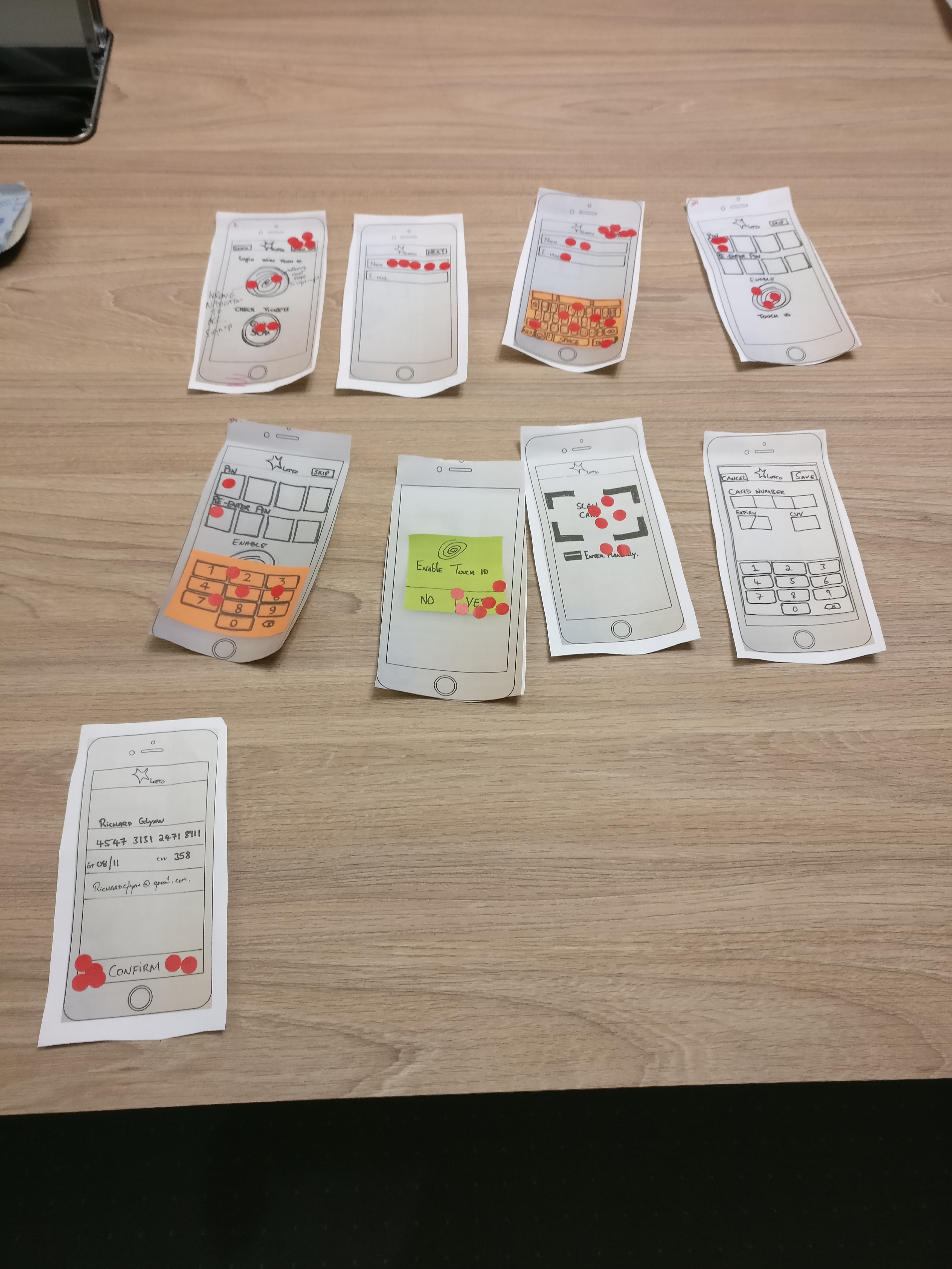

Below are the highlights and issues found during the process.
- User A missed next button on entering the name and email screen.
- User A incorrectly navigated to add a line of Quick Pick.
- User B clicked on Touch ID icon in order to sign up.
- User C says it would be important to have PIN and TouchID in order to log in as she previously burned her finger.
- User C got confused when adding multiple Quick Pick lines, she would have preferred to be prompted for how many Quick Pick lines she wants to buy.
- User C had to skip the adding line process as she could not figure out how to proceed.
- User D clicked on the wrong button in order to Sign Up.
- User D is confused by the feedback icon to indicate how many lines have been added
- Used D wants some sort of feedback when checking tickets bought via the app.
- User E found confusing to add Quick Pick lines.
- User E did not understand the use of the pop-up screen.
- User F found confusing the play draw process, did not know where to click and how to proceed.
- User F hesitated over what to do on the final payment screen.
- User F was not sure where to click when checking out numbers of previously bought tickets. The full data can be seen at this link.
Data is Beautiful
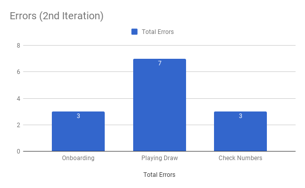
The graph below shows the numbers of errors found throughout the tasks being performed.
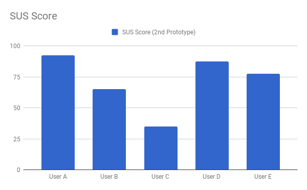
The graph below shows the SUS Score per each user.
The graph below shows the average SUS Score of the first prototype and the second prototype.
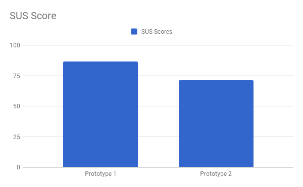
Our SUS Score decreased from the first prototype to the second prototype, we got a SUS Score of 71.5, above the average 68 but slightly. We believe there are two main reasons for the huge decrease from 86.5 to 71.5, one of them could be that the first iteration was done using Marvel, which allows us to add our paper prototypes into a mobile device. When users click on an area that is not set, Marvel highlights the possible actions in the screen, which allows the user to go ahead and complete the tasks. The other reason is one of the users that tested our prototype was confused during the Play Draw task, which will be discussed below. This particular user gave us a total SUS Score of 35, if we eliminate the lowest SUS score and the highest SUS score, our score goes to 76.7, which is still below our first mark.
During the evaluation of the Onboarding and the Check Number tasks performed by the users, the errors were mainly related to button text labels and button placement.
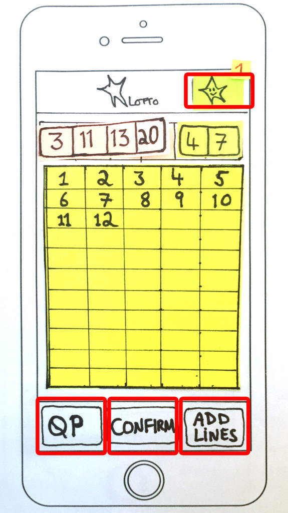
The Sign-Up button at the top of the screen (Fig. 1) made some users hesitate when asked to Sign-Up for the Lotto App. The Quick Scan button also confused users that bought their tickets online.
 Fig. 1. Misleading labels and misplaced buttons.
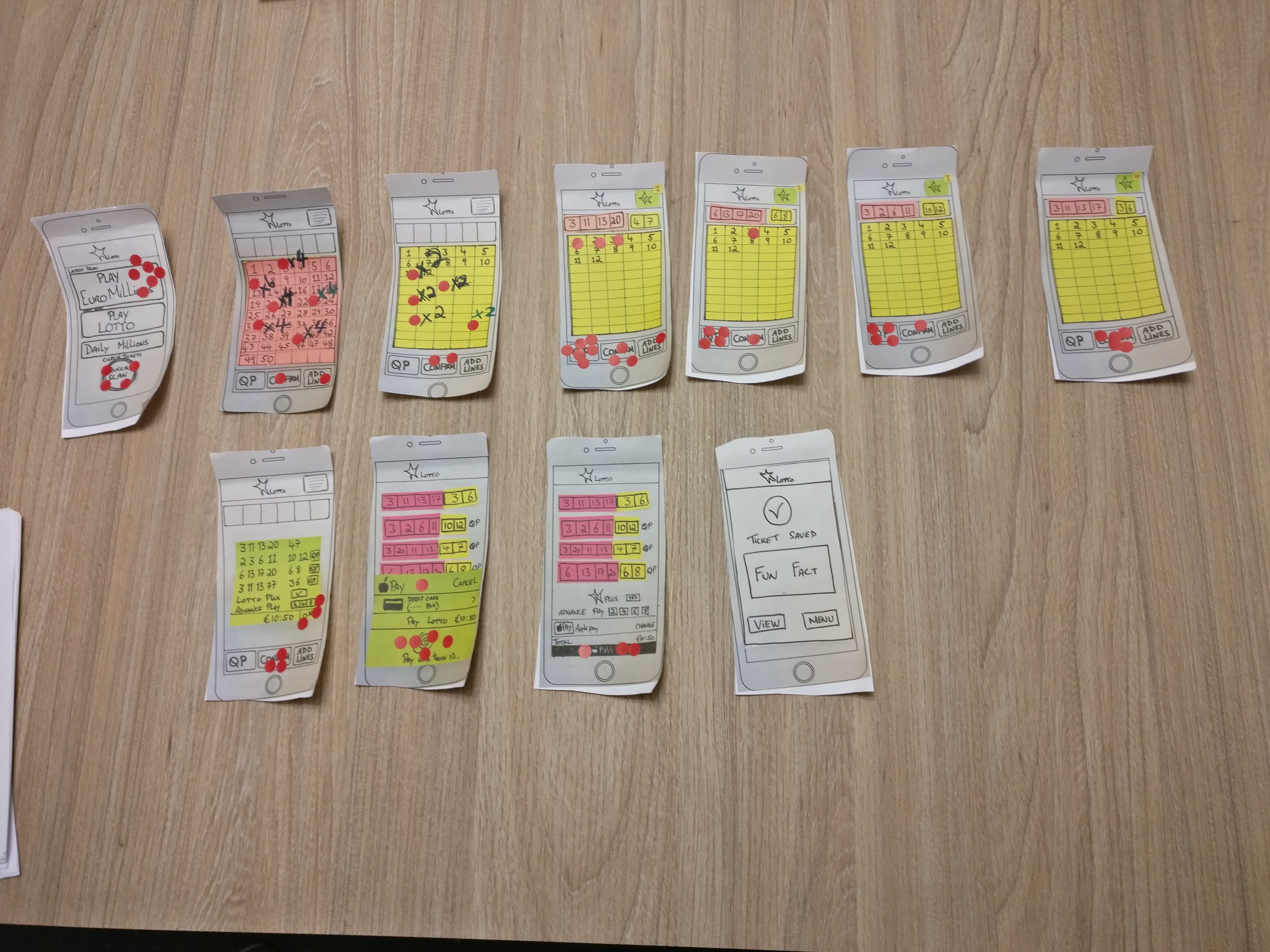
The main errors occurred during the Play Draw task (Fig. 2), there were too many buttons with misleading labels that made the users confused.
After the test, we applied a questionnaire based on the System Usability Scale and the responses can be seen here.
For the Onboarding screens even though there were mistakes the users responded positively, none of the users gave a bad feedback when asked what they thought about the account setup. It’s interesting to note that for the Onboarding task, all users, even the ones that had issues during the Onboarding process, commented that the process was easy. The same for the checking numbers functionality, where 4 users mentioned it’s easy to understand and one user got confused with the e-ticket functionality.
When asked about the playing draw functionality, the answers were more critical: “The usability was a little complicated, I couldn’t understand which button was to Save (confirm) the row, and which to get a new row. Probably, the names can be improved.” said one of them, and the majority of the answers mentioned that there was a certain confusion as to where to click when adding lines, buying tickets, selecting the Quick Pick and navigating to the checkout screen.