
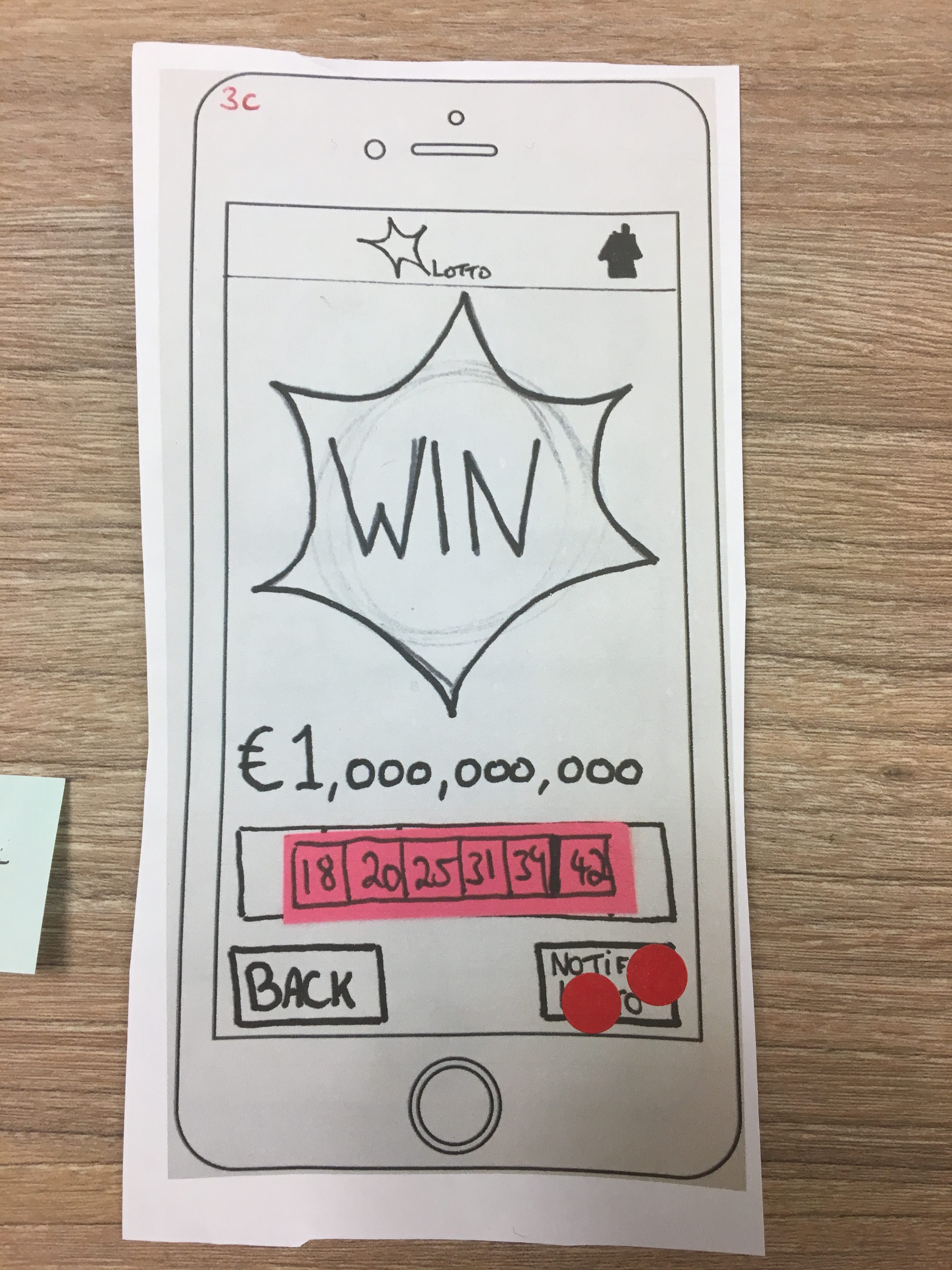
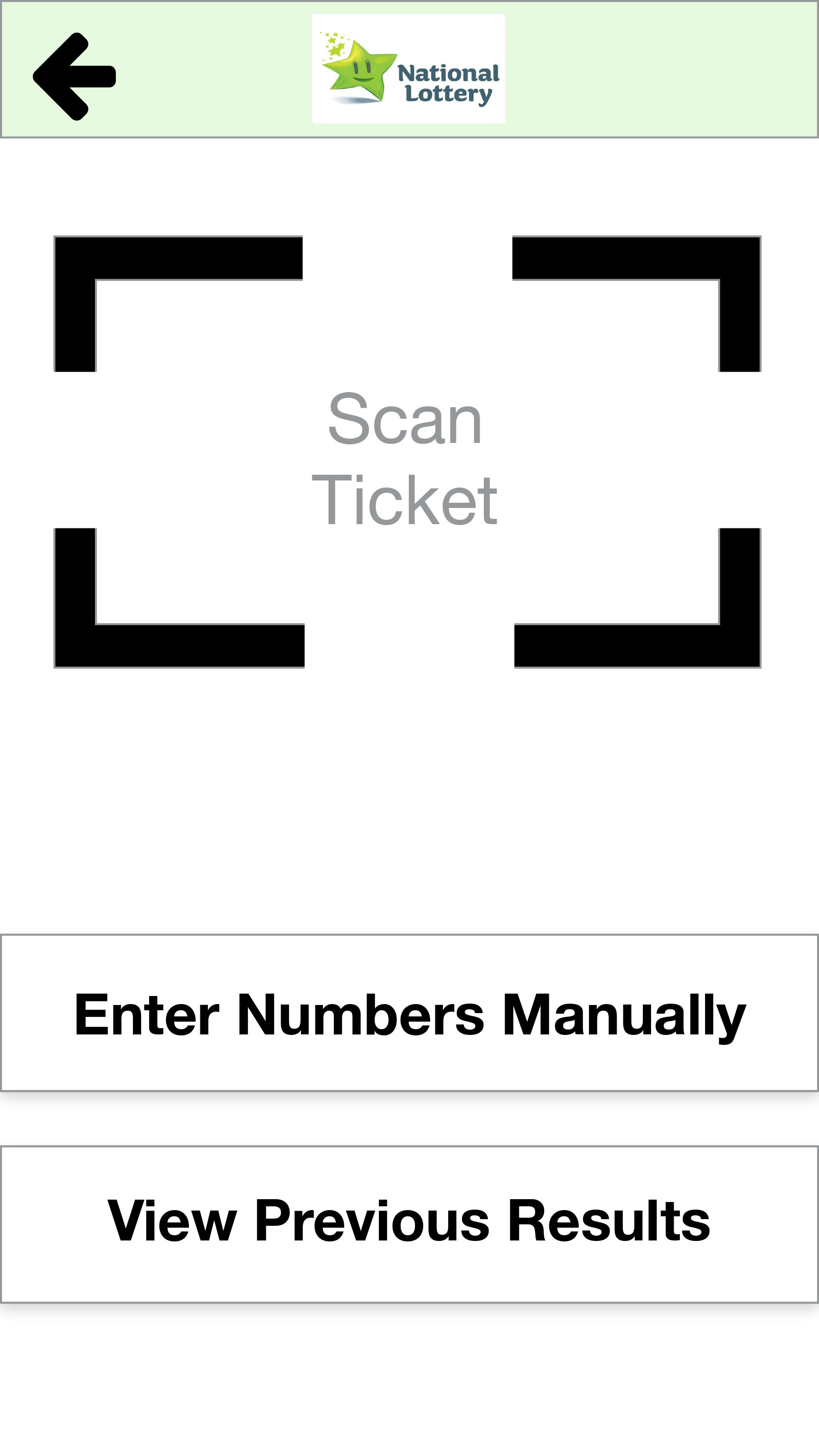
After the analysis of the second prototype, the area that needed more attention was the Play Draw task. This is the main functionality of the app and it is a core functionality for the success of the Lotto app according to the goals of our Personas.
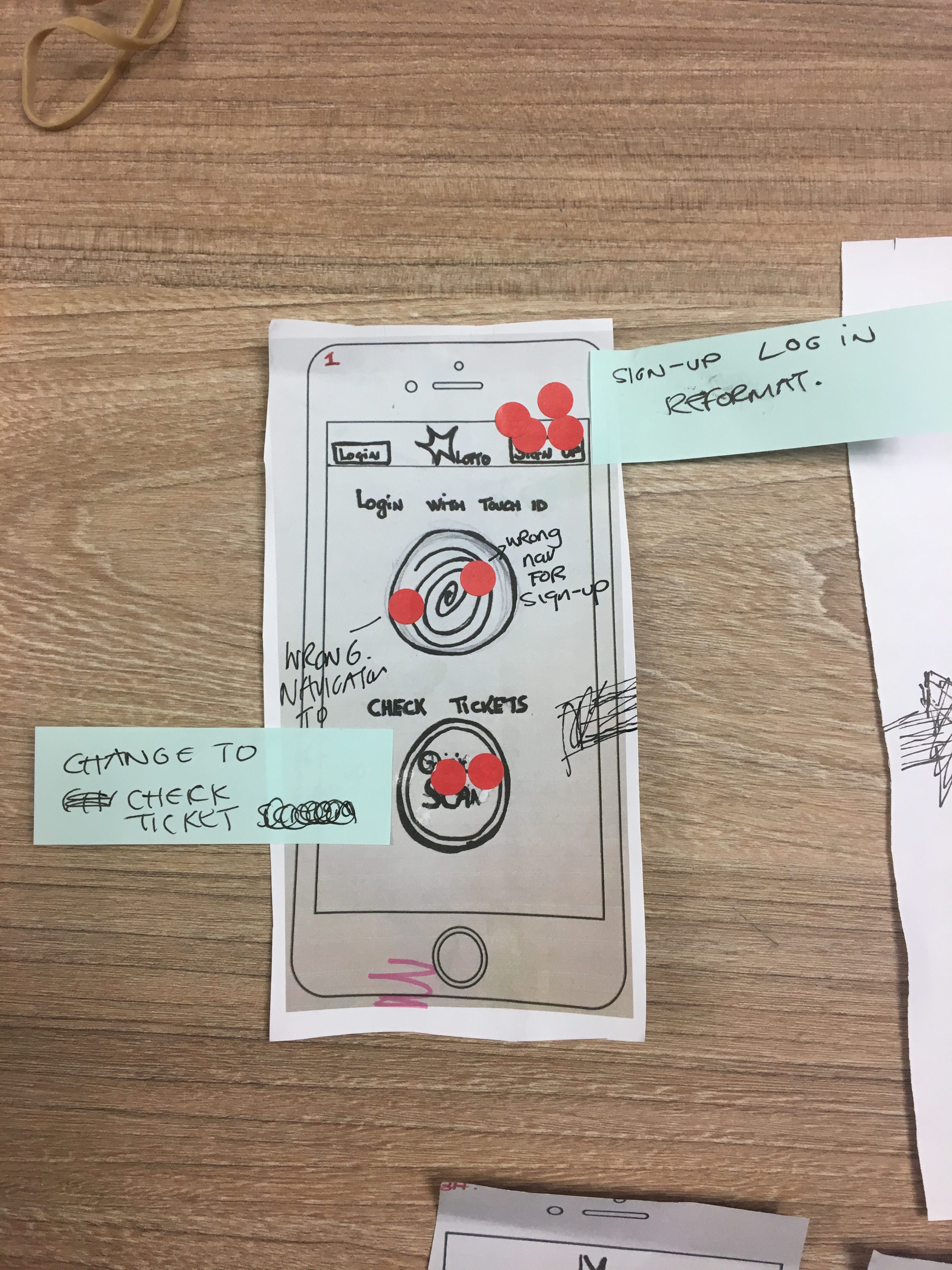
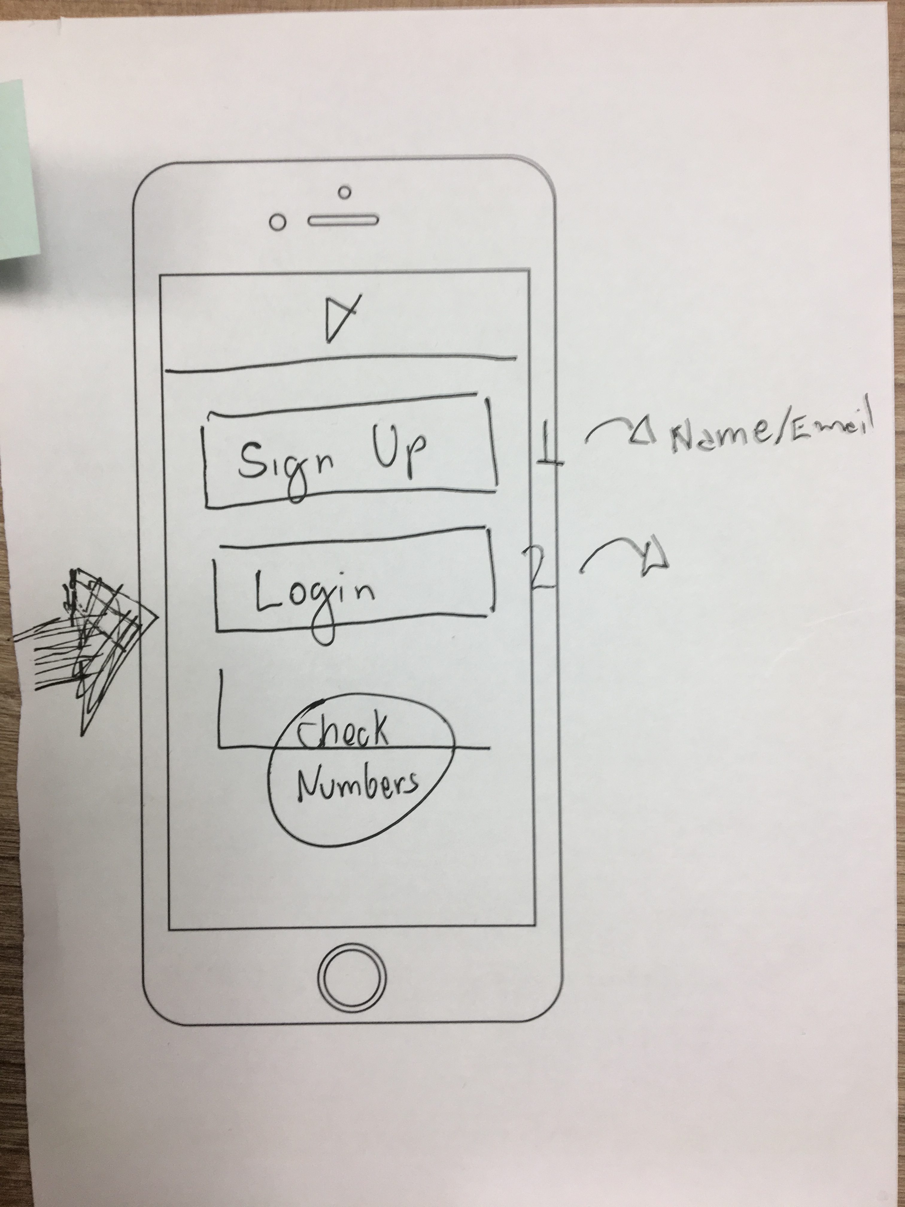
During the brainstorm session, we sketched a few ideas on how to solve the main issues that arose during the last iteration.
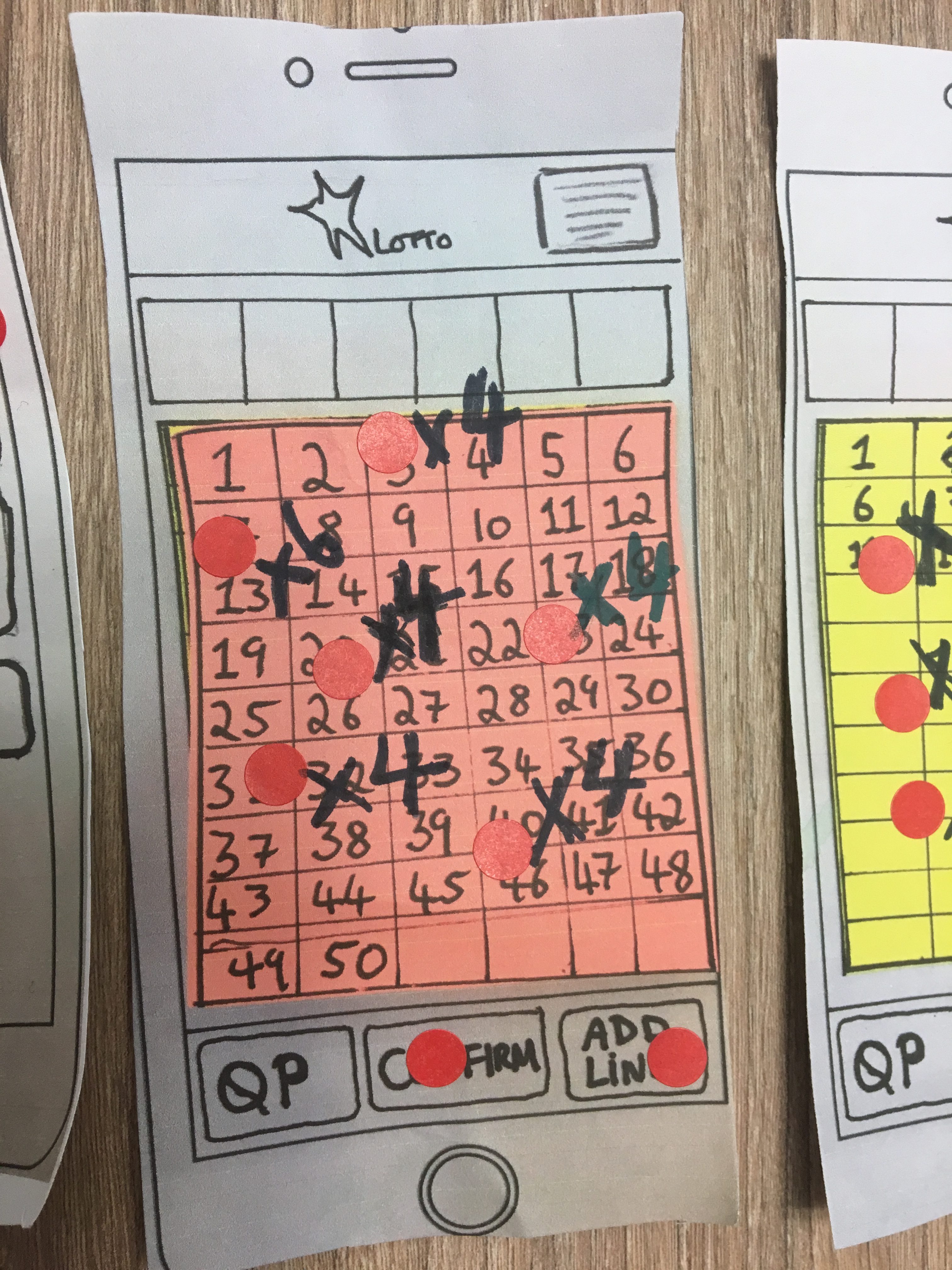
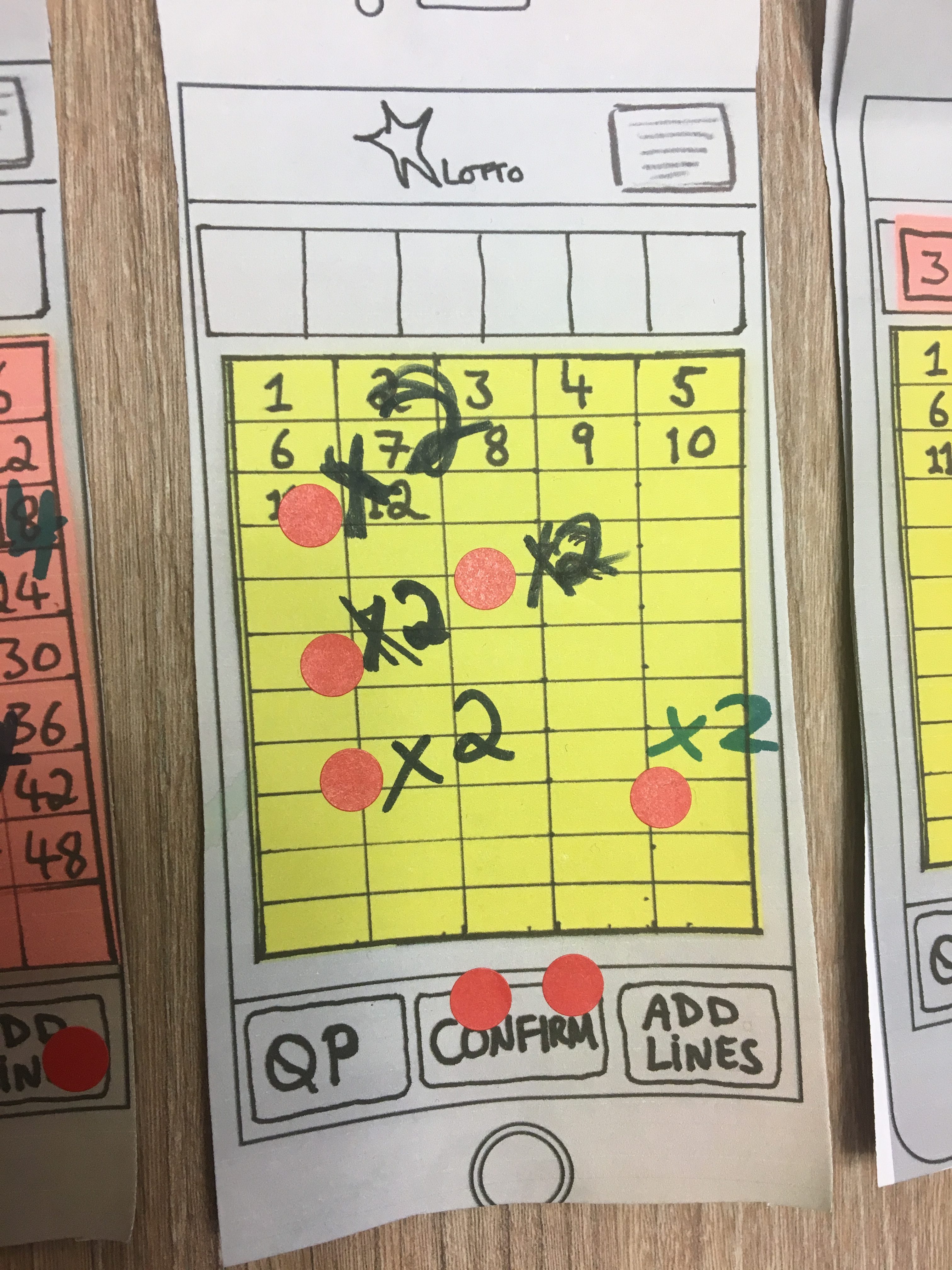
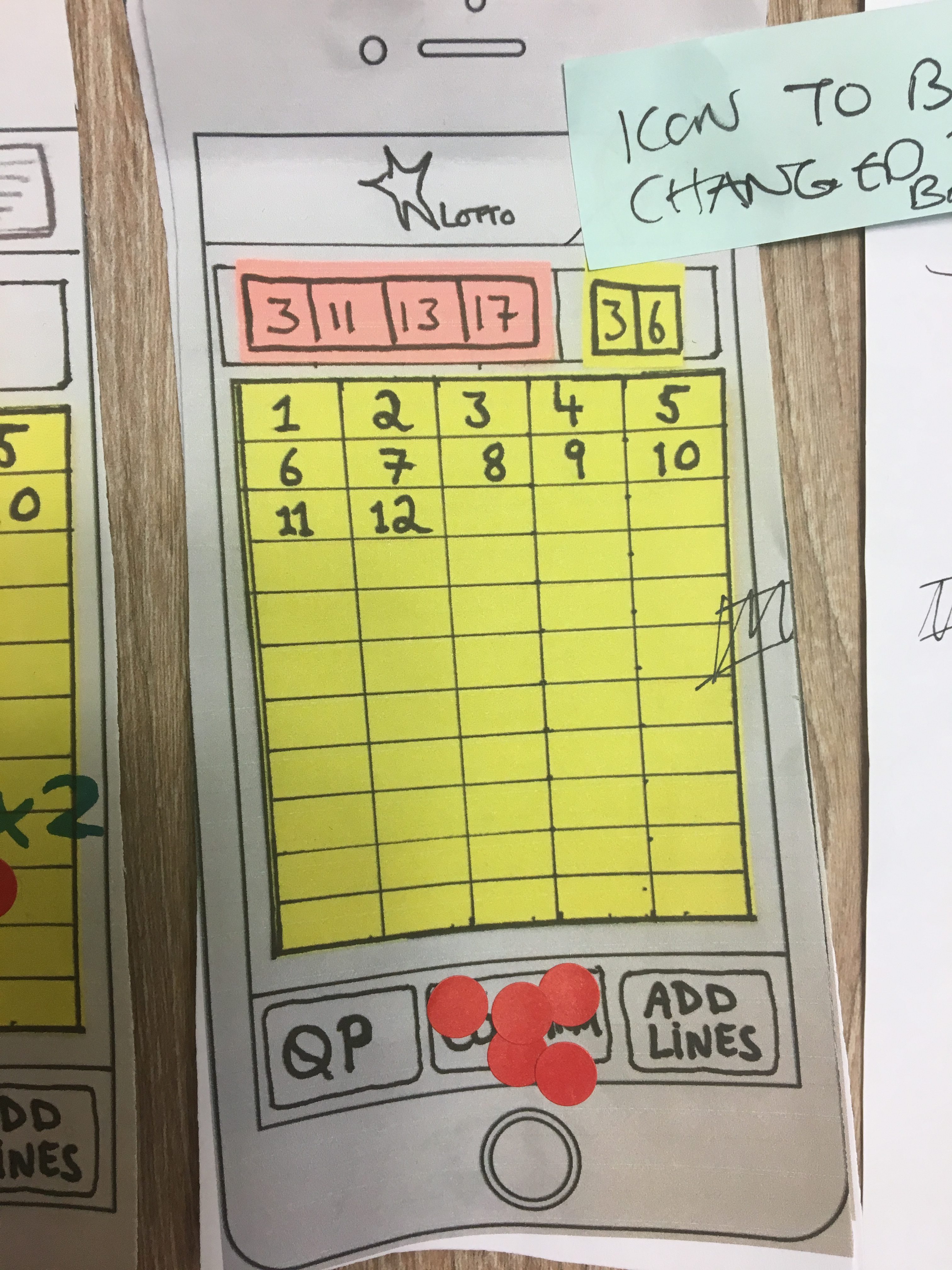
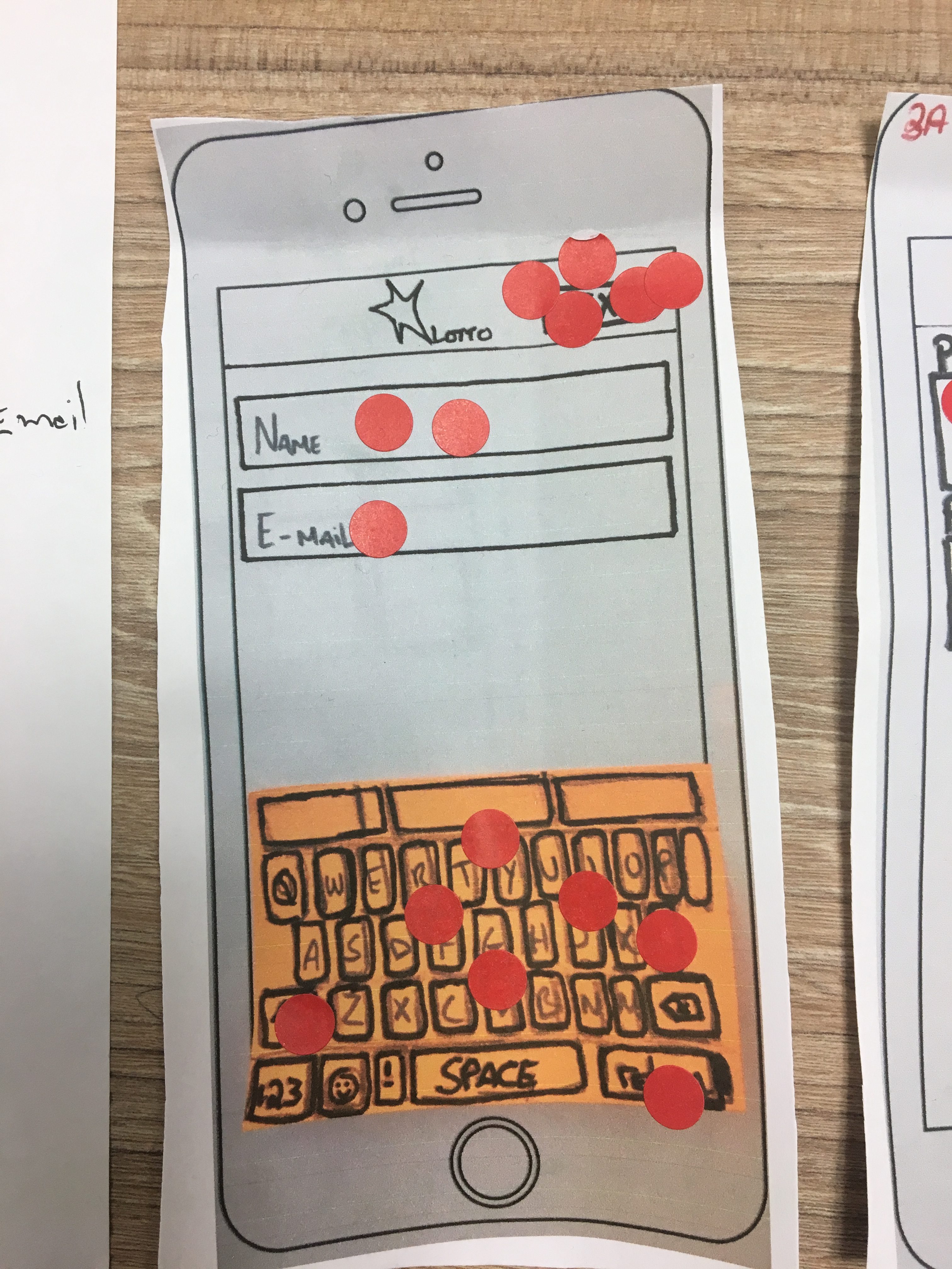
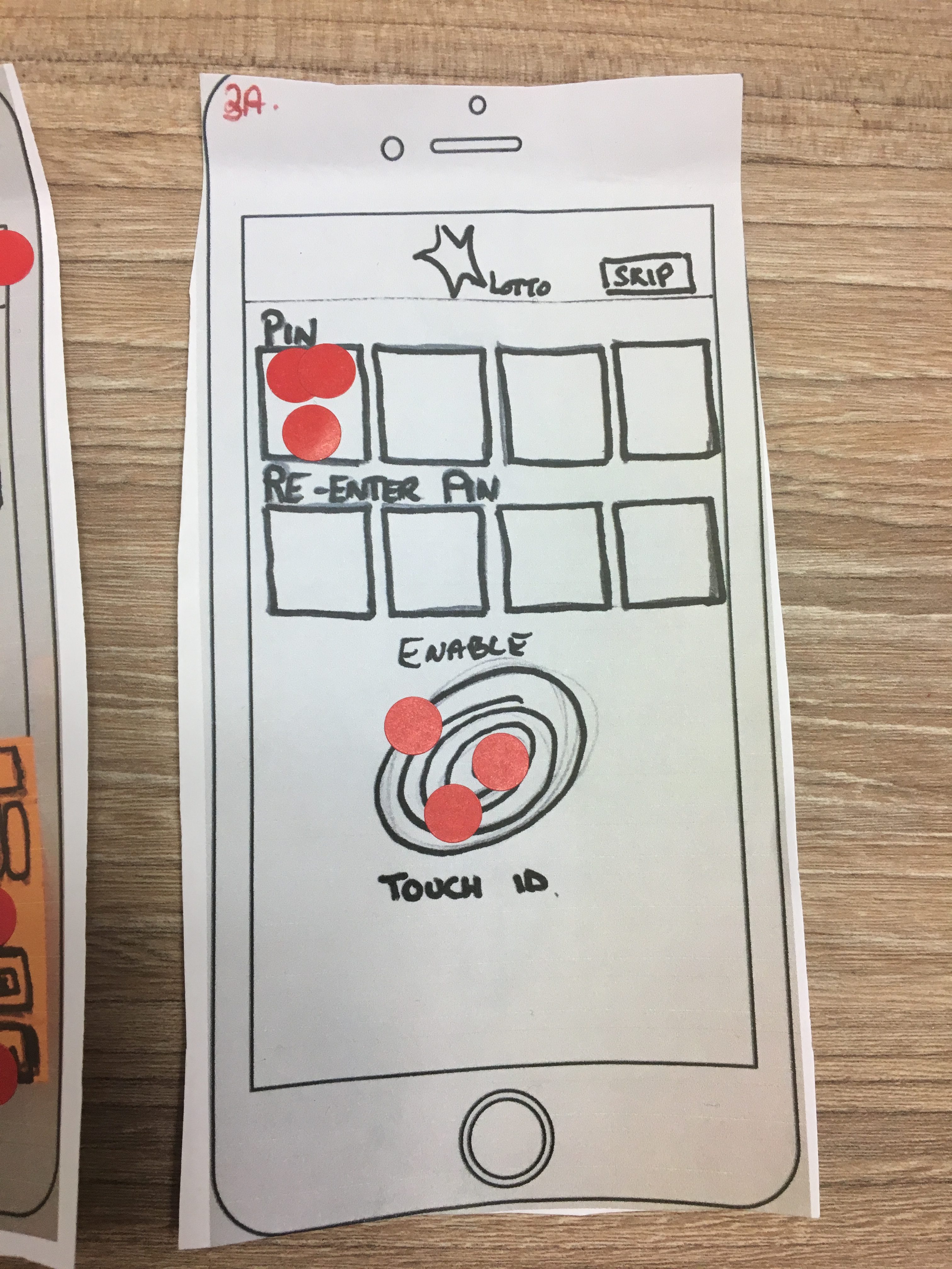
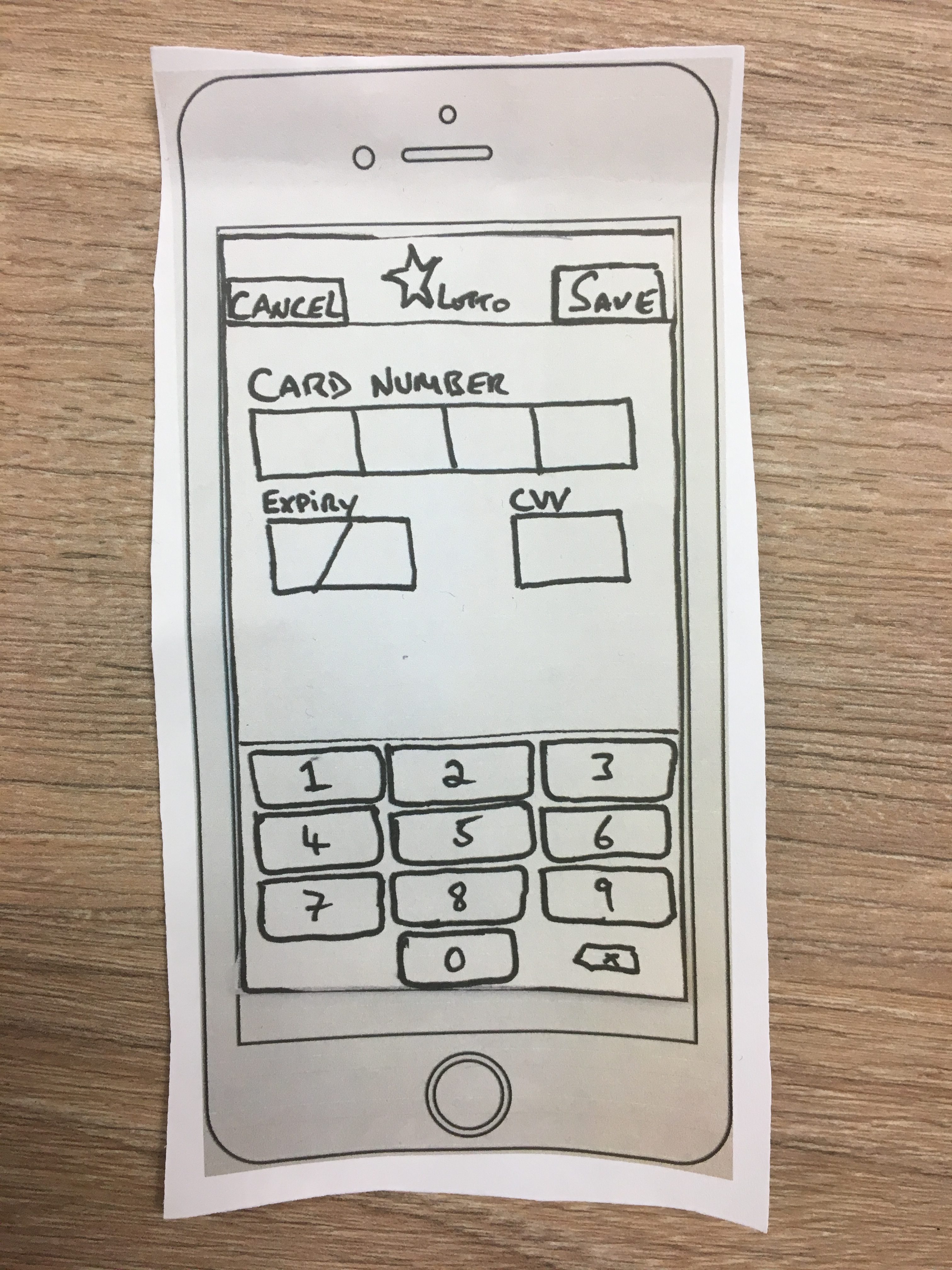
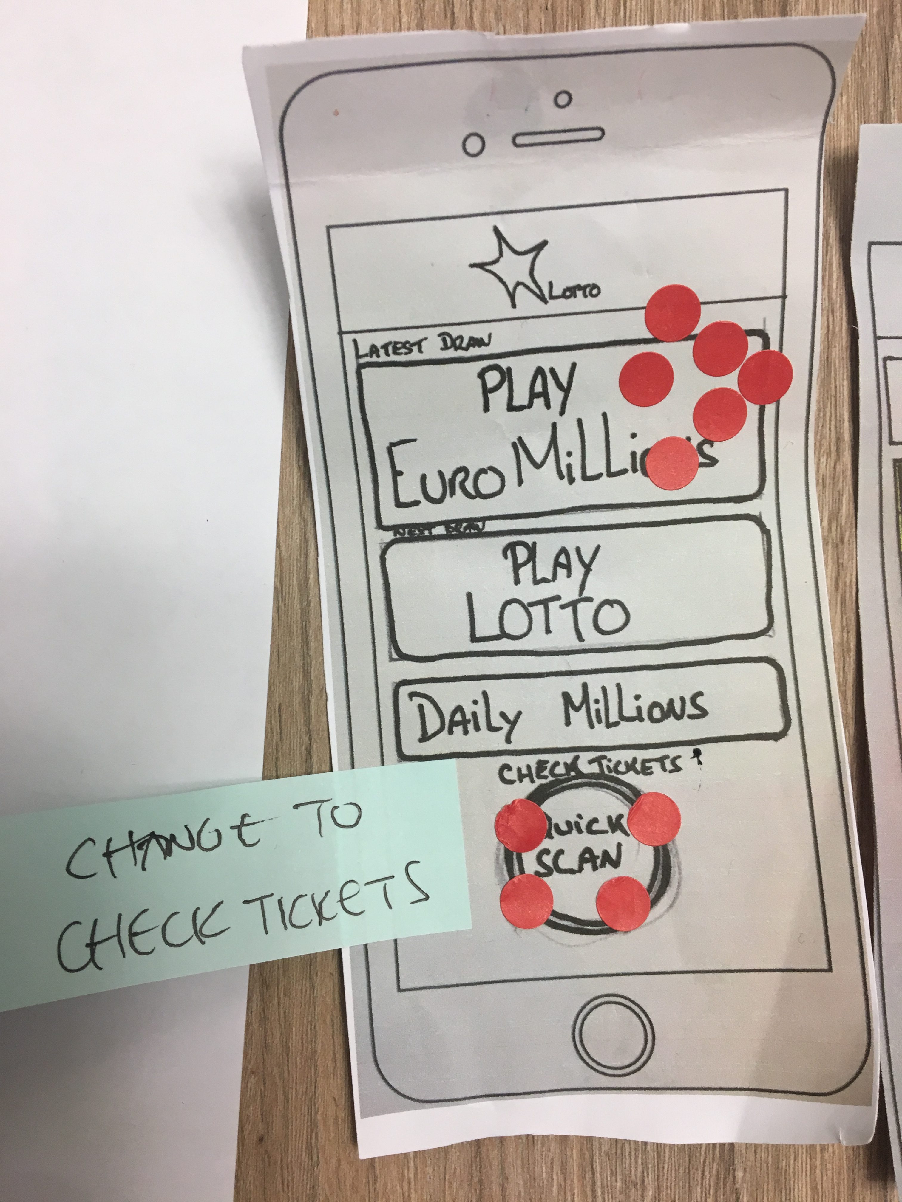
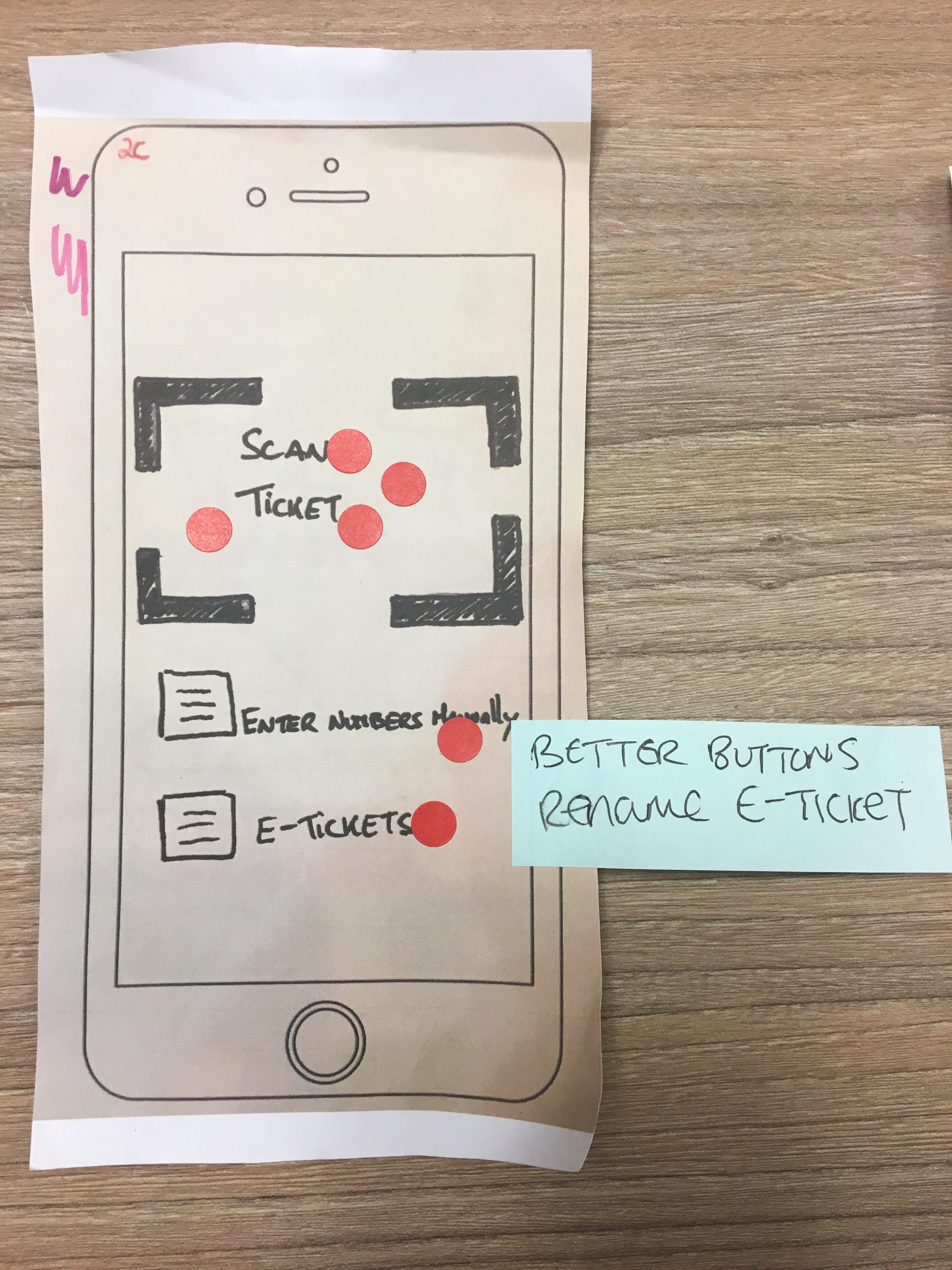
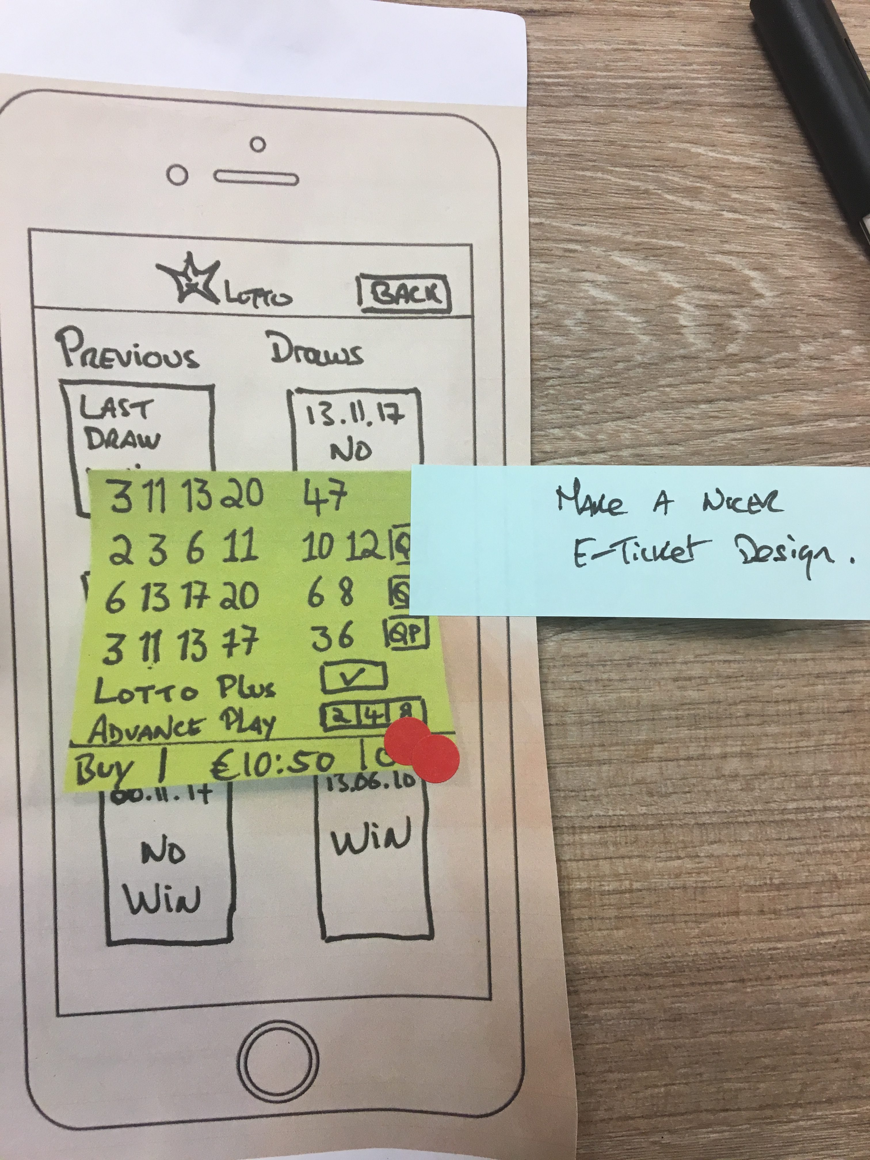
These are the sketches that came up with annotations as to what we will change for the 3rd Prototype based on the last iteration.
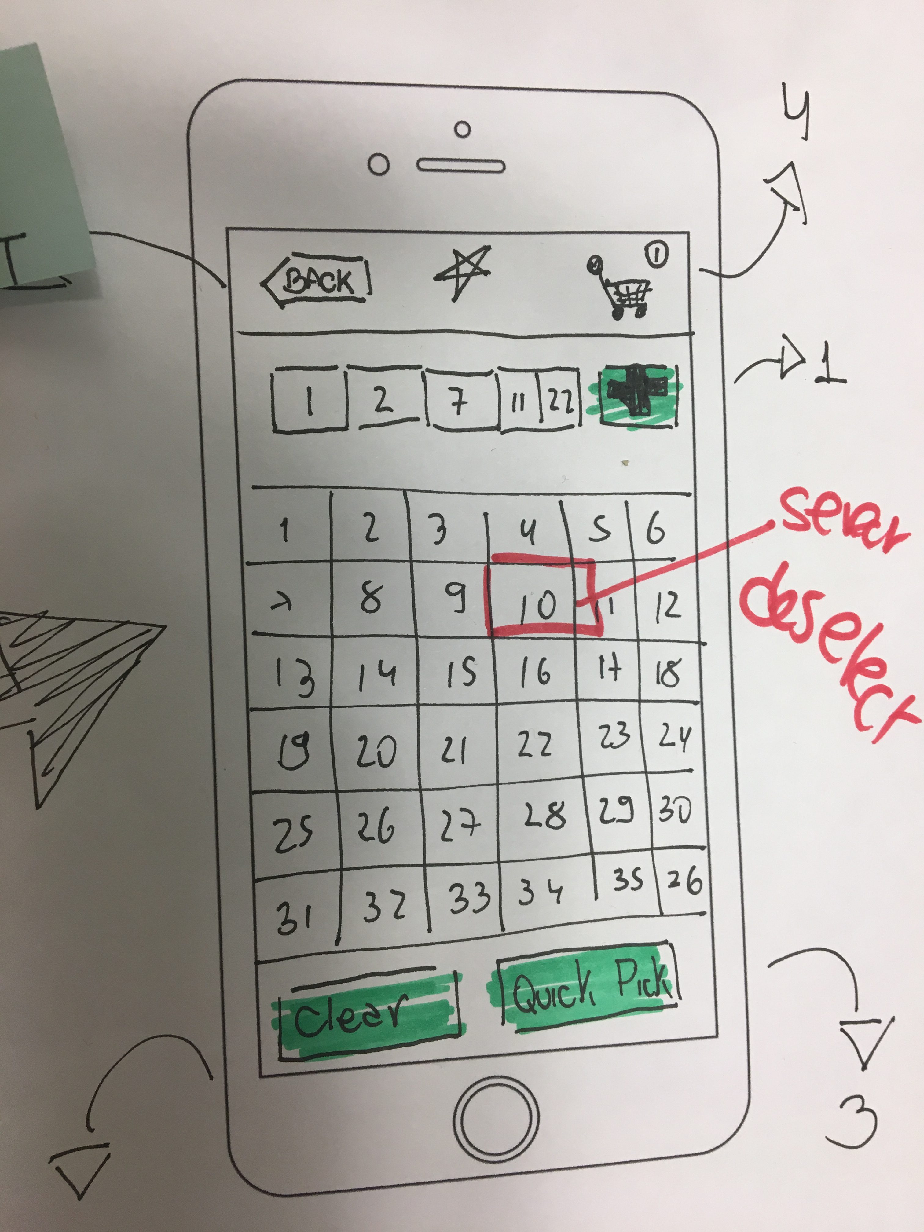
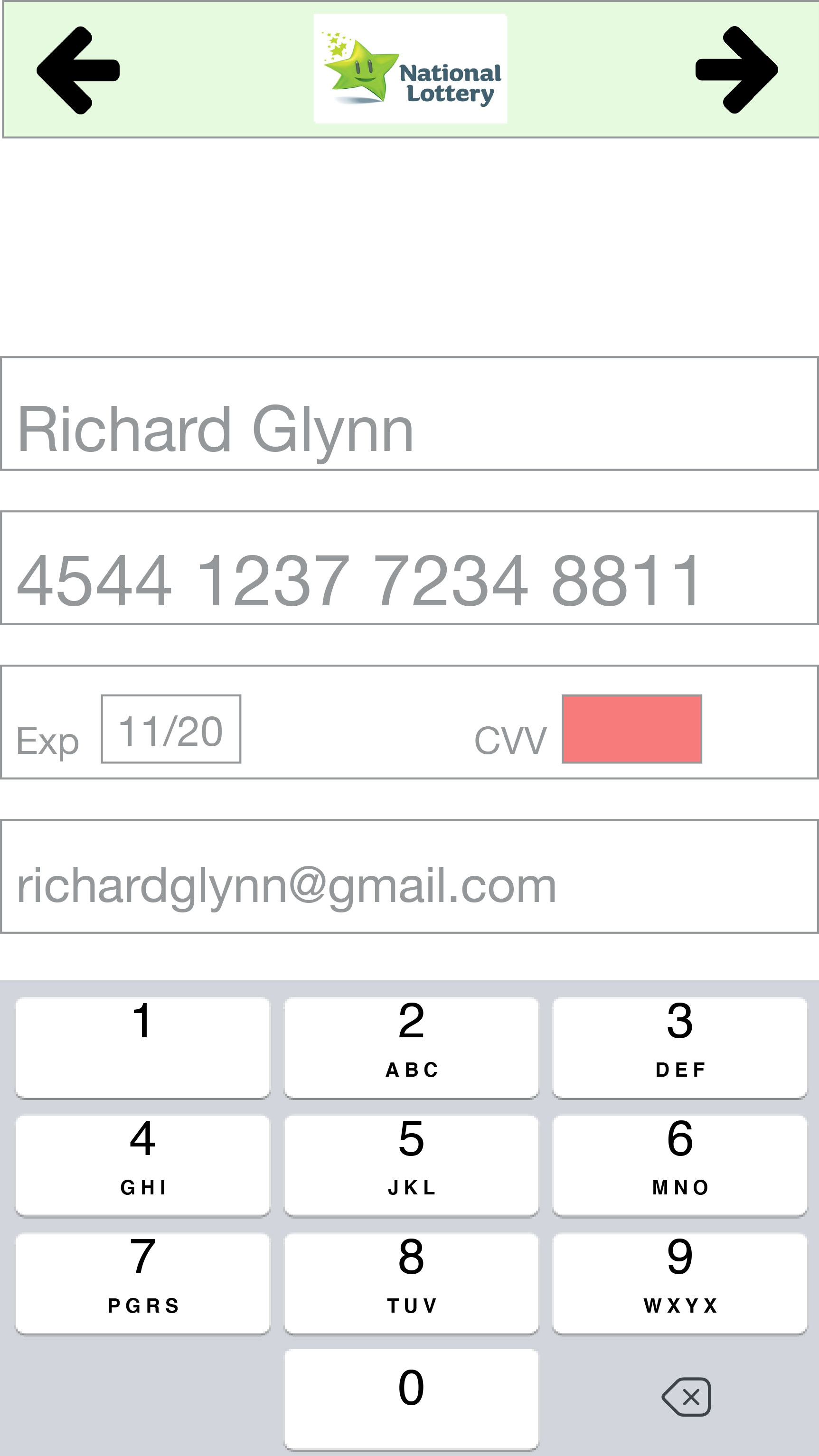
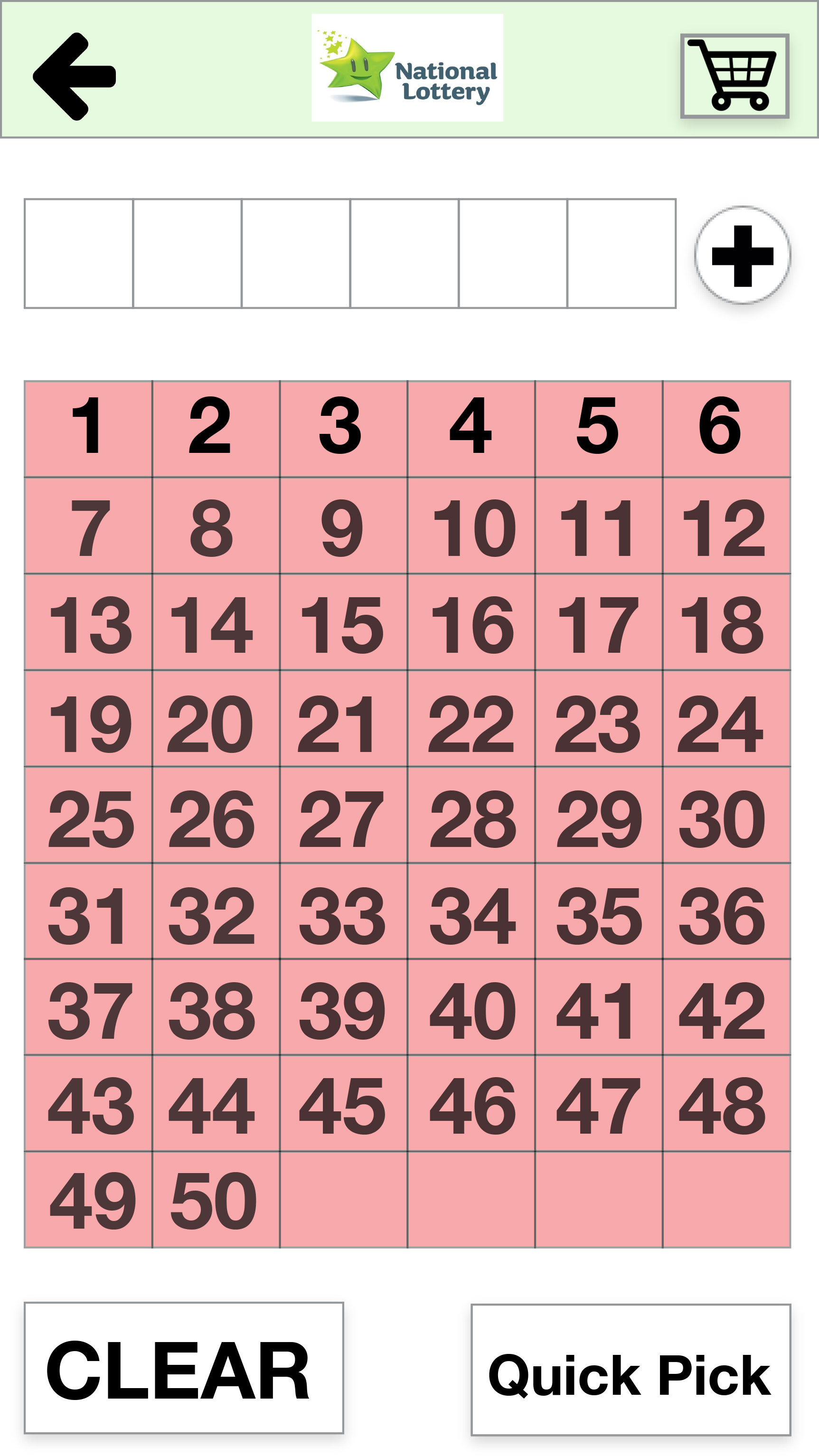
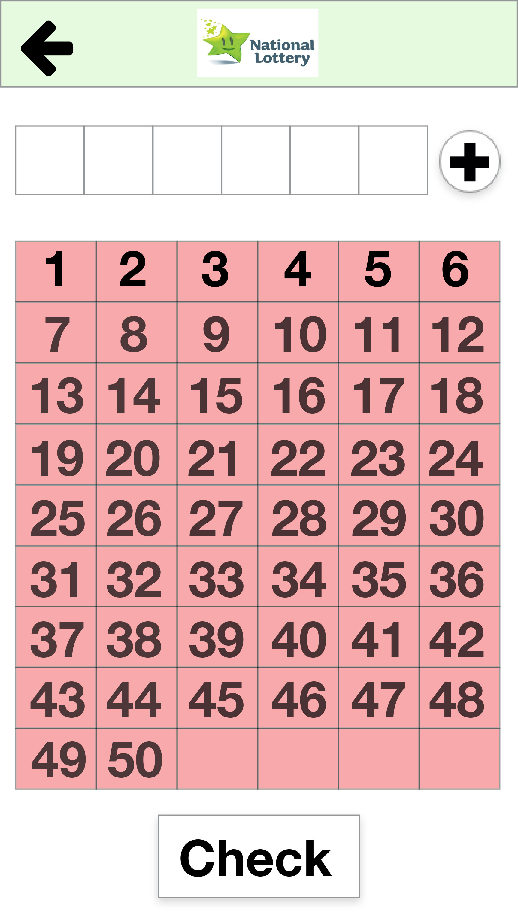
As a means to test quickly the main screen, we produced a version – Play Draw (Modified) – and marked the main actions with numbers, 1 for Add Line, 2 for Clear, 3 for Quick Pick, 4 for Checkout Screen and 5 for the Back button, and schedule a quick test via Whatsapp where we asked the tester a few questions based on the screen below:
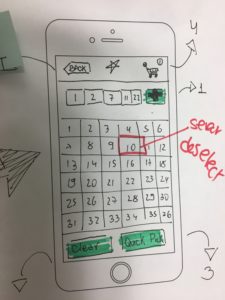
- If you have all numbers displayed at the top, where would you click to add a line?
- Where would you click in order to Clear the numbers selected?
- Where would you click to do a Quick Pick?
- How would you go to the Checkout screen from that screen?
- Where would you click to go back?
All responses were positive, the user understood and clicked on the correct buttons for all questions. We decided to go with the new design for that screen and run a new test on it.
Third Prototype
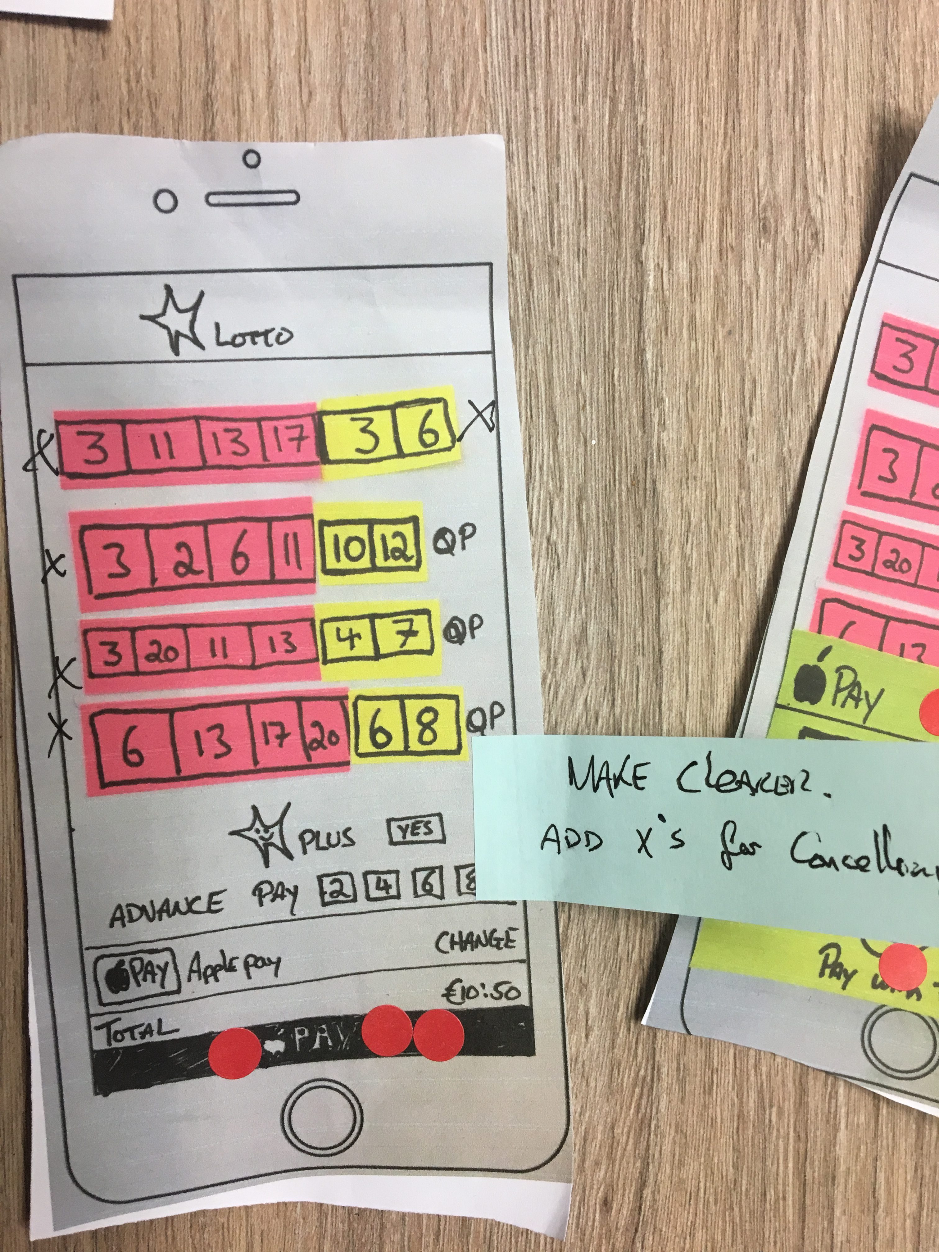
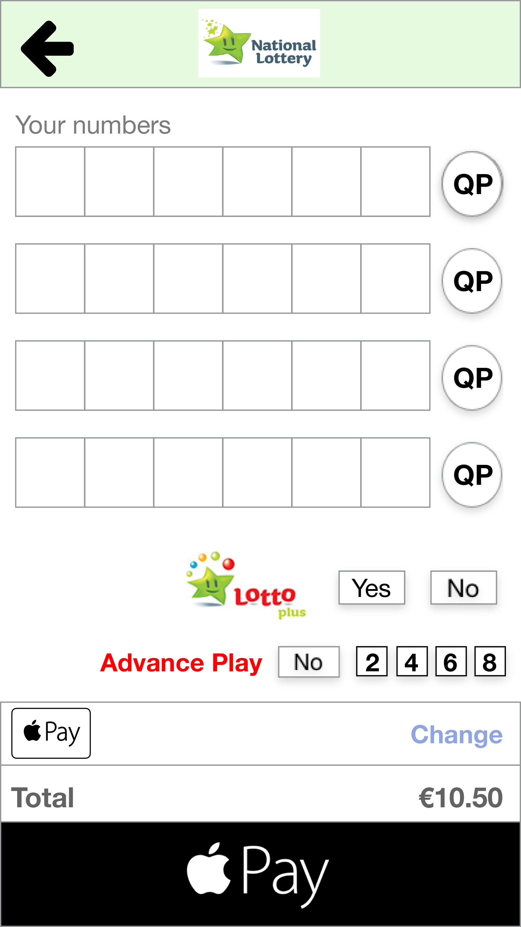
As the Check Numbers and the Onboarding tasks came back with good results from the last iteration and were validated by the users we decided that the changes on labels and button positions were enough to fix issues detected. For the Play Draw task, we redesigned the button elements, changed the label of the Quick Pick button from “QP” to “Quick Pick”. We also decided to go for a clearer design for this iteration, a step up from the drawings but still using a low fidelity prototype [1], we discussed and perceived that the sketched prototypes were more challenging for users to understand.
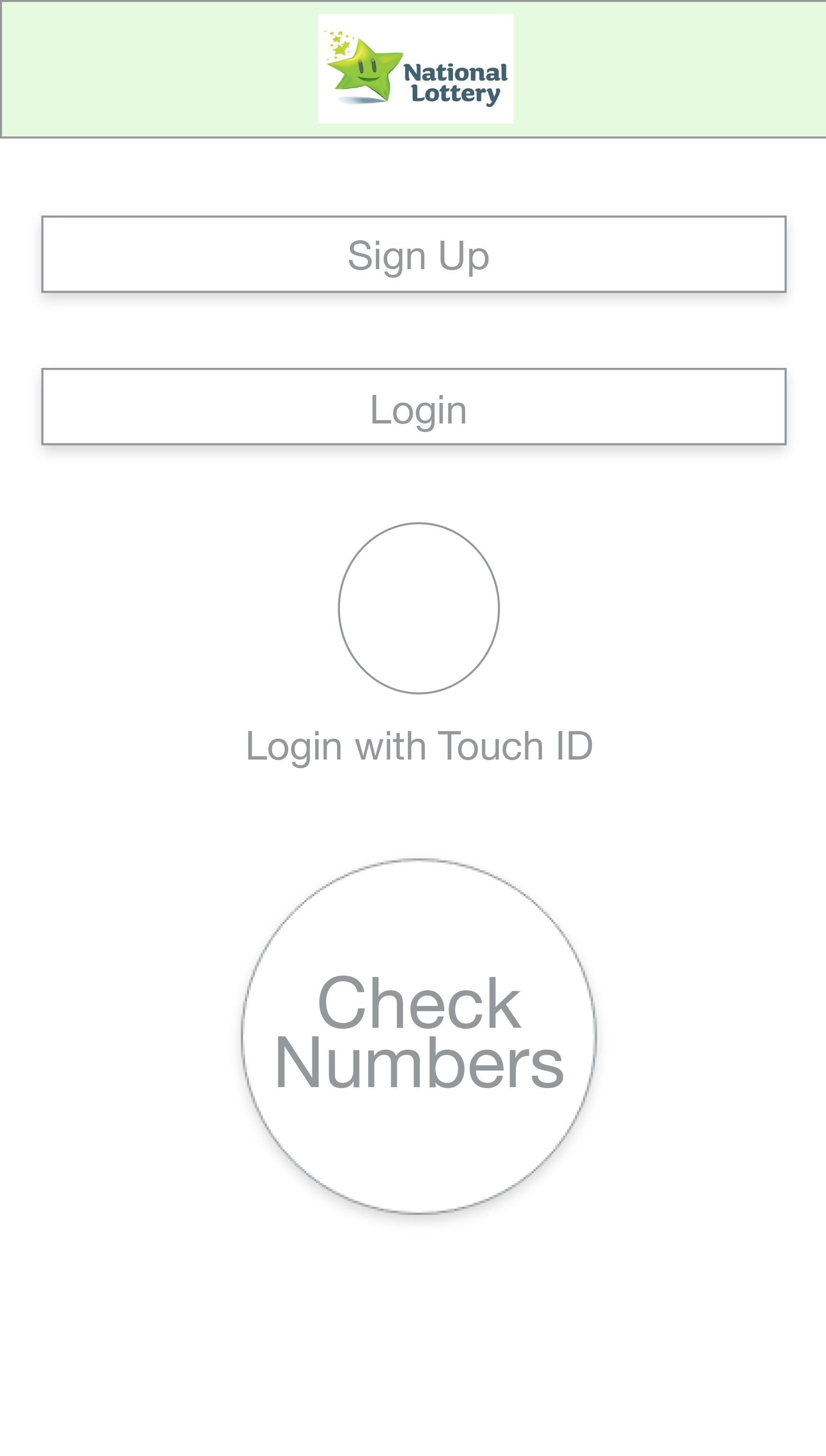
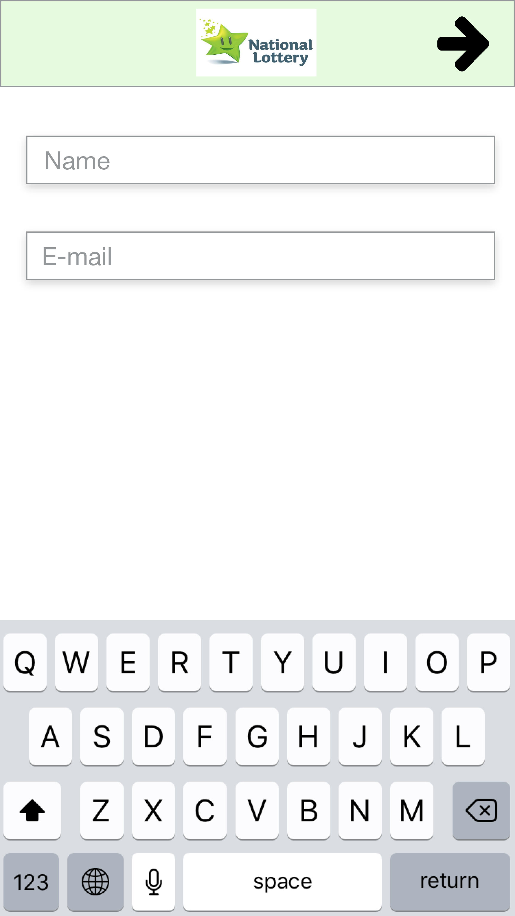
Onboarding
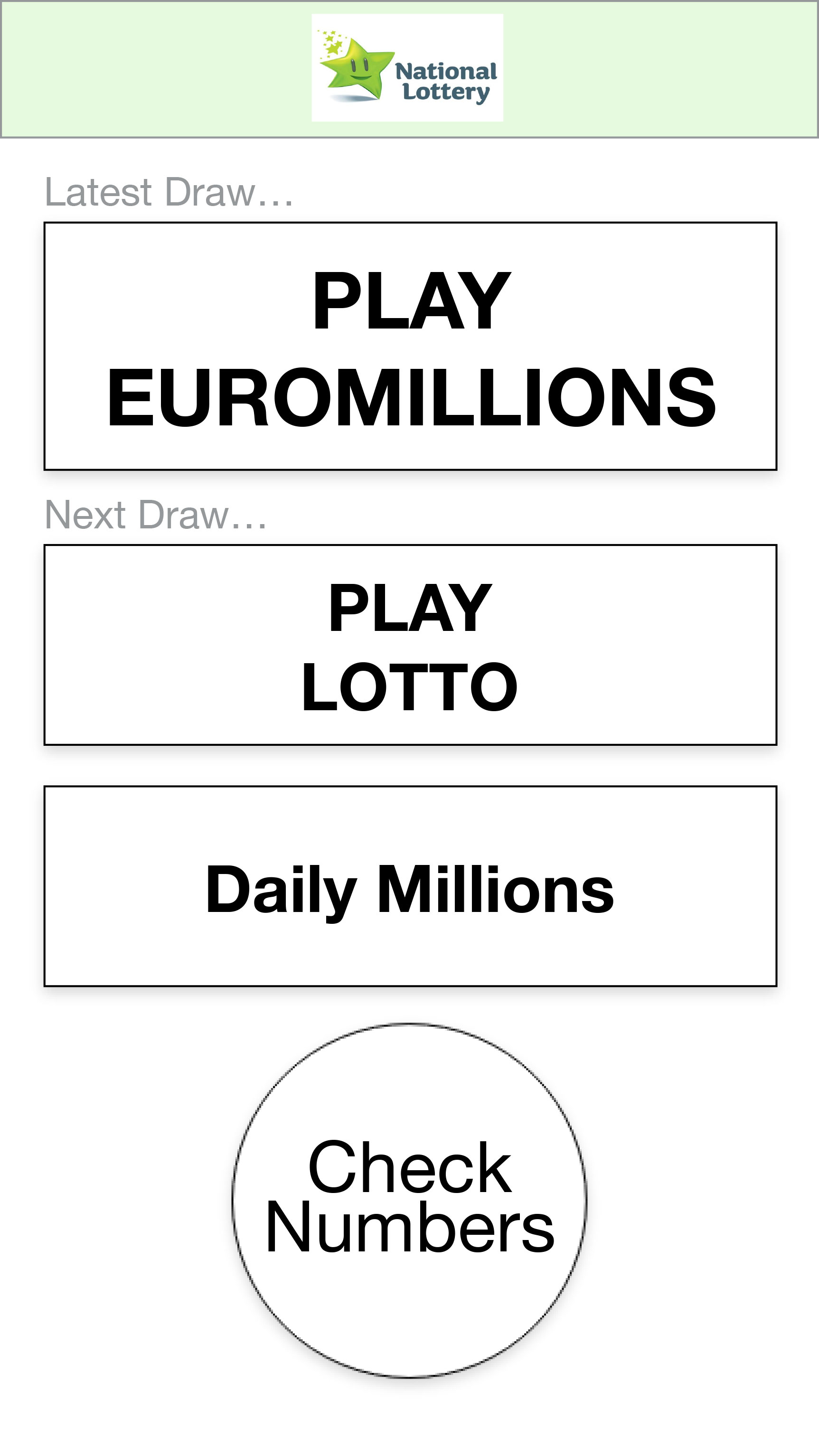
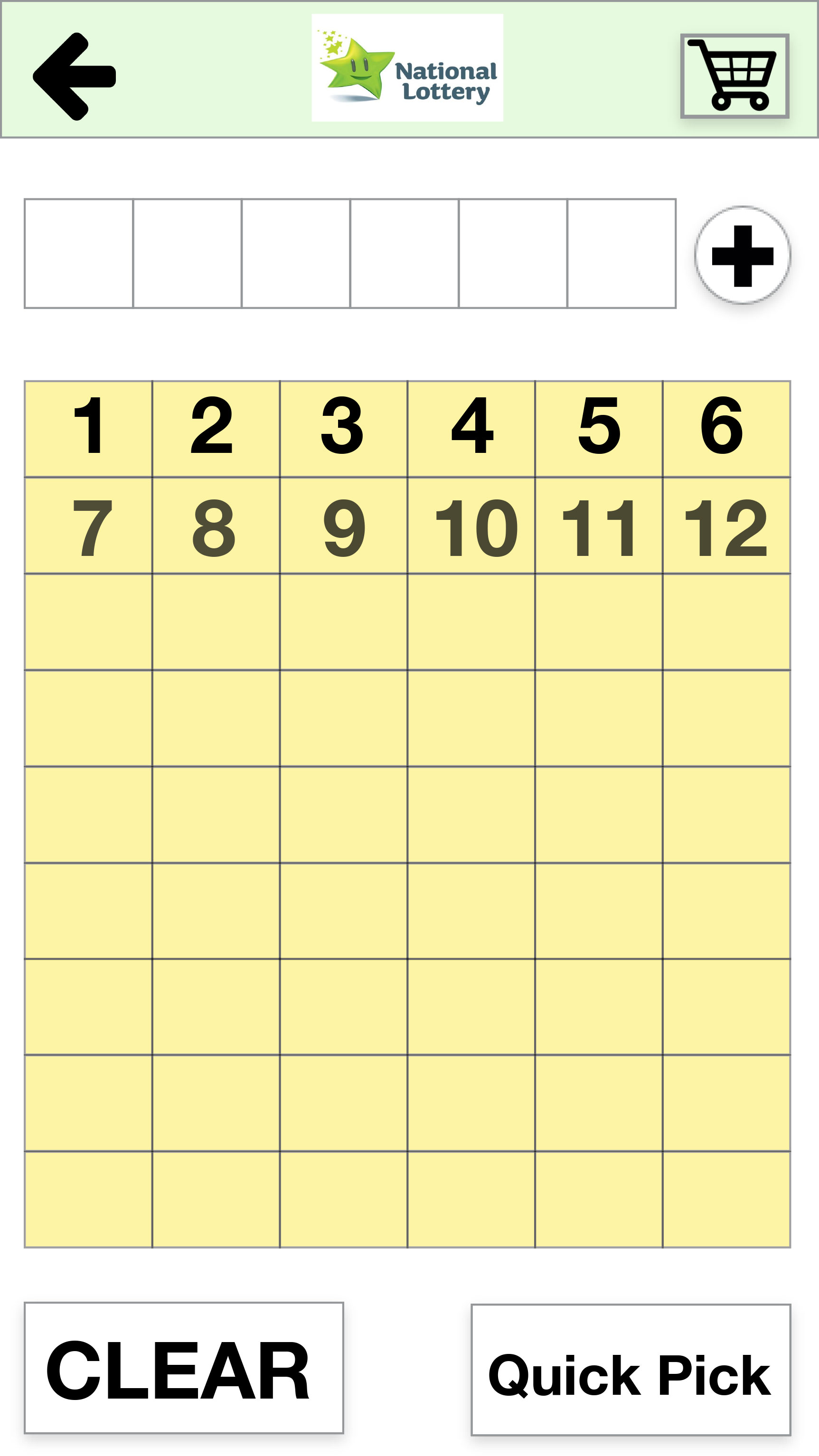
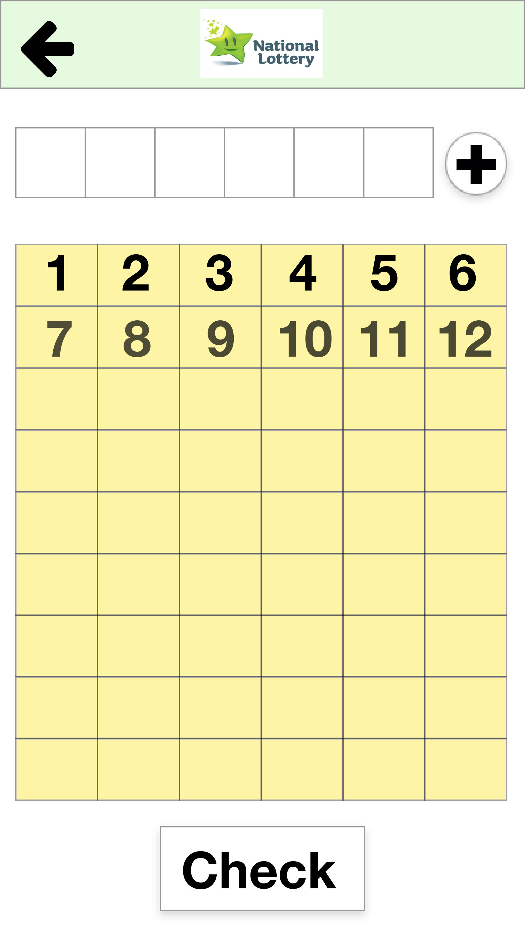
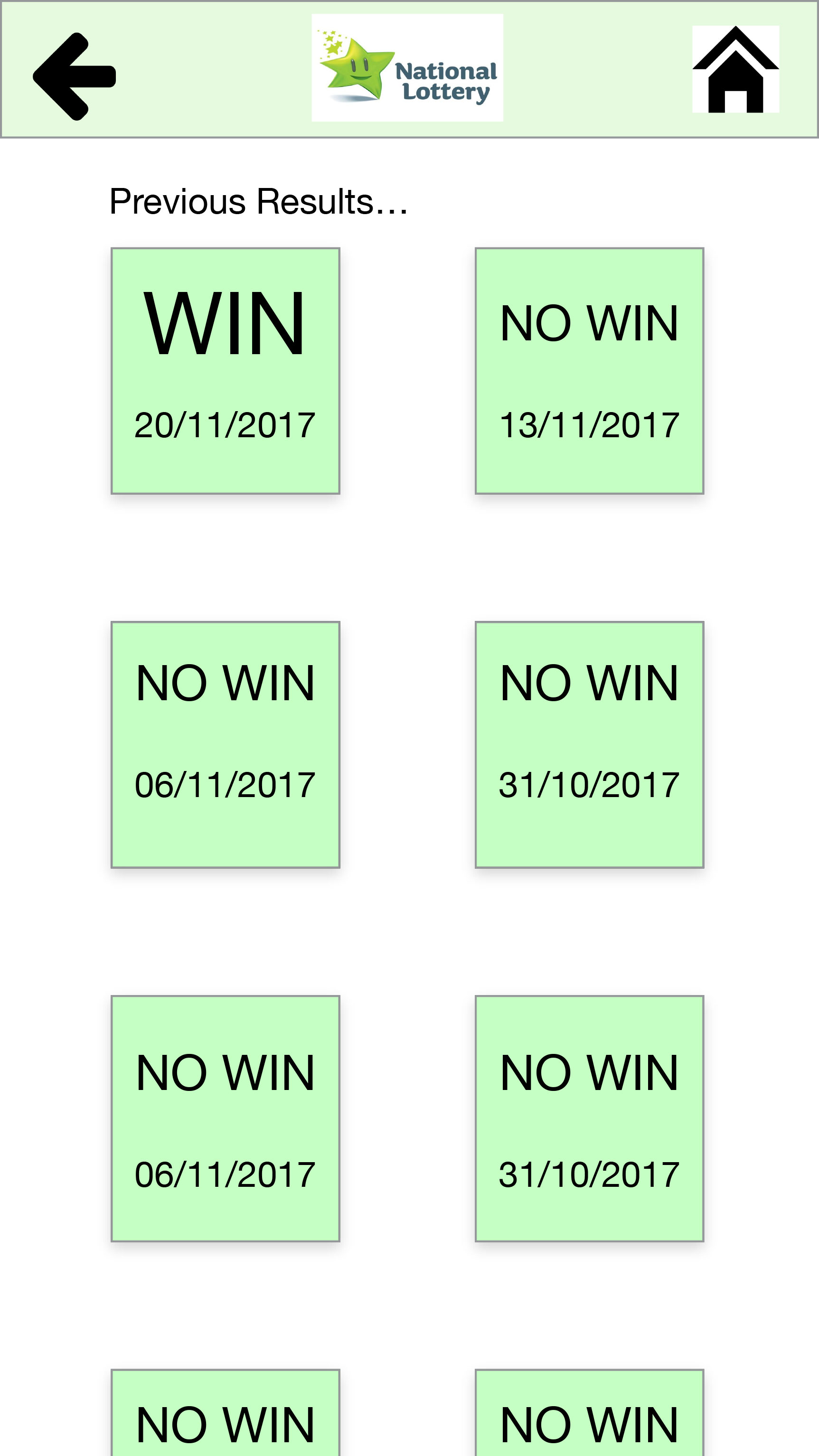
Play Draw
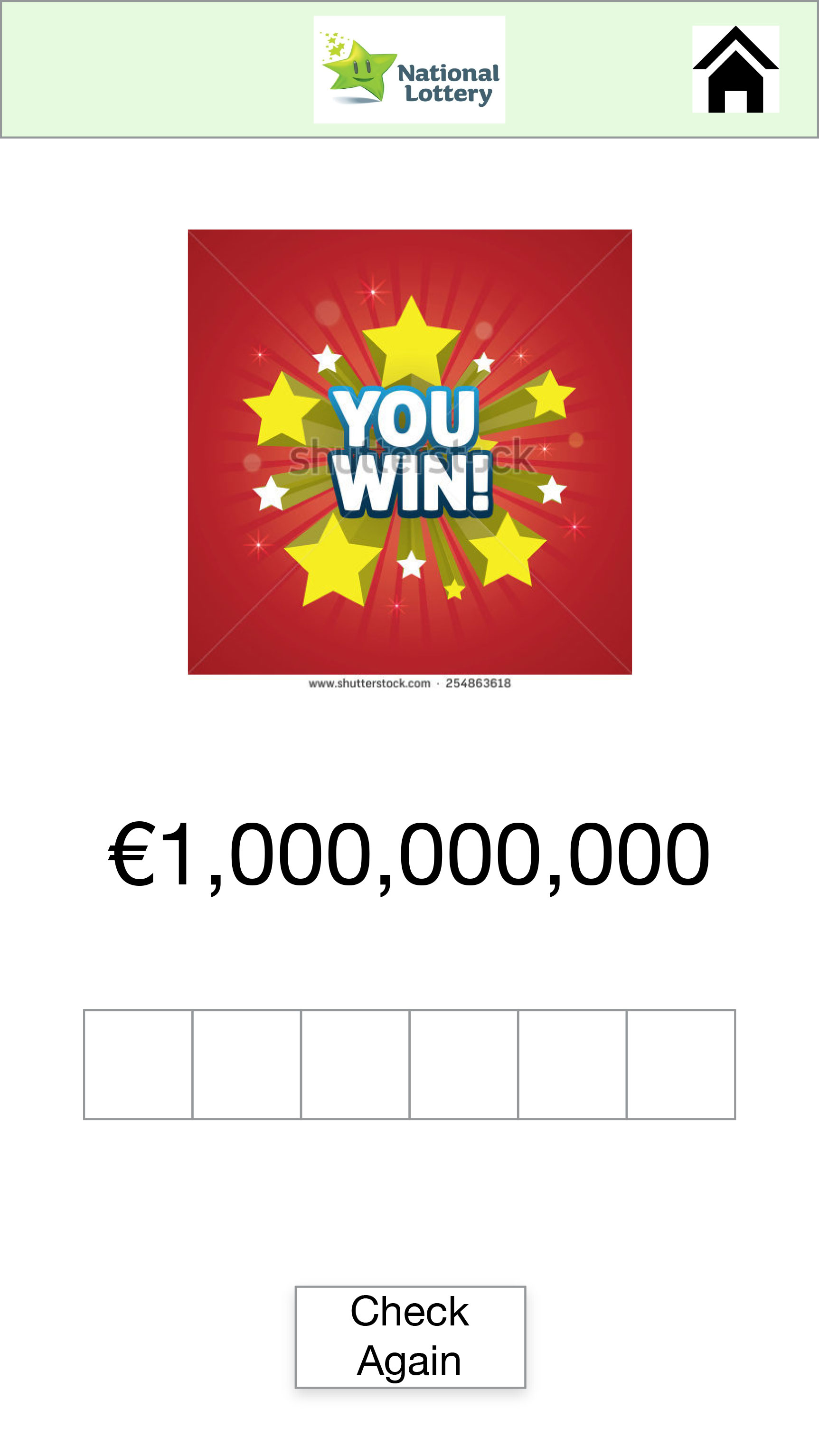
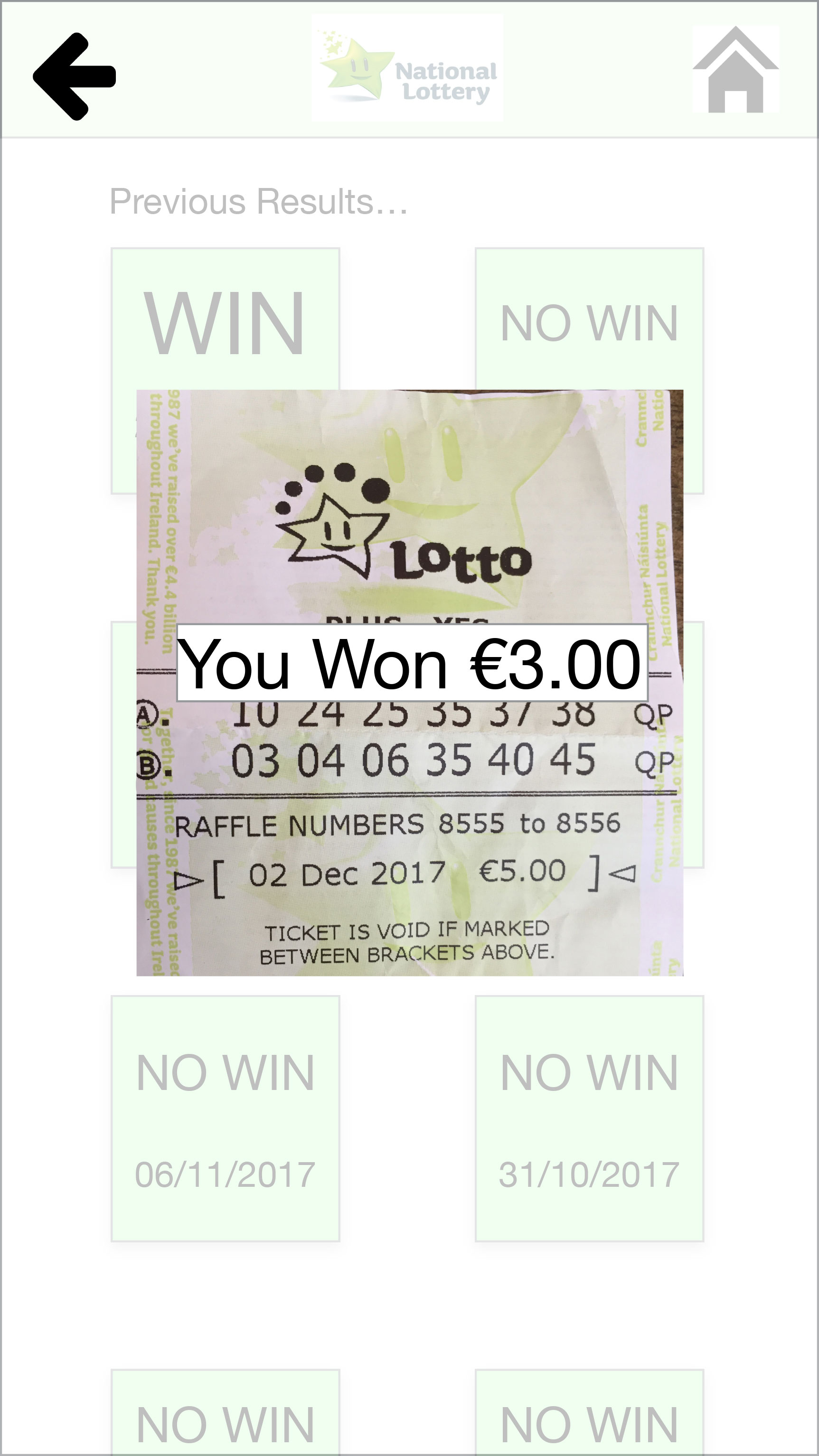
Check Numbers

Testing the 3rd Prototype
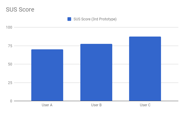
We tested the 3rd Prototype with three users. We wanted confirmation of some design changes we did before producing the final prototype.
User A: Onboarding | Play Draw | Check Numbers
User B: Onboarding | Play Draw | Check Numbers
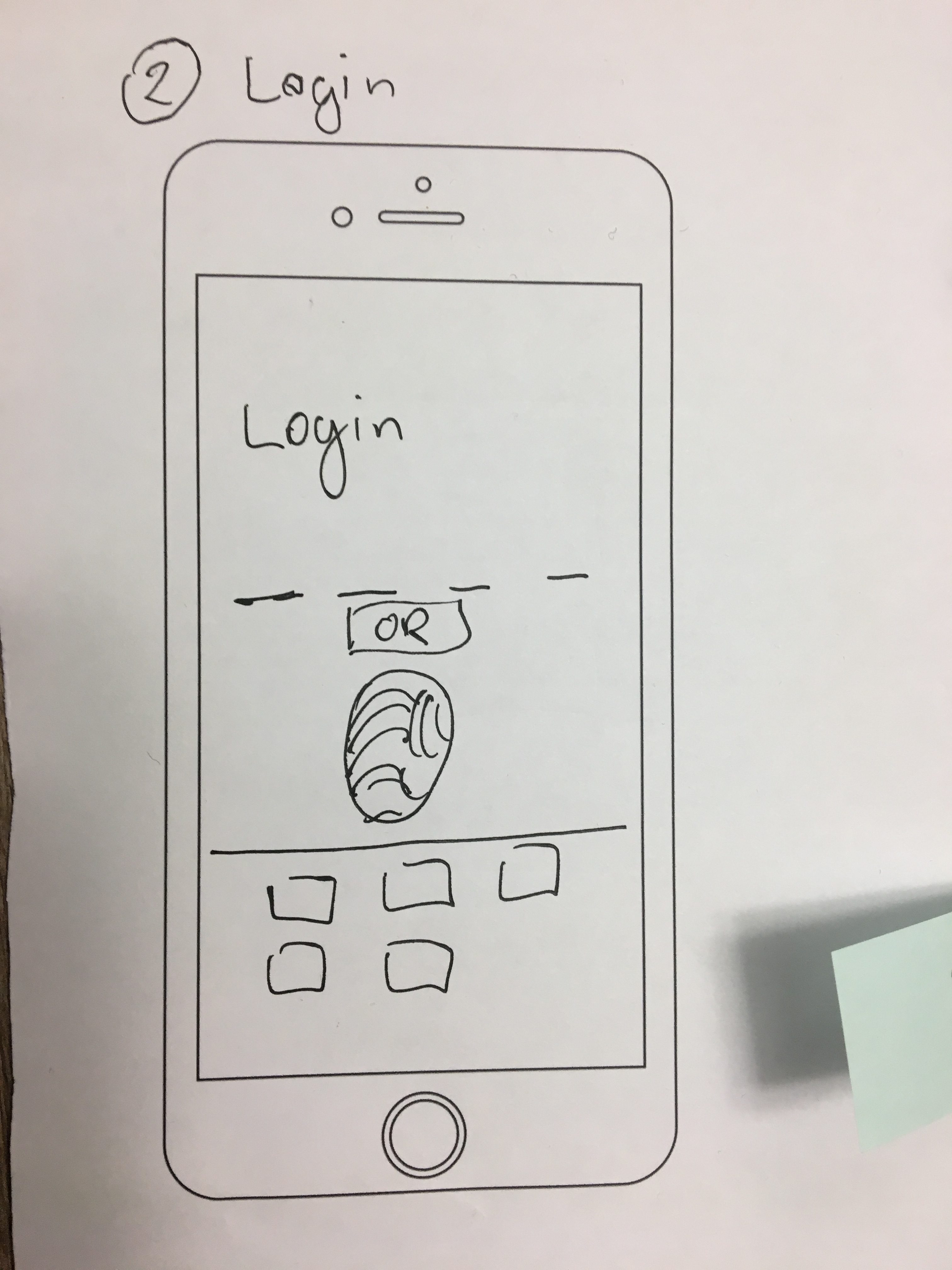
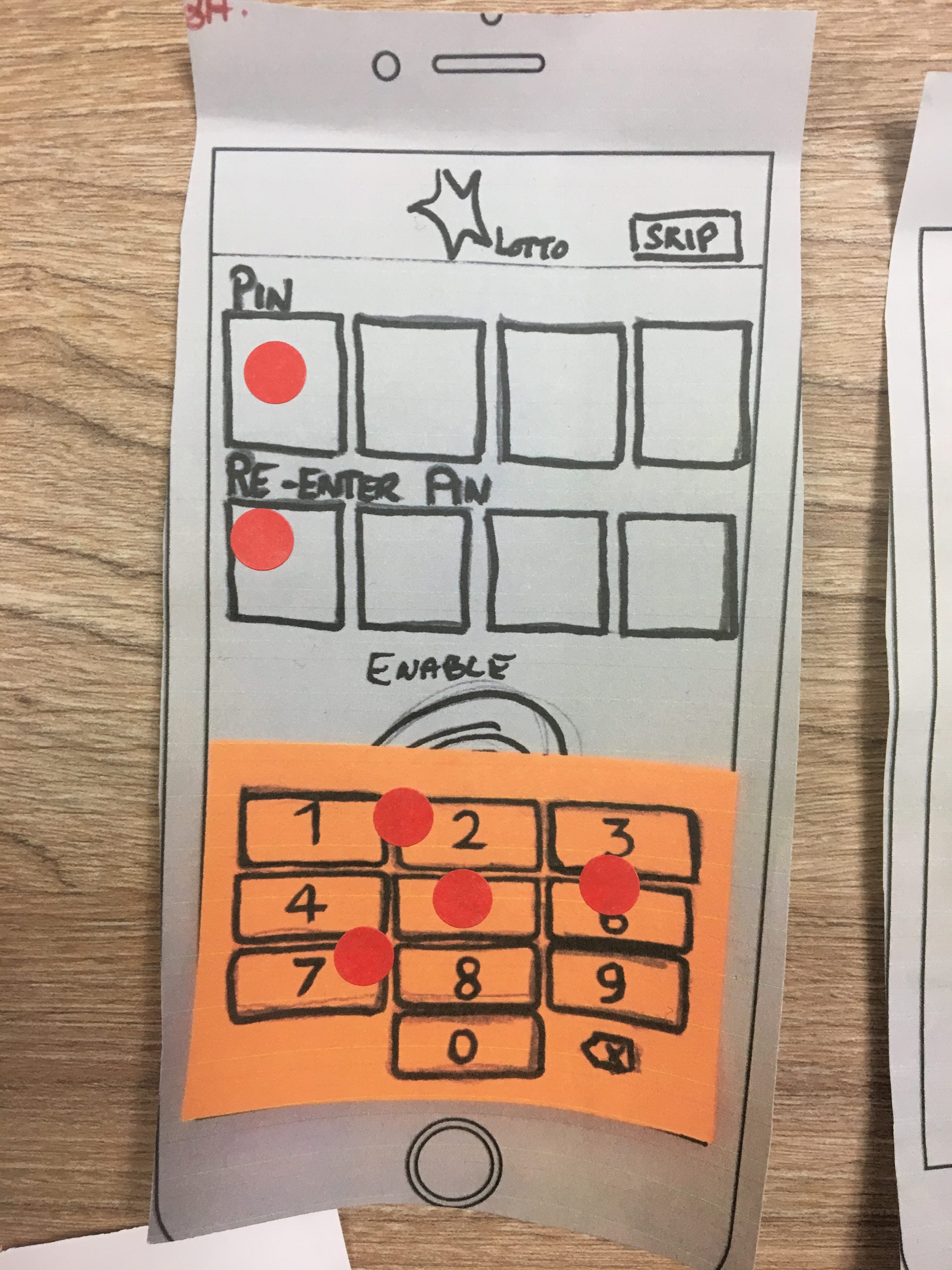
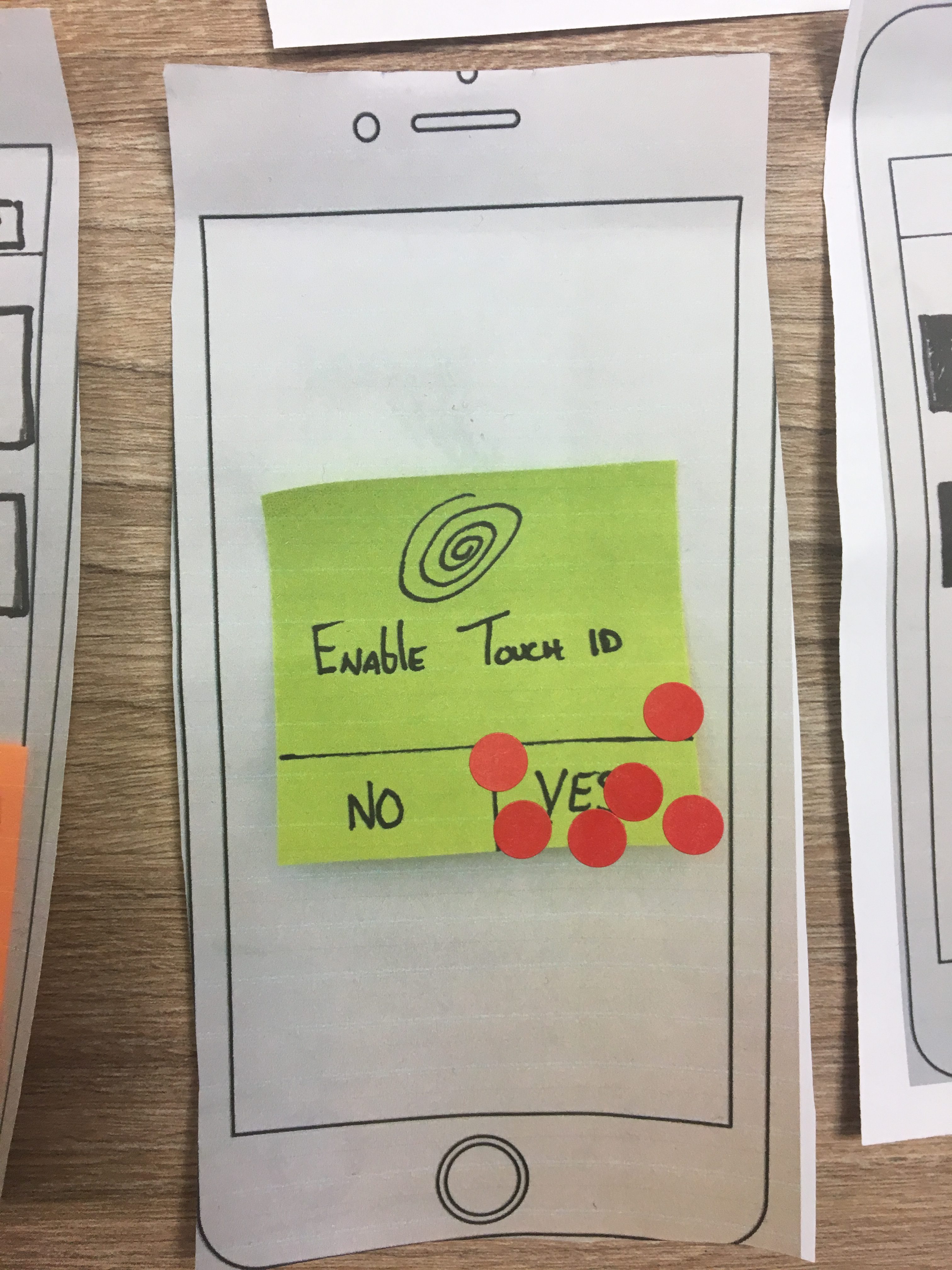
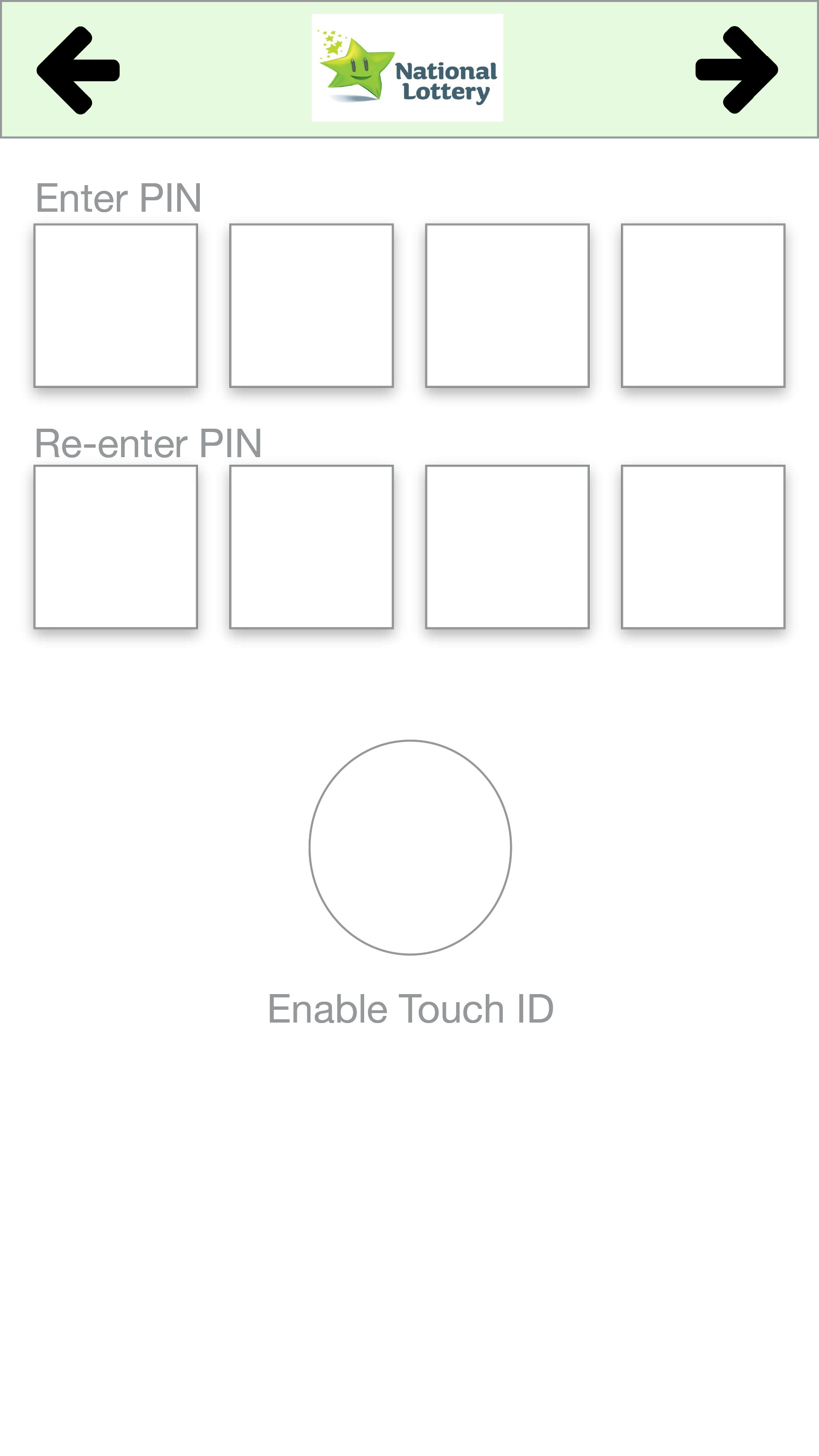
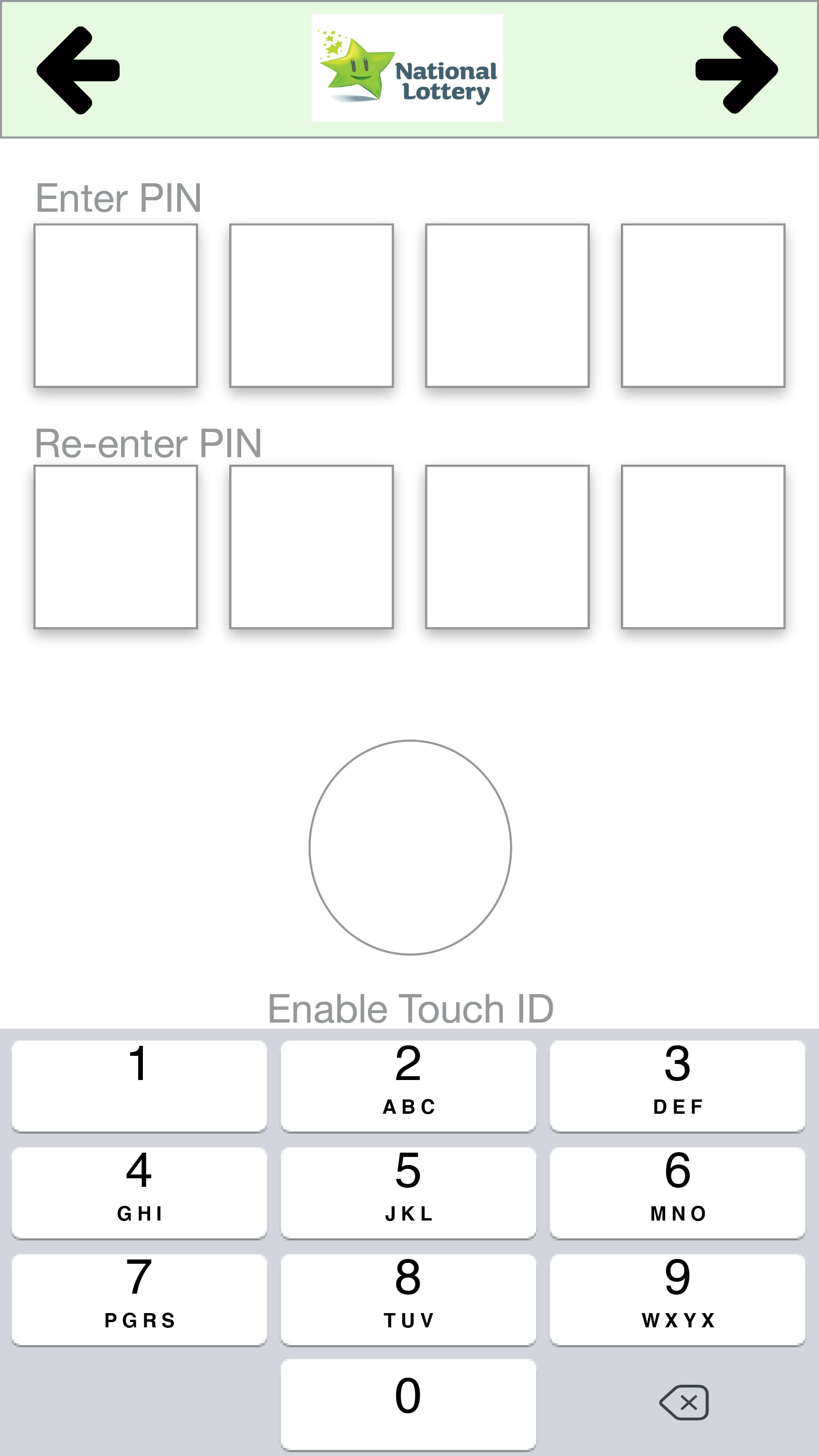
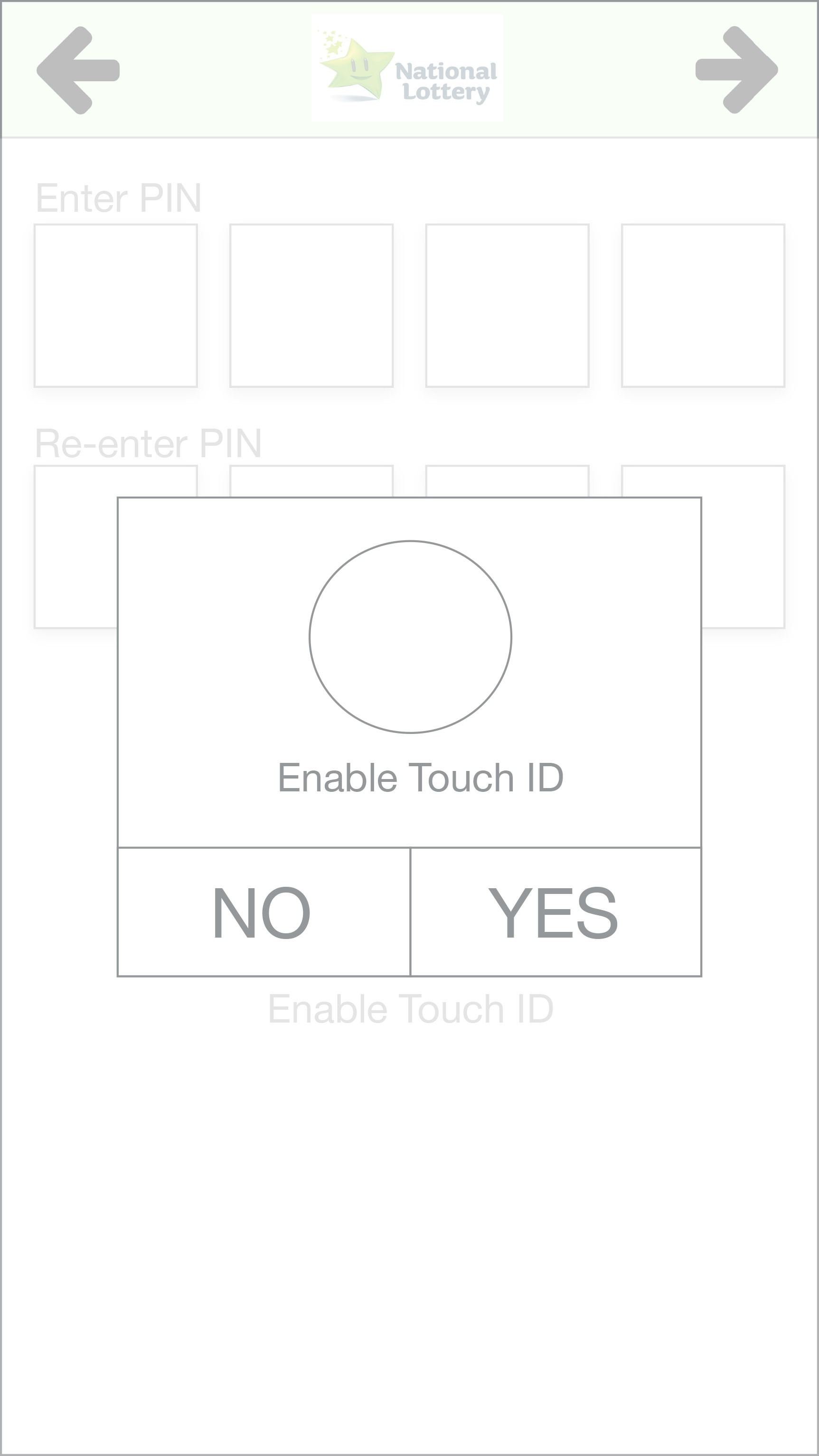
During the account setup, users felt the Touch ID option was a bit confusing and during the videos, some users hesitated during the process. User C did not understand the arrows as Next or Previous buttons but that is the first user that came back with this feedback but he navigated the onboarding process without any issues after exploring the arrows. All users had no major issues during the onboard process.
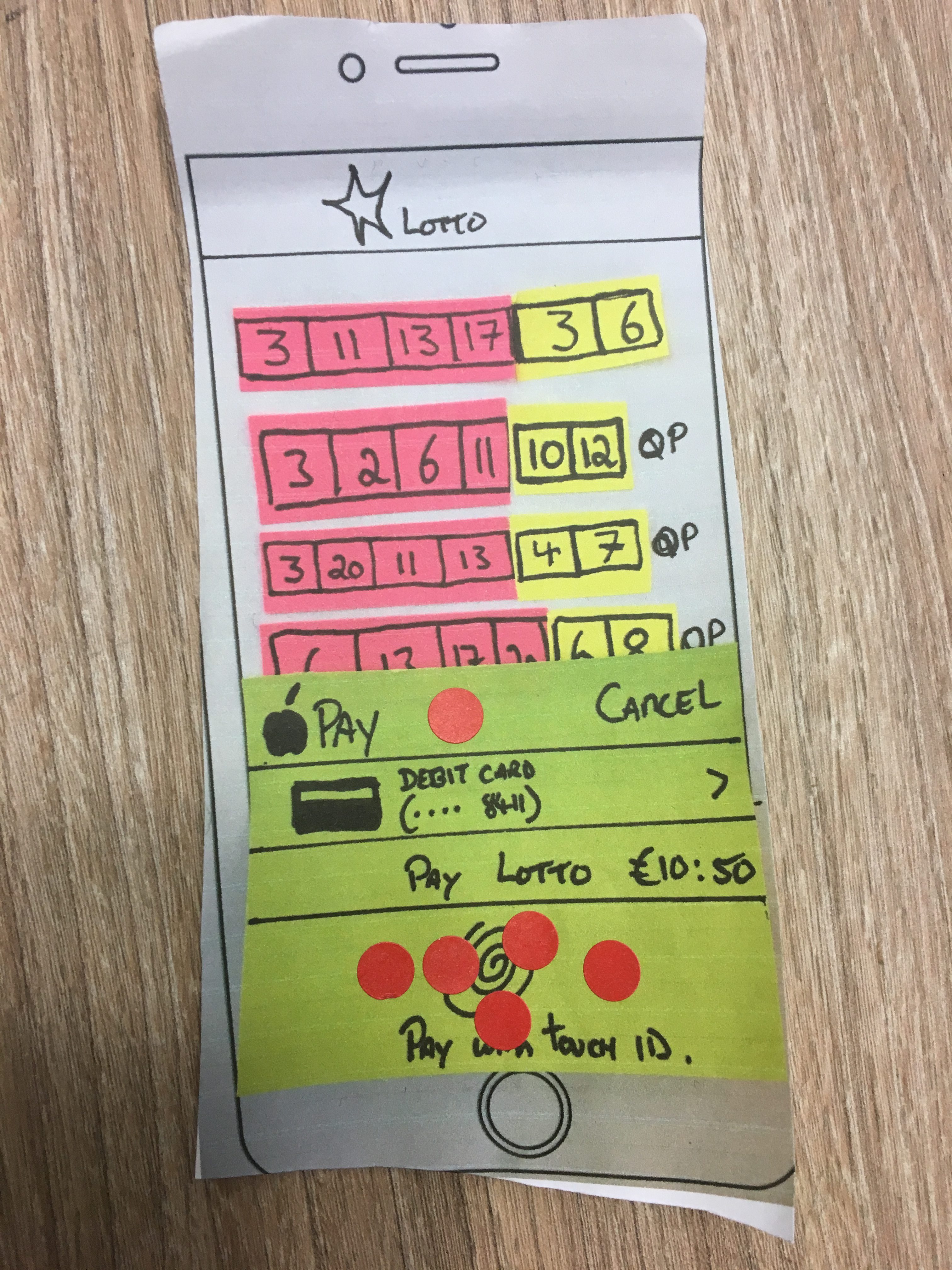
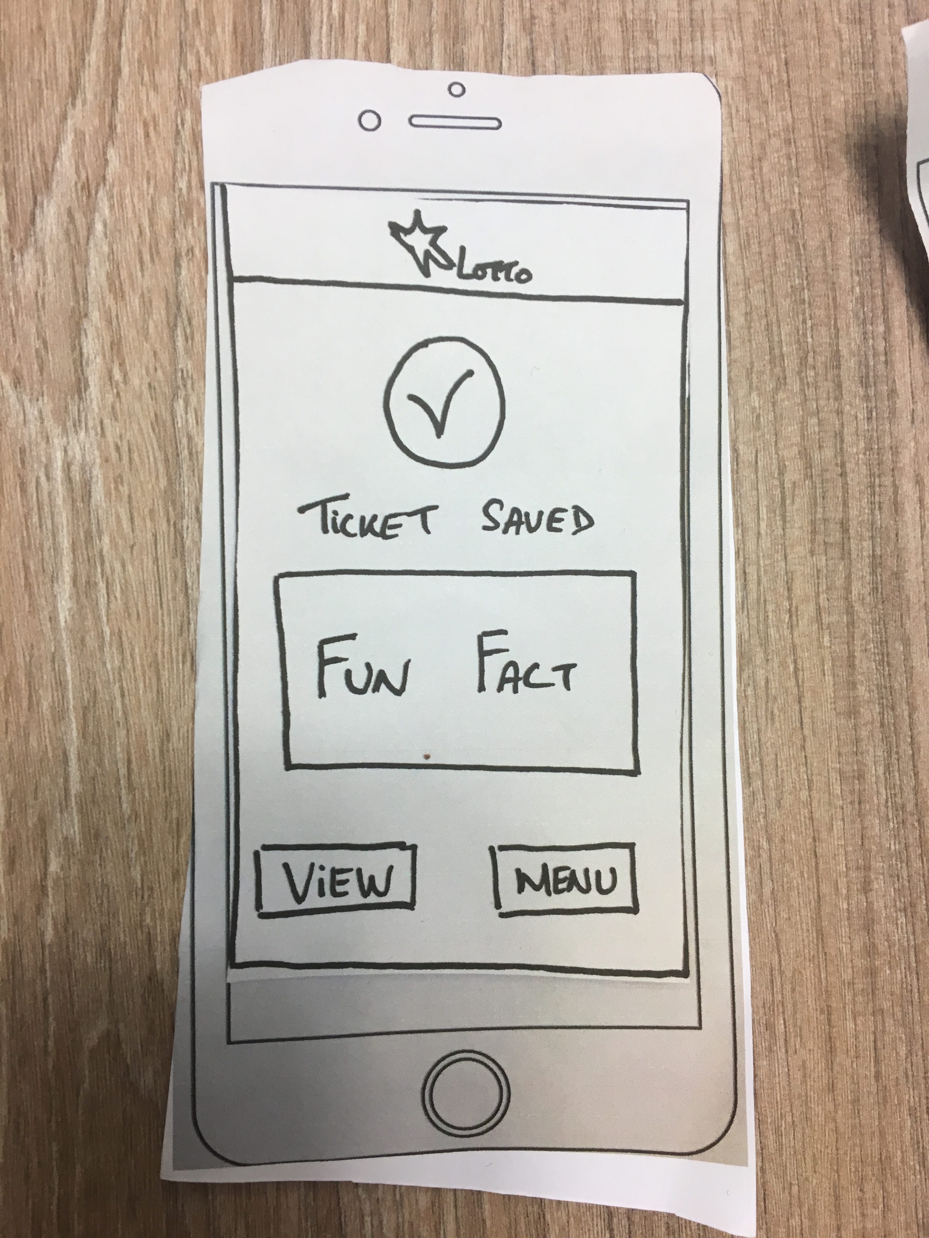
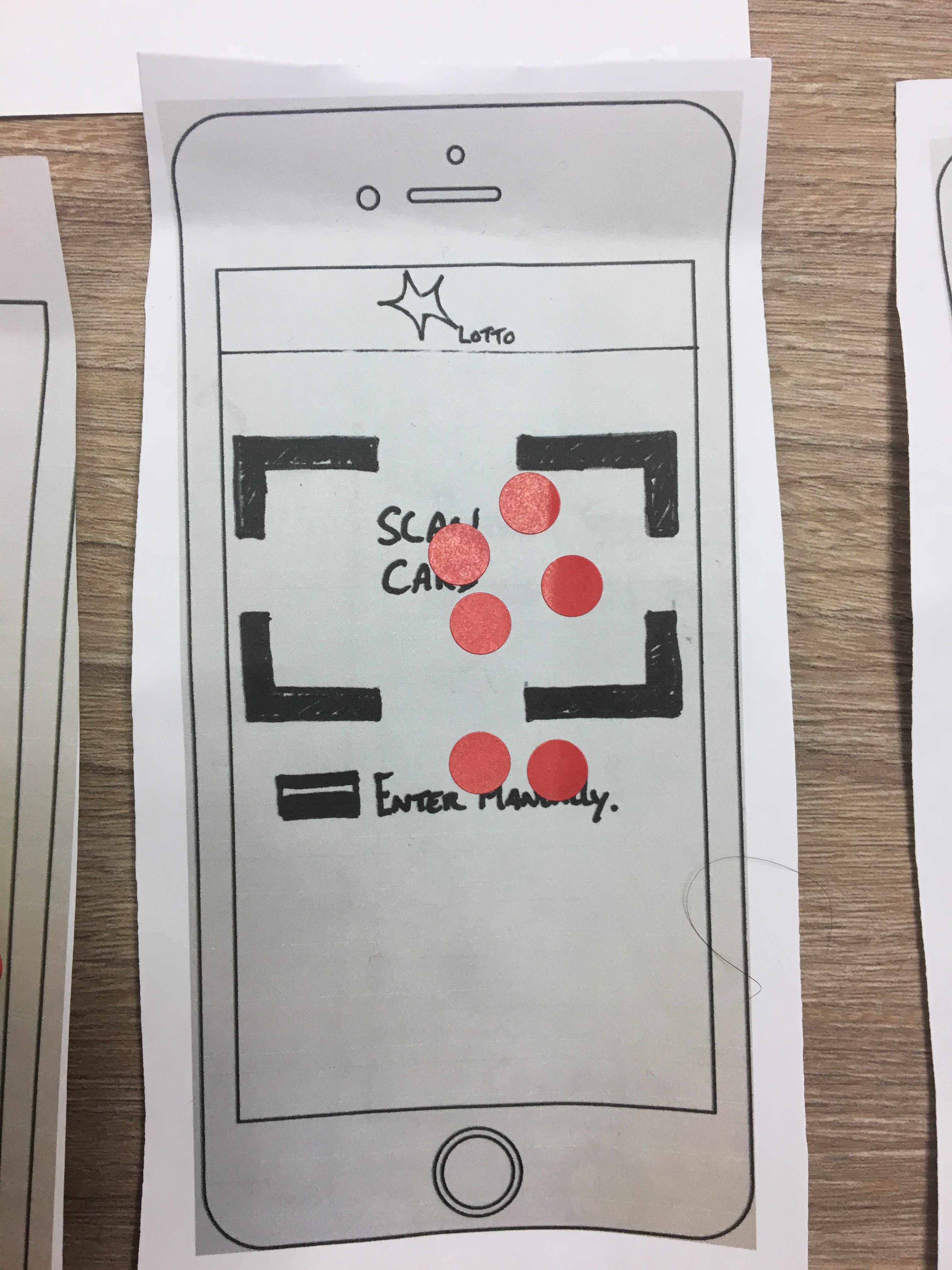
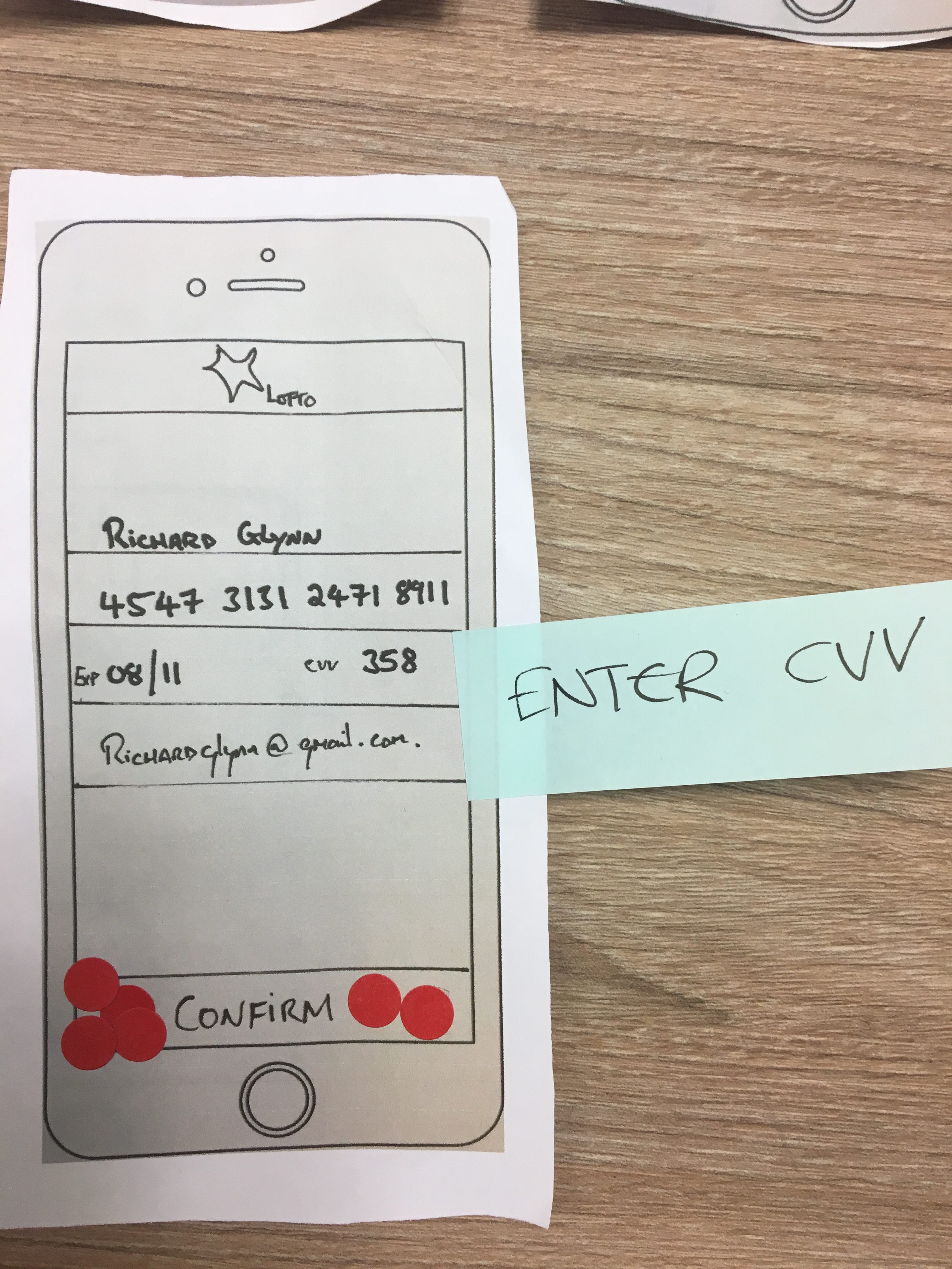
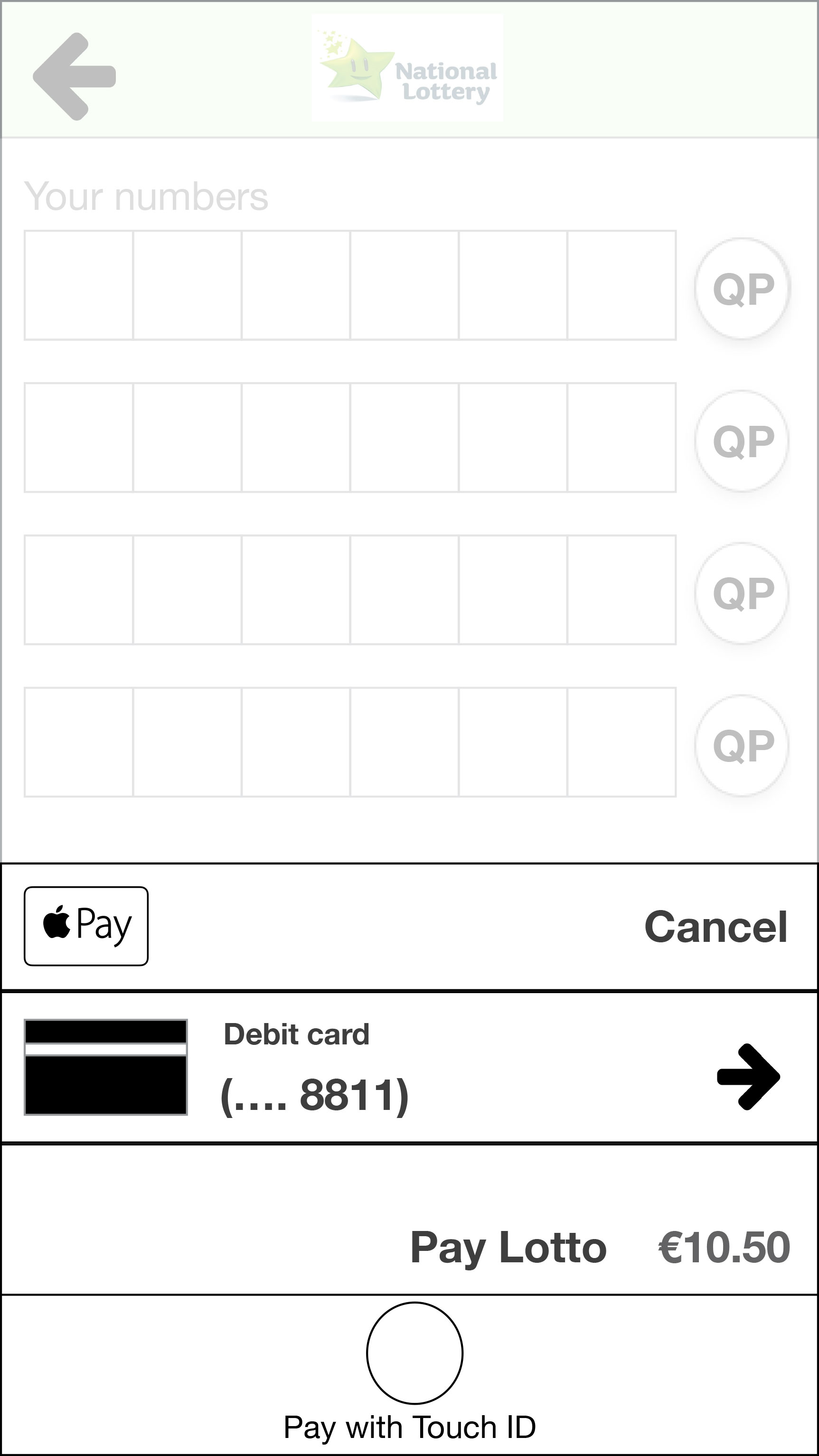
When playing a draw, all users mentioned that the process was straightforward, one user commented that having the numbers being displayed when clicking “Quick Pick” is much better than the current Lotto app that only displays a series of input boxes with the letters “QP” in them. User A also got confused by the Touch ID option during payment and found that other payment options weren’t clear on the screen. All other users had no issues with the new button placements, it was clear to them the actions that each of them would perform.
For the Check Ticket process, users found the button to go to the e-tickets was not clear and User B found it by elimination. The other 2 users responded that it was an easy process even though User A had issues to find her previous tickets bought on the app and with the whole process of the tickets bought via Lotto app.
Again, we applied a SUS questionnaire and the raw results can be visualized here. The average SUS Score was 78.33, which was higher than the score of the 2nd prototype and below the score of the 1st prototype.
And below the SUS mark of the 3rd Prototype compared to the two first iterations.
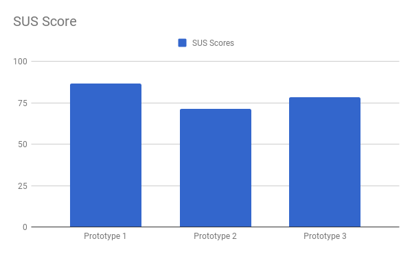
And finally, we move to the final prototype on the next section, doing the tweaks we found necessary to make. The SUS mark didn’t show a massive increase but the qualitative data was promising.
[1] Pernice, K. (2016, December 18). UX Prototypes: Low Fidelity vs. High Fidelity. Retrieved from https://www.nngroup.com/articles/ux-prototype-hi-lo-fidelity/